Quantcast
Channel: Picturebook Makers
Viewing all 132 articles
Browse latest View live

Victoria Turnbull

$
0
0

Victoria Turnbull graduated with an MA in Children’s Book Illustration from Cambridge School of Art. Her debut picturebook, ‘The Sea Tiger’ (originally a college project), was shortlisted for the Waterstones Children’s Book Prize and nominated for the prestigious CILIP Kate Greenaway Medal. Victoria lives and works in London.

In this post, Victoria talks about her third picturebook, ‘Pandora’. This stunningly illustrated tale of hope and regeneration was originally published in the UK by Frances Lincoln Children’s Books, and has been translated into several other languages.

Visit Victoria Turnbull’s website

Victoria:‘Pandora’ is the third picture book I’ve both written and illustrated. My first two books were developed on my MA in Children’s Book Illustration and published consecutively after finishing the course. So this was the first one I’d written outside the sanctuary of the MA, and it felt like a big step.

Illustration from ‘Pandora’ by Victoria Turnbull – published by Frances Lincoln, United Kingdom

The seed of the story was planted after reading a news story about recently discovered cave paintings, where footprints of a child and a fox were also found. I began to imagine a world where man no longer existed, yet one where his former existence was evident in all the things he’d left behind. In this grey desolate landscape of rubbish I was starting to picture, a fox seemed like a natural protagonist. The fox has become a feature of our urban landscape and I felt this enigmatic creature would adapt well to a man-made environment.

Development work for ‘Pandora’ by Victoria Turnbull – published by Frances Lincoln, United Kingdom

‘Pandora’ was always a story of regeneration. Whenever I considered it, an image would pop into my head of a vast landscape of waste mountains that transformed into rolling hills at the turn of a page. Visually it felt like a satisfying conclusion and if I could figure out the catalyst for the change, it also told me how the story would end.

I searched for influences to fit this idea in the form of other stories, such as ‘Pandora’s Box’ and ‘Noah’s Ark’. Around this time, I also rediscovered a book of fairy tales from my childhood. In ‘The Nightingale’ by Hans Christian Andersen, an Emperor prefers the song of a mechanical bird to that of a real nightingale – only realising his mistake when he’s close to death. The story echoes the notion of mankind valuing material possessions over the natural world and added to the connections that were starting to form in my mind. Eventually these thoughts tumbled out onto a page in my sketchbook.

Development work for ‘Pandora’ by Victoria Turnbull – published by Frances Lincoln, United Kingdom

I came to picture book making through my love of drawing, and I still find creating a narrative an incredibly difficult process. By this stage I had an idea of the shape of the story but I didn’t know how it was going to fit into a 32-page format. In an effort to organise my thoughts, I started laying it out as thumbnails. In one of my early drafts, Pandora constructs a mechanical bird out of the objects she finds on the dump and the bird brings back seeds that transform her landscape. It seemed like a neat solution but I felt something was missing.

Illustration from ‘Pandora’ by Victoria Turnbull – published by Frances Lincoln, United Kingdom

At the heart of all my stories is a search for something: a journey of self-discovery where the character finds the inner strength needed along the way. Pandora’s story only became clear when I realised, like the Emperor in ‘The Nightingale’, she wouldn’t be happy with an imitation of nature. She needed a real connection. Once I decided a wounded bird would come into Pandora’s world, the narrative fell into place much more easily.

I worked on the text and the illustrations simultaneously, adding corresponding text to my sequential drawings to show what was happening in each panel. The text reflects Pandora’s limited understanding of her world and serves to enhance her feelings of isolation. It changed very little from here to the final book.

Development work for ‘Pandora’ by Victoria Turnbull – published by Frances Lincoln, United Kingdom

I submitted the final storyboard alongside a couple of character sketches to my publisher and they liked the concept, so I was able to start work on the roughs. At this stage, compositions can easily change so I don’t like to invest too much time in the drawings. I try to keep them quite loose, so there’s still more for me to discover when creating the final artwork.

Development work for ‘Pandora’ by Victoria Turnbull – published by Frances Lincoln, United Kingdom

Illustration from ‘Pandora’ by Victoria Turnbull – published by Frances Lincoln, United Kingdom

Sometimes a character just speaks to me in some way, and that’s how it was with Pandora. I really empathised with this little fox and I wanted that feeling to come across in the drawings.

I thought Pandora should look small and vulnerable in relation to the environment, so I proportioned her like a child and put her in a dress that allowed her tail to poke out from underneath. I also liked the way her markings gave the appearance that she was wearing socks. When I draw, I’m often looking for something elusive, a feeling I get when I know it’s right. It usually takes many failed attempts but it’s exhilarating when it happens.

Development work for ‘Pandora’ by Victoria Turnbull – published by Frances Lincoln, United Kingdom

I felt emotionally invested in telling this story and I wanted to do that as best as I could. My concern was that setting a picture book on a rubbish dump could potentially feel a little depressing. I also much prefer to draw natural forms than man-made objects but there was nothing I could do to avoid it here. So just as Pandora manages to bring beauty into her imperfect world, I endeavored to find little things of interest to love as I created the pictures.

Illustration from ‘Pandora’ by Victoria Turnbull – published by Frances Lincoln, United Kingdom

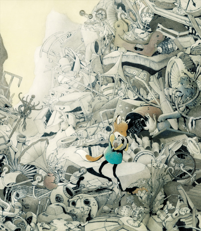
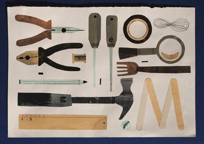
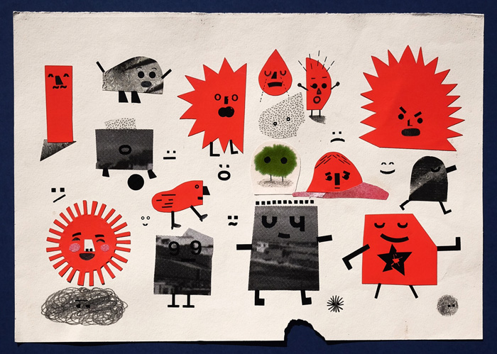
My first step was to go to various London museums to photograph all the things that seemed to belong in this world I was creating. I wanted it to look alien yet familiar, so I tried to choose objects that reflected this. My hope was by introducing lots of detail, the reader would be forced to stop and consider the environment. But as a consequence, it also made me consider the areas of white space and how important it was for the book to work as a whole.

Research photographs for ‘Pandora’ by Victoria Turnbull – published by Frances Lincoln, United Kingdom

I try to adapt my technique to each narrative. For this book, I knew I wanted very little colour in the initial pages, with gradually more colour creeping in as the story progresses and as nature prevails. In an effort to preserve the spontaneity of my original sketches, I scanned and printed out my pencil drawings onto thick paper. These line drawings were then coloured with a combination of graphite pencil, coloured pencil, pastel and linseed oil. Creating the artwork by hand is quite a laborious process, and after straining my arm, I struggled to complete the final few spreads. But I think in the end it was worth it.

Work in progress for ‘Pandora’ by Victoria Turnbull – published by Frances Lincoln, United Kingdom

For me, ‘Pandora’ is a story of hope and humanity. Even though man doesn’t appear in the book, he is always present. Children have an innate sense of wonder and curiosity in the natural world, but it’s easy to lose that connection as we grow older. I hope the reader takes from this book the knowledge that they can affect their own story, and the story of the world they inhabit.

Illustrations from ‘Pandora’ by Victoria Turnbull – published by Frances Lincoln, United Kingdom

Illustration from ‘Pandora’ by Victoria Turnbull – published by Frances Lincoln, United Kingdom

Illustrations © Victoria Turnbull.
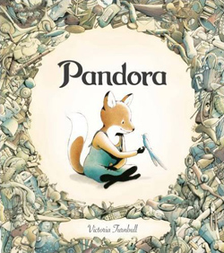
Pandora

Victoria Turnbull
Frances Lincoln, United Kingdom, 2016

Pandora lives alone in a land of broken things. She makes herself a handsome home from all that people had left behind, but no one ever comes to visit. One day, a bird with a broken wing falls from the sky. Pandora nurses the bird back to health, and it begins to fly away each day, bringing back seeds and small plants. When the bird stops coming, Pandora is heartbroken. But day by day, things begin to grow…

A beautiful tale of hope and regeneration.


Tor Freeman

$
0
0

Tor Freeman was born in London, and spent lots of time as a child in California and South Africa. She graduated from Kingston University in 1999 with a degree in Illustration, and has since written and illustrated a selection of picturebooks which are published in several countries. In 2012, Tor received the prestigious Maurice Sendak Fellowship.

In this post, Tor talks about the creation of ‘Welcome to Oddleigh’, a hilarious and hugely engaging comic. Tor self-published this project, and talks here about the freedom of this approach.

Visit Tor Freeman’s website
Visit the ‘Welcome to Oddleigh’ blog

Tor: Hello! I’m going to talk about my web-and-self-published comic, ‘Welcome to Oddleigh’.

Front cover for ‘Welcome to Oddleigh’ by Tor Freeman

Although I’ve primarily worked in children’s books during my career, my interest when I was young was in making comic strips. I think in pictures before words, and enjoy trying express myself through expressions and movement of characters, so it has always felt a natural fit for me. But it took me until very recently to realise that I could practice having the ‘right’ ideas for those drawings, too.

A page from ‘Welcome to Oddleigh’ by Tor Freeman

I wanted to make a comic about a strange town, in the vein of ‘Twin Peaks’, ‘Eerie, Indiana’, Buffy and the many other stories of places with uncanny goings-on beneath the surface. I made the main protagonists police officers as that naturally involves them in all the local goings-on. I am drawn to characters that are ‘sensible’: Flora Poste in ‘Cold Comfort Farm’ is probably my favourite literary heroine, and my rat police chief Jessie was inspired by her.

A page from ‘Welcome to Oddleigh’ by Tor Freeman

I faced a few challenges starting out.

One was formatting the comic… With no guidelines and every possibility available, how would I pick what was best? I started by following The Phoenix magazine’s submission guidelines, and began working on four-page stories. But that was quickly overwhelming, especially with my lack of comic-writing experience. Shorter, episodic comics seemed the answer. As soon as I started drawing episodes onto A5 sheets, the ideas came much more easily – from a novice trying to write a full novel in one sitting to serialising it instead.

Development work for ‘Welcome to Oddleigh’ by Tor Freeman

Development work for ‘Welcome to Oddleigh’ by Tor Freeman

Development work for ‘Welcome to Oddleigh’ by Tor Freeman

Development work for ‘Welcome to Oddleigh’ by Tor Freeman

Development work for ‘Welcome to Oddleigh’ by Tor Freeman

Self-motivation was another challenge; without an external deadline and no one clamouring for a finished book, I knew I needed some kind of check on myself. I’ve found social media is really helpful for this. I don’t think you need many followers to feel a commitment to finishing something you’ve promised in public – no matter how small a public it is! This suggested that a good option would be making a webcomic with a fairly strict self-imposed schedule of posting – at least twice a week.

Work in progress for ‘Welcome to Oddleigh’ by Tor Freeman

But the main challenge I faced was my lack of comic-writing experience! Although reading comics was part of my childhood, I didn’t know much about making them, and felt I was a late and unconfident beginner. Reading books seemed a way in, and I found invaluable help in those of both Scott McCloud and Will Eisner, and re-reading Stephen King’s ‘On Writing’ for the third time!

The other surprisingly helpful thing has been taking improvisation classes recently. From those I learned: going straight into stories without tons of exposition, having the characters do ‘space work’ and letting the stories devise themselves. As I’ve read other writers mention, I’ve found once I’ve got some characters they will often write their own lines.

A page from ‘Welcome to Oddleigh’ by Tor Freeman

And of course the biggest help in learning to write comics has been… writing comics! Looking back to my first ‘Welcome to Oddleighs’ from last year, I can see such an improvement since then, in both pacing and drawing.

A page from ‘Welcome to Oddleigh’ by Tor Freeman

I put each finished episode up on a Tumblr blog, and also I use the video function in Instagram to put it up frame by frame. It’s been interesting trying to promote it myself.

I decided to self-publish it in time for the Leeds comic festival’s ‘Thought Bubble’ in November last year – and Comic Printing UK did a brilliant job. It opened my eyes to the possibilities of self-publishing, the freedom and the high quality it affords… I have lots of ideas for the future!

A page from ‘Welcome to Oddleigh’ by Tor Freeman

A page from ‘Welcome to Oddleigh’ by Tor Freeman

Making a comic feels like being the director of a film for which you are also the writer, the set designer and all the actors at once. The possibilities feel endless to me – a receptacle for any idea I might have floating about. Because it’s my own project, I’m unconstrained by aiming at a particular age group or market – and the freedom feels excellent.

I feel fond of my two main characters, Jessie and Sid. I’m looking forward to seeing what happens to them next!

A page from ‘Welcome to Oddleigh’ by Tor Freeman

Illustrations © Tor Freeman.

Welcome to Oddleigh

Tor Freeman
Self-published, United Kingdom, 2016

Chief Inspector Jessie and Sergeant Sid are tasked with policing the town of Oddleigh. Jessie’s sworn to uphold the law of the town, and she’s going to do it – no matter how weirdly its citizens are behaving…

Maja Kastelic

$
0
0

Maja Kastelic was born in Slovenia, where she studied painting, philosophy and the theory of visual arts. She worked for several years as a retouching artist restoring frescos, before starting her career in children’s publishing. Maja has received a White Ravens Award and has been selected for the Bologna Illustrators Exhibition.

In this post, Maja talks about her debut picturebook, ‘Deček in Hiša’ (A Boy and a House). This beautifully illustrated wordless story is published in Slovenia by Mladinska knjiga, and is a homage to children’s literature and illustration.

Visit Maja Kastelic’s blog

Maja:‘If I create from the heart, nearly everything works; if from the head, almost nothing.’
—Marc Chagall

Front cover for ‘Deček in Hiša / A Boy and a House’ by Maja Kastelic – published by Mladinska knjiga, Slovenia

Illustration from ‘Deček in Hiša / A Boy and a House’ by Maja Kastelic – published by Mladinska knjiga, Slovenia

‘A Boy and a House’ is a silent book about a little boy’s morning wandering, and also, or even more, a story about going up and following the light, about curiosity and daring, getting lost and finding, friendship, secrets, and also about hoping for and believing in happy endings. I also wished to make it as a homage to literature, illustration, and to the nostalgic beauty of old times and timeless things.

It was my first picturebook and it took me two years to finish it. Its making was full of everything – from enthusiasm to despair, paralysing uncertainties and little miracles on a small scale that seemed the world to me. A lot about the book changed while working on it, but the main idea remained the same: I wanted to make a book I’d give to a dear friend.

Illustration from ‘Deček in Hiša / A Boy and a House’ by Maja Kastelic – published by Mladinska knjiga, Slovenia

I studied painting while working as a fresco retoucher, but I’ve loved books and admired illustration for as long as I can remember. I’d been wishing I could somehow work in illustration for many years (and through two pregnancies), but there was never enough time, or the time wasn’t right, or I just didn’t know how to do it properly. So I just kept on daydreaming till I finally decided to enter the Slovenian Biennial of Illustration.

Development work for ‘Deček in Hiša / A Boy and a House’ by Maja Kastelic – published by Mladinska knjiga, Slovenia

I’d never worked on a book project before, so I had to come up with my own story. Sketches of a boy I made some time earlier made me think about the need to seek the light and the effort we make to rise – and how we must believe in finding beauty. So I did three illustrations of a boy following a light through a mysterious old house. The illustrations were awarded in the Slovenian Biennial of Illustration, which encouraged me to make a storyboard and send it to Mladinska knjiga, the main publishing house in Slovenia. There were no words, at first because I just didn’t think about it, and later as a decision: wordless books are so universal and accessible, but their capacity to adapt to the reader’s perspective also makes them unique and personal.

Development work for ‘Deček in Hiša / A Boy and a House’ by Maja Kastelic – published by Mladinska knjiga, Slovenia

The first version goes like this: A boy walks to school in the early morning when it’s still dark, but stops at the open doors of a lighted house. There is a cat who leads the boy through the labyrinth of rooms and staircases until they arrive on the roof to find the spectacular view of a brand new day. For me, it was primarily a metaphor about daring to set out into the unknown and pursuing what you think is good. However, the end seemed too open and not satisfactory enough for the reader, and there were also a few flaws within the logic of the narrative – like who is turning on the lights and if anybody lives in the house – so my editors wisely thought we should add some content and come up with a different ending.

Many notes, meetings and storyboard sketches later, we let the boy find drawings on the floor of the house, had him collect them while following the cat to the attic, and added a girl making paper planes which they release over the town together. This added much to the book and the metaphor was even better now: one of friendship and finding a way to one another.

Development work for ‘Deček in Hiša / A Boy and a House’ by Maja Kastelic – published by Mladinska knjiga, Slovenia

The next thing was to define the look of the book – the appearance and the atmosphere. It felt right to place a story in an undefined, nostalgic past; I wanted to give it a sense of some childhood memory of discovery and wonder.

I filled up the scenography with my belongings and hints of what I admire. This was partly just putting in things I look at all the time, but I also imagined the house as a space which contained my thoughts, memories and ideas. It was very personal to me, but I also wanted it to be meaningful in some general sense as well – as a tribute to culture and playfulness, and to literature and the beauty found in little things. So there’s Grimm and Andersen Streets, proverbs and quotations on the fronts of buildings and walls (like Bucay’s ‘Let it go, let life surprise you’), real books, some playing cards, Ghibli’s soot gremlin, and framed illustrations by the artists I admire on the wall of the hallway – and also my own illustrations (two self-portraits), the names of my sons and a note for the reader (from the housekeeper, Maja), my porcelain ware, our gramophone and the wooden stairs from our house.

Development work for ‘Deček in Hiša / A Boy and a House’ by Maja Kastelic – published by Mladinska knjiga, Slovenia

One of the most important parts of the narrative and of the atmosphere was the light: the chiaroscuro to create the tension and cocoon-like roundness of the space. I sketched a number of old houses and their interiors (I looked at photographs of old Slovenian town houses). I like their grandness and elegance, but also their dusky mysteriousness.

Development work for ‘Deček in Hiša / A Boy and a House’ by Maja Kastelic – published by Mladinska knjiga, Slovenia

Working on tonal sketches seemed very natural but I had no idea how to do the final artwork. So I did a number of technique experiments; I tried pencils, inks, gouache, acrylics, watercolour and all the combinations of the above you can imagine. It was quite a factual, probably too objective way to handle the process, and I felt very stressed – till I finally realised I had to stop acting like a catalogue, and just come up with something that would be so immanently mine that it could hold the whole process together and allow me to play.

Development work for ‘Deček in Hiša / A Boy and a House’ by Maja Kastelic – published by Mladinska knjiga, Slovenia

I later found Chagall’s famous quotation about how nearly everything works when you create from the heart and it proved true so many times later on in the process. I got another great piece of practical advice from my editor: to work on all the pieces at the same time in order to attain the wholeness and cohesion of the book. I was used to mixing pigments from my restoration work, and I like this alchemical witchery, so I took watercolour tubes and made my own dark mixture of umber, Van Dyke brown and Ivory black (it ended up as just another black, but the feeling was better). Another important factor was that I finally found a perfect watercolour paper that allowed many washes and layers without smearing.

Work in progress for ‘Deček in Hiša / A Boy and a House’ by Maja Kastelic – published by Mladinska knjiga, Slovenia

I wanted the illustrations to convey the feeling of nostalgia we get when looking at old photographs. In fact, making them strongly resembled developing in the darkroom. Illustrations were done with single dark tone on very wet paper, and it was much like immersing the photographic paper into the developer so the image slowly emerged out of the whiteness. I was working in steps, constantly shifting from big-area colouring to finer details, gradual darkening. Adding depth and moulding objects was very sculptural, while the line work, patterns and inscriptions felt like delicate embroidery.

I painted all the scenes in black, and then added red iron oxide, burnt umber and raw sienna.

Work in progress for ‘Deček in Hiša / A Boy and a House’ by Maja Kastelic – published by Mladinska knjiga, Slovenia

Illustration from ‘Deček in Hiša / A Boy and a House’ by Maja Kastelic – published by Mladinska knjiga, Slovenia

Illustration from ‘Deček in Hiša / A Boy and a House’ by Maja Kastelic – published by Mladinska knjiga, Slovenia

Illustration from ‘Deček in Hiša / A Boy and a House’ by Maja Kastelic – published by Mladinska knjiga, Slovenia

In contrast to the exciting and sometimes stressful first stage (developing a story, taking notes, looking for inspiration and experimenting with different media), I remember working on the final artwork as a very calm and natural process – as if I just let it all happen, without too much thinking or having an exact plan.

‘Deček in Hiša / A Boy and a House’ by Maja Kastelic – published by Mladinska knjiga, Slovenia

‘Deček in Hiša / A Boy and a House’ by Maja Kastelic – published by Mladinska knjiga, Slovenia

‘Deček in Hiša / A Boy and a House’ by Maja Kastelic – published by Mladinska knjiga, Slovenia

The process was very important for me – all of it. The discoveries and doubts, the practical knowledge and the failures, everything I’ve learned and the things I’ve forgotten… But I think the most valuable lesson for me, as an artist and a person, was becoming aware of the importance of following that inner voice, and sometimes, letting things come and go their own way.

Illustration from ‘Deček in Hiša / A Boy and a House’ by Maja Kastelic – published by Mladinska knjiga, Slovenia

Illustration from ‘Deček in Hiša / A Boy and a House’ by Maja Kastelic – published by Mladinska knjiga, Slovenia

Illustrations © Maja Kastelic.

Deček in Hiša /
A Boy and a House

Maja Kastelic
Mladinska knjiga, Slovenia, 2015

In this wordless story, a boy follows a cat into a mysterious house. In each room, he finds and collects pieces of paper and follows the cat all the way to the top of the house, where he discovers something surprising and wonderful.

This beautifully illustrated picturebook by Maja Kastelic has received numerous accolades including the Hinko Smrekar Award and a White Ravens Award.

Marc Martin

$
0
0

Marc Martin is an artist, illustrator and picturebook maker based in Melbourne. Having trained and worked as a graphic designer, his moonlighting as an illustrator eventually led him to a successful freelance career. Marc draws inspiration from his surroundings, nature, animals, and the city he lives in.

In this post, Marc talks about ‘LOTS’. This wonderful picturebook, which takes you on a guided journey around the world, was originally published in Australia by Penguin Random House, and has now been published in the UK by Big Picture Press.

Visit Marc Martin’s website

Marc: When I think about how to describe ‘LOTS’, I usually tell people that it’s part-travel diary, and part-fact book.

Front cover for ‘LOTS’ by Marc Martin – published by Penguin Random House, Australia

I wanted to make a book that encapsulated all the unique things you find in various places around the world, without resorting to travel guide clichés or being too heavy handed in its approach to the subject matter. It had to feel spontaneous, familiar and fun. I’m also a big fan of M. Sasek and his ‘This Is’ series, and in some ways, ‘LOTS’ is a kind of homage to those books, albeit in a more condensed form.

Spread from ‘LOTS’ by Marc Martin – published by Penguin Random House, Australia

Spread from ‘LOTS’ by Marc Martin – published by Penguin Random House, Australia

The first step with ‘LOTS’ was settling on which places to draw. I made a list of all the places I thought might make good subject matter, and narrowed it down to fourteen places &ndahs; making sure that I had at least one location from each continent.

Development work for ‘LOTS’ by Marc Martin – published by Penguin Random House, Australia

Endpapers from ‘LOTS’ by Marc Martin – published by Penguin Random House, Australia

Next came the storyboard. ‘LOTS’ was a little bit different in terms of this process, as the storyboards were much looser than a typical narrative driven text. This allowed me to add things as I went. You can see from my roughs that things are very loose!

Development work for ‘LOTS’ by Marc Martin – published by Penguin Random House, Australia

Each spread involved plenty of research. I’ve been to about half of the places in the book, so some places were easy in terms of recalling certain things (like all the delicious pastries I ate when I lived in Paris, or all the horses I saw in Ulaanbaatar). Other places required more traditional research, which involved a lot of reading and internet sleuthing. You can see from the reference imagery that sometimes there’s a bit of creative interpretation of the subject matter!

Reference images and illustrations for ‘LOTS’ by Marc Martin – published by Penguin Random House, Australia

One of the most enjoyable aspects of the making process was letting things happen as I went; a lot of the humour in the book came while I was drawing…

You have to be Seinfeld fan to get this one:

Illustration from ‘LOTS’ by Marc Martin – published by Penguin Random House, Australia

I also wanted the book to be engaging for adults and parents; after all, they’re probably the people who will be reading the book with children. So there’s also the odd reference to things only adults might get…

Illustration from ‘LOTS’ by Marc Martin – published by Penguin Random House, Australia

And because I love to add lots of things to my illustrations (pun intended!), each location has a flag and the narrator of the book hidden somewhere on the page…

Spread from ‘LOTS’ by Marc Martin – published by Penguin Random House, Australia

The most difficult part of the process was choosing a cover. I had a few ideas that I was playing around with, but I’m glad I pushed through all of these options and ended up with the cover as it is today.

Cover tests for ‘LOTS’ by Marc Martin – published by Penguin Random House, Australia

For this book, I used a combination of watercolour, pencil and gouache to achieve a feeling of immediacy and vibrancy on each page, reflecting the colours and energy of each location.

Spread from ‘LOTS’ by Marc Martin – published by Penguin Random House, Australia

Spread from ‘LOTS’ by Marc Martin – published by Penguin Random House, Australia

Illustration from ‘LOTS’ by Marc Martin – published by Penguin Random House, Australia

Illustrations © Marc Martin.

Lots

Marc Martin
Penguin Random House, Australia, 2016
Big Picture Press (Templar), United Kingdom, 2017

A book about everything* for everyone.

From Hong Kong to the Amazon and Ulaanbaatar to Antarctica, come on a guided journey around the world and discover the many things that make each place unique. Sleepy sloths, colourful cows, prolific pastries, staggering skylines, terrible traffic, bustling bodies, burglarising baboons… you’ll be surprised by what you find along the way!

*almost!

Mari Kanstad Johnsen

$
0
0

Mari Kanstad Johnsen was born in Bergen, a seaport in south-west Norway. She studied Visual Communication at Oslo National Academy of the Arts, then took a Master’s degree in Storytelling at Konstfack in Stockholm. Mari has written and illustrated many picturebooks, one of which received a Special Mention in the BolognaRagazzi Awards.

In this post, Mari talks about her wonderful wordless picturebook, ‘Jeg Rømmer’ (I’m out of here). This heartfelt story received a Special Mention in the Fiction category of the BolognaRagazzi Awards 2017. It’s published in Norway by Gyldendal Norsk Forlag.

Visit Mari Kanstad Johnsen’s website

Mari:‘Jeg Rømmer / I’m out of here’ is about a girl who is torn from her roots and moves with her family to a house by the sea, where she starts at a new school. No one is really interested in getting to know the new girl.

Front cover for ‘Jeg Rømmer / I’m out of here’ by Mari Kanstad Johnsen – published by Gyldendal Norsk Forlag, Norway

The girl discovers an island through her binoculars at night, with something white and shiny moving around on it. She goes there in the middle of the night by boat, and finds a little paradise of friendly rabbits.

Illustration from ‘Jeg Rømmer / I’m out of here’ by Mari Kanstad Johnsen – published by Gyldendal Norsk Forlag, Norway

She takes one back with her, and shows it off at school, gaining her huge popularity. But when she sees the rabbit sitting in the window at night looking longingly towards his island and friends, she realises she has to take him back.

Illustrations from ‘Jeg Rømmer / I’m out of here’ by Mari Kanstad Johnsen – published by Gyldendal Norsk Forlag, Norway

At school, she returns to unpopularity, but she finds more sustainable ways of surviving, starting to feel secure in her own company…

And in the end, she discovers a very small, slightly rabbity-looking girl in her class, and they develop a friendship.

Spread from ‘Jeg Rømmer / I’m out of here’ by Mari Kanstad Johnsen – published by Gyldendal Norsk Forlag, Norway

The book is entirely without text.

I remember when my editor first asked me if I wanted to do a children’s book without text (Gyldendal Norsk Forlag, the publishing house, was planning to make a series of six wordless books). She wondered if it sounded intimidating or difficult to rely on images only.

When I write books, I usually start with the illustrations, spending a lot of time in the beginning just drawing and drawing without a clear direction, until some scenery or characters start to appear… Then I will usually keep drawing as a story appears in my head, and after a while I will start writing. Then I then go back and forth between drawing and writing.

So, I originally imagined using no text would cause me no troubles, almost making it easier, as I feel a lot more secure in my drawing than in my writing. But I soon realised I needed to make a whole lot of choices in the story to make it understandable through the images. Certain things can be explained so easily with just a couple of words, which become more complicated to explain through images.

Spread from ‘Jeg Rømmer / I’m out of here’ by Mari Kanstad Johnsen – published by Gyldendal Norsk Forlag, Norway

On the other hand, having no words means the story can be read more freely, which is a bonus. For example, one of the scenes where the girl goes to the island with the rabbits appears a bit dreamy; it can be read as both real events or the girl’s fantasy. I like that it is up to the reader to decide. Also, the little girl who appears in the class at the end of the story is a bit mysterious. Maybe she’s a regular girl who has been there all along (but is so little she hasn’t been noticed before), or maybe she’s a sort of rabbit-like fantasy friend. I like these different readings. Growing up isn’t about one true story; everything depends on the point of view, and how a person experiences and understands something.

Illustration from ‘Jeg Rømmer / I’m out of here’ by Mari Kanstad Johnsen – published by Gyldendal Norsk Forlag, Norway

Here’s my very first attempt at the story. Simple digital drawings were done quite quickly and intuitively. It shows a lonely girl, on holiday with her family, who decides to swim off to an island to find out what is there.

Development work for ‘Jeg Rømmer / I’m out of here’ by Mari Kanstad Johnsen – published by Gyldendal Norsk Forlag, Norway

Development work for ‘Jeg Rømmer / I’m out of here’ by Mari Kanstad Johnsen – published by Gyldendal Norsk Forlag, Norway

Development work for ‘Jeg Rømmer / I’m out of here’ by Mari Kanstad Johnsen – published by Gyldendal Norsk Forlag, Norway

I stuck with the core of the original storyboard, but took many detours while working out WHY the girl needed to run off, and what she would gain from it.

At an early stage, I tried to combine the story of this girl, which I already had a sense of, with a short graphic story I made on my Master’s degree about a mountain taking revenge on the industry quickly growing around it, polluting its air. The mountain lifts its masses of stone, like a skirt, and covers the city until it disappears, and slowly forest grows back. While trying to combine these stories, I thought that the girl protagonist, doing research, could figure out that a nearby volcano would be an extremely fruitful base to quickly grow plants that would take over the city again. The girl would be a secret hero in the end.

Development work for ‘Jeg Rømmer / I’m out of here’ by Mari Kanstad Johnsen – published by Gyldendal Norsk Forlag, Norway

It turned out difficult to explain all her clever plans through images though, so the original story felt stronger to me.

I decided to focus on a theme which I often work with: Solitude and finding strength in yourself. Finding your own place instead of losing yourself to fit in.

Spread from ‘Jeg Rømmer / I’m out of here’ by Mari Kanstad Johnsen – published by Gyldendal Norsk Forlag, Norway

Not using text, it worked for me to focus only on one person and their connection with animals, which makes the lack of dialogue natural.

Also, this wordless universe is a nice way to communicate certain dynamics that are difficult to explain in words. The girl is not bullied by anyone at her new school; the other students, who become a bit of a blended mass, are just busy with their own stuff. No one is particularly interested in making a new friend.

Work in progress for ‘Jeg Rømmer / I’m out of here’ by Mari Kanstad Johnsen – published by Gyldendal Norsk Forlag, Norway

The story became more and more clear while I was drawing, and the images in the final book are in many ways very typical of how I work – with different techniques and expressions. This is seldom a conscious plan. It’s more that with some images, I have a clear idea what they should be, maybe strong and colourful graphic images that I work towards with determination, while with others, I like the original sketches the best, and stay with the simple pencil drawing.

Spread from ‘Jeg Rømmer / I’m out of here’ by Mari Kanstad Johnsen – published by Gyldendal Norsk Forlag, Norway

But in contrast to other children’s books I have made, this one is more influenced by comic books, using several frames per page to explain the story more clearly.

Development work for ‘Jeg Rømmer / I’m out of here’ by Mari Kanstad Johnsen – published by Gyldendal Norsk Forlag, Norway

During the making process it acquired even more frames, but I did some strict editing and simplifications in the end because I wanted more single images occupying a whole page, drawing the reader into the emotions of the story.

Some images were drawn in one go – pencil drawings that were digitally coloured afterwords…

Work in progress for ‘Jeg Rømmer / I’m out of here’ by Mari Kanstad Johnsen – published by Gyldendal Norsk Forlag, Norway

And some images were put together in bits and pieces – little details on different sheets.

Work in progress for ‘Jeg Rømmer / I’m out of here’ by Mari Kanstad Johnsen – published by Gyldendal Norsk Forlag, Norway

Work in progress for ‘Jeg Rømmer / I’m out of here’ by Mari Kanstad Johnsen – published by Gyldendal Norsk Forlag, Norway

While going through all the sketches and originals for the book in preparation to write this post, I remembered many detours in the plot I had completely forgotten…

For example, on one of the originals used for a final image, all the girls in the new school have tiny, fancy dogs on their desk. I had an idea that the girl would sit up all night sewing a dog suit for the kidnapped rabbit, bringing it to school pretending it was a cool little dog. But it was just too complicated and didn’t work visually. Also, on one original, the rabbit is switched with a monkey. This was simply because the previous book I illustrated (‘Tunellen’ published by Magikon Forlag) was about two rabbits, and I thought maybe I shouldn’t only make books about rabbits… But rabbits felt like the right thing for this story, so I returned to the rabbits.

Development work for ‘Jeg Rømmer / I’m out of here’ by Mari Kanstad Johnsen – published by Gyldendal Norsk Forlag, Norway

Work in progress for ‘Jeg Rømmer / I’m out of here’ by Mari Kanstad Johnsen – published by Gyldendal Norsk Forlag, Norway

And so many other things. It often feels random how books I make turn out in the end; there are so many small choices along the way, but there is always this basic feeling that I keep all the way, like with this book: A feeling of not belonging, looking for an outside solution, but sticking with your thing.

Illustration from ‘Jeg Rømmer / I’m out of here’ by Mari Kanstad Johnsen – published by Gyldendal Norsk Forlag, Norway

Illustrations © Mari Kanstad Johnsen.

Jeg Rømmer /
I’m out of here

Mari Kanstad Johnsen
Gyldendal Norsk Forlag, Norway, 2016

‘This wordless picturebook tells the story of a lonely girl who moves house and school and needs to find a way of making friends. She finds a special rabbit, which she uses to help her make new friends – a clever device, although she soon discovers that she can be a good friend without anything special to help her. The pace of the pictures, and hence the story, varies interestingly – sometimes fast, sometimes more reflective. A very personal book, it makes its point with gentle humour.’
—The BolognaRagazzi Award Jury

Won Hee Jo

$
0
0

Won Hee Jo studied Multimedia Design at Hongik University, and illustration at HILLS (Hankuk Illustration School). Since graduating, she’s made a selection of picturebooks, most of which deal with emotional themes. Won Hee’s work has won her a CJ Picture Book Award and a Special Mention in the BolognaRagazzi Awards.

In this post, Won Hee talks about ‘Teeth Hunters’, which received a Special Mention in the Fiction category of the 2017 BolognaRagazzi Awards. This intense picturebook, which deals with the emotional subject of animal cruelty, is published in Korea by Iyagikot.

The ‘Teeth Hunters’ book trailer

Won Hee: I started writing ‘Teeth Hunters’ after watching a documentary film in which an assortment of elephant tusks were laying around on the ground. It was so unrealistic; it was beyond cruelty. To think that these were the teeth of such a large number of elephants. Killing elephants for their teeth? Why? It was not for the sake of survival, but for the sake of decoration!

Front cover for ‘Teeth Hunters’ by Won Hee Jo – published by Iyagikot, Korea

Illustration from ‘Teeth Hunters’ by Won Hee Jo – published by Iyagikot, Korea

Illustration from ‘Teeth Hunters’ by Won Hee Jo – published by Iyagikot, Korea

Through drawing, I wanted to portray the weird and uncomfortable feeling I had after watching that documentary film. Three images came to mind: a teeth market, a human being hunted, and elephants as teeth hunters.

Development work for ‘Teeth Hunters’ by Won Hee Jo – published by Iyagikot, Korea

Instead of relying on stories, my work usually takes off from an image or from a short movie clip. That is when I can picture in my head what a finished project would look like (including what colours I would use). Sometimes those images pop into my head vaguely. But for ‘Teeth Hunters’, the images were so vivid that I decided to use them as a starting point to unfold the whole story.

To get the flow of a story, I normally draw different scenes with a pencil. This is very rough. I write out what I definitely want to include in the final images. During this process, I mix up the order of images in different ways to make the story more interesting and more natural.

Development work for ‘Teeth Hunters’ by Won Hee Jo – published by Iyagikot, Korea

Once I’ve found the flow, I focus on details. Instead of a pencil, I work on the images with my computer. As far as my work is concerned, colour scheme and composition are more important than the actual drawings. So it is more efficient to work digitally than with a pencil.

When I started my first storyboard for this book, I focussed on not taking this serious issue too seriously. I came up with the story of a child who, before his tooth is pulled out, promises teeth hunters that he will give them the tooth he loses naturally when he’s seven years old. In other words, I wanted the story to end peacefully.

Development work for ‘Teeth Hunters’ by Won Hee Jo – published by Iyagikot, Korea

I came up with this first story to reflect my hope: that I did not want hunters to kill elephants for the sake of their tusks. However, the story did not reflect this very well. So in the second storyboard, I focused on the commercialisation of tusks. I came up with the story of elephants processing human teeth to make tusks which they would then attach to themselves where their old tusks used to be. Again, I thought it did not convey my hope very well.

Development work for ‘Teeth Hunters’ by Won Hee Jo – published by Iyagikot, Korea

After going through a few modifications, the final (quite serious) version of the storyboard was completed. It was to reveal the reality of human beings seen through the eyes of children.

Development work for ‘Teeth Hunters’ by Won Hee Jo – published by Iyagikot, Korea

In the process of finalising the storyboard, I refined all the scenes. With the overall colour and layout in mind, I tested various scenes to the point of ‘this is it’.

Development work for ‘Teeth Hunters’ by Won Hee Jo – published by Iyagikot, Korea

I think my ‘this is it’ moments are heavily influenced by the movies I watch. Sometimes I ended up using the very first version of a scene I came up with, having gone through so many tests. So, of course, I sometimes doubted whether this long ordeal was worth it. But then I realised that if I had not vigorously tested out the different options, uncertainty would be hanging over my head. So now, I just think this is what I must do.

In the past, it took me a lot of time and energy to make my images by hand. Now I do it digitally. It’s more efficient, and I really enjoy it. With colouring, I set some restrictions which must be followed. Within these restrictions, I tend to free myself by selecting a variety of techniques.

Illustration from ‘Teeth Hunters’ by Won Hee Jo – published by Iyagikot, Korea

Illustration from ‘Teeth Hunters’ by Won Hee Jo – published by Iyagikot, Korea

I wanted ‘Teeth Hunters’ to be tense and unfamiliar. So…

  • Instead of making cute elephant hunters, I used the colour contrast in a way that I feel is reminiscent of a soldier (whose nationality is vague).
  • Even when you see the characters up close, I wanted their emotions to be obscured. In addition, I wanted the movements of the characters to be rigid and unnatural.
  • I made the background and other elements as simple as possible.

For this book, I mostly used traditional Korean papers and watercolours (scanned in). From time to time, I also used markers and felt-tip pens. To differentiate (i.e. to invoke unfamiliarity) between teeth and other commercial products, I drew them on a piece of smooth paper and then created collages digitally.

Work in progress for ‘Teeth Hunters’ by Won Hee Jo – published by Iyagikot, Korea

Work in progress for ‘Teeth Hunters’ by Won Hee Jo – published by Iyagikot, Korea

Work in progress for ‘Teeth Hunters’ by Won Hee Jo – published by Iyagikot, Korea

‘Teeth Hunters’ is not a book that would make a reader feel great when reading it, and they may not like to read it again; it is so tense in every scene.

I like to be relaxed while working, so if I were to do this book again – though I would not like to do so – I could probably make it more peaceful by using dry materials that could be perceived as more two-dimensional, rather than using watercolours.

Illustration from ‘Teeth Hunters’ by Won Hee Jo – published by Iyagikot, Korea

But actually, if I really did go back, I would probably go through exactly the same process and end up with a similar outcome!

This project was a very meaningful one for me, and I’m so glad I was able to tell the story in the way I had originally intended to.

Illustration from ‘Teeth Hunters’ by Won Hee Jo – published by Iyagikot, Korea

Illustration from ‘Teeth Hunters’ by Won Hee Jo – published by Iyagikot, Korea

All the hard work and obstacles I overcame during this project will become a part of me, and I believe the experience will guide me through future projects. I’m not yet sure what my next project will be, but I hope it will be another one that I can take to completion.

Illustration from ‘Teeth Hunters’ by Won Hee Jo – published by Iyagikot, Korea

Illustrations © Won Hee Jo. Post translated by Gengo and edited by dPICTUS

이빨 사냥꾼 / Teeth Hunters

Won Hee Jo
Iyagikot, Korea, 2016

‘This almost wordless picturebook with powerful, intense illustrations tells an inverted story that will make children think about man’s cruelty to animals – and to other humans…
The effect of this book is profound. The message conveyed by the strong images – that we should treat other humans and animals as we would like to be treated ourselves – succeeds in not being clichéd.’
—The BolognaRagazzi Award Jury

Anna Höglund

$
0
0

Anna Höglund is one of Sweden’s leading illustrators. She made her debut in 1982 and has since published over twenty books, often with renowned authors such as Ulf Stark and Barbro Lindgren. Anna has received many accolades for her work, such as Sweden’s August Prize and a Special Mention in the BolognaRagazzi Awards.

In this post, Anna talks about her work and shares some stunning illustrations from a few books including ‘Alla frågar sig varför’ (Everyone Asks Why) – a unique picturebook which introduces us to children asking existential questions and philosophers who have tried to answer them. It’s published in Sweden by Lilla Piratförlaget.

Anna Höglund on the Lilla Piratförlaget website

Anna: To start at the beginning: What is the driving force that keeps you doing what you do?

Photograph from the Anna Höglund family album

This picture was in a photo album that I received from my mother when I turned thirty. In the foreground you can see a glass bowl that my father made. He was the centre of the family that everything revolved around, even though he was rarely physically available.

To my mother, he was everything.

Slightly blurry in the background is my mother and the child that she thought was me, but in fact it is my sister. Well, you get it.

Almost everything I do is about identity and a desire for some kind of truth.

Illustration from ‘Whereof one only speaks with rabbits’ by Anna Höglund – published by Lilla Piratförlaget, Sweden

I often use emotions from childhood and youth, rarely specific events.

Illustration from ‘Whereof one only speaks with rabbits’ by Anna Höglund – published by Lilla Piratförlaget, Sweden

In my latest books, I have started mixing in collage because I started to get so tired of my own style. Collage is also a great way to escape the lonely white paper. By bringing in a foreign element like something I have cut out, I can shake up my associations and pathways. I can surprise myself a little.

Illustration from ‘Whereof one only speaks with rabbits’ by Anna Höglund – published by Lilla Piratförlaget, Sweden

In a similar way, for example, that a trouser commercial from the 70s (my own teenage years) set off a whole lot in my subconscious. My aim with the resulting book – called ‘To Be Me’ – was to make the book I myself needed when I was thirteen. “Why do you have to be afraid so often, as if you were some kind of prey made to be hunted?” thinks the protagonist.

Illustration from ‘To Be Me’ by Anna Höglund – published by Lilla Piratförlaget, Sweden

It was ten years before I found the right tone and shape for ‘To Be Me’. At first, I wanted to do Simone de Beauvoir’s ‘The Second Sex’ in a simplified cartoon for youths, but it didn’t work out.

Illustration from ‘To Be Me’ by Anna Höglund – published by Lilla Piratförlaget, Sweden

I have started letting the subconscious increasingly control the work process because I realised I work best at that level. In one of my books about a highly sensitive teenage rabbit, I started by making the pictures; the text was probably somewhere in the back of my mind. I hung the pictures on strings with clothes pegs one after the other as they were finished. That way, I could move them around in different combinations and chapters.

Illustration from ‘Whereof one only speaks with rabbits’ by Anna Höglund – published by Lilla Piratförlaget, Sweden

The rabbit likes people. But he needs to be alone otherwise he starts to think just like whoever else happens to be in the same room as him. He realises that everything contains its own opposite and that if you can be your own worst enemy, you can also be your own best friend.

Freud claimed that the very first language is verbal. That as soon as we receive the verbal language, we translate all previous impressions from the pre-verbal period into words. I am not sure if this applies to everyone though. For me, the idea can still manifest itself as a picture when dealing with things that are more difficult to understand…

Illustration by Anna Höglund from ‘Everyone Asks Why’ – written by Eva Susso and published by Lilla Piratförlaget, Sweden

My latest book is called ‘Everyone Asks Why’, and it is about existential questions.

Front cover for ‘Everyone Asks Why’ by Eva Susso and Anna Höglund – published by Lilla Piratförlaget, Sweden

Illustration by Anna Höglund from ‘Everyone Asks Why’ – written by Eva Susso and published by Lilla Piratförlaget, Sweden

Illustration by Anna Höglund from ‘Everyone Asks Why’ – written by Eva Susso and published by Lilla Piratförlaget, Sweden

The text is written by Eva Susso from different philosophers’ existential theories.

I made the philosophers animals. (They are all dead anyway.)

Illustration by Anna Höglund from ‘Everyone Asks Why’ – written by Eva Susso and published by Lilla Piratförlaget, Sweden

Illustration by Anna Höglund from ‘Everyone Asks Why’ – written by Eva Susso and published by Lilla Piratförlaget, Sweden

Illustrations © Anna Höglund. Post translated by Gengo and edited by dPICTUS.

Alla frågar sig varför /
Everyone Asks Why

Eva Susso& Anna Höglund
Lilla Piratförlaget, Sweden, 2017

Is everyone worth the same? Why do you have to die? Who decides over my future? In ‘Everyone Asks Why’ we meet children who ask various questions about some of those things we all think about, and we also meet famous philosophers who have tried to answer those eternal questions. The book puts the questions into a larger context and discusses them through a philosophical perspective, in text as well as in illustration. A thoughtful book which allows the reader, no matter what age, to feel that they are not alone in asking difficult existential questions.

Sign up for the Picturebook Makers Gallery

Romana Romanyshyn & Andriy Lesiv

$
0
0

Romana Romanyshyn and Andriy Lesiv were both born in Lviv, Ukraine in 1984. After graduating from the Lviv National Academy of the Arts they set up Studio Agrafka, where they collaborate on books and various other projects. They’ve received many accolades for their work, including two Special Mentions in the BolognaRagazzi Awards.

In this post, Romana and Andriy talk about the creation of ‘The War that Changed Rondo’, which is published in Ukraine by The Old Lion Publishing House. This powerful picturebook received a Special Mention in the 2015 BolognaRagazzi Awards.

Visit the Studio Agrafka website

Romana: We had never actually planned to create a picture book for children about war, but reality in our country changed things.

Front cover for ‘The War that Changed Rondo’ by Romana Romanyshyn & Andriy Lesiv – published by The Old Lion Publishing House, Ukraine

It all started with the Revolution of Dignity at the end of 2013, than the annexation of Crimea in March 2014 and military conflict in East Ukraine. The war had started. Thousands of victims and broken lives. At that moment we were all unprepared and vulnerable, but determined. Many of our friends were mobilised for military service.

We couldn’t stay calm and we had to react in some way. Often, parents don’t know how to explain to their children what war is and why it has come to their homes. We decided to create a picture book which could be the starting point for such a sincere talk between children and their parents about what is going on.

As authors, we felt that we should be honest and base the story on our own experience.

Spread from ‘The War that Changed Rondo’ by Romana Romanyshyn & Andriy Lesiv – published by The Old Lion Publishing House, Ukraine

First of all, we developed the main characters…

Development work for ‘The War that Changed Rondo’ by Romana Romanyshyn & Andriy Lesiv – published by The Old Lion Publishing House, Ukraine

Danko is made of glass with a transparent, fragile body. We wanted to show his fragility and sensitivity because it’s exactly how we felt ourselves at that time, in the face of war.

Page from ‘The War that Changed Rondo’ by Romana Romanyshyn & Andriy Lesiv – published by The Old Lion Publishing House, Ukraine

Fabian is a dog made of balloons and Zirka is a bird made of paper. The three main characters are made from such fragile materials. It’s easy to hurt them – to destroy their world.

Page from ‘The War that Changed Rondo’ by Romana Romanyshyn & Andriy Lesiv – published by The Old Lion Publishing House, Ukraine

We imagined the city of Rondo to be filled with light, fresh air, culture, happiness, joy and music.

Spread from ‘The War that Changed Rondo’ by Romana Romanyshyn & Andriy Lesiv – published by The Old Lion Publishing House, Ukraine

But one day, The War comes to the city. No one had expected it, no one knows what to do with it, how to live and move on. For us, it was very important to show how the citizens of Rondo, faced with such a strong and hard reality, don’t lose hope and just carry on. They come together and find a bright solution for how to end the war and how to win.

Spread from ‘The War that Changed Rondo’ by Romana Romanyshyn & Andriy Lesiv – published by The Old Lion Publishing House, Ukraine

In our book, The War is a character: silent, without face, without feeling. It speaks with the language of force and hate and doesn’t understand any other language.

Spread from ‘The War that Changed Rondo’ by Romana Romanyshyn & Andriy Lesiv – published by The Old Lion Publishing House, Ukraine

Andriy: Some details in the illustrations were inspired by reality. For example, the map of Rondo shows how the city landscape changes during the war… In these screenshots from Google Maps, we can see how the real landscape of our country changed in the area of military action.

Google Maps screenshots of Ukraine

In the following illustration, we can see Danko throwing stones at The War. This was inspired by activity in Maidan, when protesters threw stones at armed forces during the civil protests.

Spread from ‘The War that Changed Rondo’ by Romana Romanyshyn & Andriy Lesiv – published by The Old Lion Publishing House, Ukraine

Another example of taking inspiration from reality is the music greenhouse, the main building in the city of Rondo. It was inspired by the real greenhouse in our home city, Lviv.

Greenhouse in Lviv, Ukraine

Spread from ‘The War that Changed Rondo’ by Romana Romanyshyn & Andriy Lesiv – published by The Old Lion Publishing House, Ukraine

While working on the illustrations, we explored anti-war posters and graphic design. We drew a lot, prepared graphic elements and then digitised them to finish on the computer.

Work in progress for ‘The War that Changed Rondo’ by Romana Romanyshyn & Andriy Lesiv – published by The Old Lion Publishing House, Ukraine

Work in progress for ‘The War that Changed Rondo’ by Romana Romanyshyn & Andriy Lesiv – published by The Old Lion Publishing House, Ukraine

The colour system of this book is very important. It begins with bright colours, with a lot of light, showing the peaceful life of the city… Then it unexpectedly changes; the colours become darker; the light is turned off. We even placed white text diagonally on dark backgrounds to make the reading process uncomfortable, like war makes our living uncomfortable.

Spread from ‘The War that Changed Rondo’ by Romana Romanyshyn & Andriy Lesiv – published by The Old Lion Publishing House, Ukraine

And at the end of the book when war is over, the light returns. Light and dark are the main symbols here; the darkness of war is defeated by the light which is produced by the citizens of Rondo. The light is a symbol of education, culture and bright ideas.

Development work for ‘The War that Changed Rondo’ by Romana Romanyshyn & Andriy Lesiv – published by The Old Lion Publishing House, Ukraine

We also wanted to be honest with children – not lying to them by saying that after war ends, everything will go back to how it was before. War leaves scars; it changes everyone, physically and mentally. The citizens of Rondo have to live though this painful experience. But they become stronger because of it.

Spread from ‘The War that Changed Rondo’ by Romana Romanyshyn & Andriy Lesiv – published by The Old Lion Publishing House, Ukraine

‘The War that Changed Rondo’ has been published in Ukraine, France, Poland, Slovakia, South Korea and China. It received a Special Mention in the BolognaRagazzi Awards 2015 and it was included in the White Ravens list.

The book is not about the war in Ukraine; it is about war as a common disease of the world. It tells children how important it is to not be afraid, to be strong, to stay together with your friends and your people, and to keep hope…

Spread from ‘The War that Changed Rondo’ by Romana Romanyshyn & Andriy Lesiv – published by The Old Lion Publishing House, Ukraine

Illustrations © Romana Romanyshyn and Andriy Lesiv.

Війна, що змінила Рондо /
The War that Changed Rondo

Romana Romanyshyn & Andriy Lesiv
The Old Lion Publishing House, Ukraine, 2015

Danko, Zirka and Fabian live peacefully in a small town called Rondo… until The War comes. The three friends have never experienced war before, so they are unsure how to act. In the hope of stopping The War, they talk to it and fight it, but it’s all in vain. Ultimately, they discover an effective way to stop this darkness: the power of LIGHT. With the help of all the residents of Rondo, Danko, Zirka and Fabian build a huge light machine that disperses the darkness and stops The War. ‘The War that Changed Rondo’ reflects the ambiguity of war and is a tribute to peace.

Sign up for the Picturebook Makers Gallery


Carll Cneut

$
0
0

Carll Cneut studied Graphic Design at the Sint-Lucas Institute in Ghent. His first illustrated book was published in 1996, and he has since been published in almost forty countries and received many awards. Carll also exhibits his paintings around the world and he teaches illustration at the Royal Academy of Fine Arts in Ghent.

In this post, Carll talks about the creation of ‘De Gouden Kooi’ (The Golden Cage), and shares lots of stunning illustrations and work in progress. This equisite picturebook was written by Anna Castagnoli and is published in Belgium by De Eenhoorn.

Visit Carll Cneut’s Facebook page
Visit Carll Cneut’s Instagram page

Carll: I met Anna Castagnoli many years ago in Italy. Shortly after our first meeting, Anna wrote to me saying she had written this story about a princess. I can’t say I was immediately enthusiastic on hearing it was about a princess. But when I read the first line, I was already smitten with it…

The daughter of the emperor was called Valentina. She was unbearable.

The full title of the book is: ‘The Golden Cage: The True Story of The Blood Princess’.

Illustration by Carll Cneut from ‘De Gouden Kooi / The Golden Cage’ – written by Anna Castagnoli and published De Eenhoorn, Belgium

Valentina, daughter of the emperor, is a spoiled brat, who loves and collects birds in the gardens of the palace. For her tenth birthday, she receives a golden cage from her father, and she decides she wants a talking bird to put in it. So lots of servants are sent off to all corners of the world, searching for a talking bird. But all they find are parrots who can only repeat. Days, weeks and months go by and the golden cage remains empty.

Illustration by Carll Cneut from ‘De Gouden Kooi / The Golden Cage’ – written by Anna Castagnoli and published De Eenhoorn, Belgium

Until one day, a handsome young servant with blue eyes arrives at the palace…

And that’s all I can say!

Anna’s story has everything of a classic fairy tale.

Illustration by Carll Cneut from ‘De Gouden Kooi / The Golden Cage’ – written by Anna Castagnoli and published De Eenhoorn, Belgium

To start with, I sat down and sketched, and made endless dummies of the book until I got everything as I felt it should be. Then I painted for months and months. I painted from dark to light, the opposite of what is usually done. I picked that up from painters like Anthony van Dyck in his Italian period. It is painstakingly slow as a process. For example, to paint a yellow plume (every plume is painted separately), first I paint the plume dark brown. On top of that goes a layer of dark red, then a layer of bright red. Then orange. Then dark yellow, mid yellow, yellow, light yellow… I paint with acrylics.

Sometimes I curse myself for working with this process!

Work in progress by Carll Cneut for ‘De Gouden Kooi / The Golden Cage’ – written by Anna Castagnoli and published De Eenhoorn, Belgium

Work in progress by Carll Cneut for ‘De Gouden Kooi / The Golden Cage’ – written by Anna Castagnoli and published De Eenhoorn, Belgium

Work in progress by Carll Cneut for ‘De Gouden Kooi / The Golden Cage’ – written by Anna Castagnoli and published De Eenhoorn, Belgium

Illustration by Carll Cneut from ‘De Gouden Kooi / The Golden Cage’ – written by Anna Castagnoli and published De Eenhoorn, Belgium

Parts of the images in this book are left unfinished, and show my pencil drawings underneath. Being used to always completing every detail, this was a hard thing for me to do. I was doubting it, so I put an image on Facebook and got an awful lot of ‘don’t touch it anymore’ reactions. I tried to be brave and keep unfinished parts throughout the book. But throughout the whole process, I had this little voice in my head questioning: shouldn’t you finish every detail?

Illustration by Carll Cneut from ‘De Gouden Kooi / The Golden Cage’ – written by Anna Castagnoli and published De Eenhoorn, Belgium

Work in progress by Carll Cneut for ‘De Gouden Kooi / The Golden Cage’ – written by Anna Castagnoli and published De Eenhoorn, Belgium

I have always felt that a picture book is an object to be used. An object which has a function and is not just a collection of words and accompanying images. So, every detail is important. The rhythm of the story, the turning of the pages, how the paper feels, the size of the book, and so on. I think a lot about all this before starting a book. So by the time I start work on a project, I usually have a defined idea of how the book should look, feel, and be designed.

Once the project is finished, I sit down with the graphic designer and we design the book together, search for the right paper, etc. Actually, I was originally a graphic designer who never meant to become an illustrator!

Spread from ‘De Gouden Kooi / The Golden Cage’ – by Anna Castagnoli and Carll Cneut – published De Eenhoorn, Belgium

Spread from ‘De Gouden Kooi / The Golden Cage’ – by Anna Castagnoli and Carll Cneut – published De Eenhoorn, Belgium

With ‘The Golden Cage’, I knew what the book had to look like right away. It had to be big, and there had to be handwriting in it. (I did the handwriting in most language editions of this book.)

Work in progress by Carll Cneut for ‘De Gouden Kooi / The Golden Cage’ – written by Anna Castagnoli and published De Eenhoorn, Belgium

Work in progress by Carll Cneut for ‘De Gouden Kooi / The Golden Cage’ – written by Anna Castagnoli and published De Eenhoorn, Belgium

For years, I had wanted to do some kind of graphic activity book. When getting so into painting birds it just struck me that this was a good opportunity to make an activity book alongside ‘The Golden Cage’, using the same graphic design to create some visual unity between the two of them. But of course, both books can be read or used separately.

Work in progress by Carll Cneut for ‘Vogels tekenen, krabbelen en kleuren / Birds drawing, scratching and colouring’ – published De Eenhoorn, Belgium

Work in progress by Carll Cneut for ‘Vogels tekenen, krabbelen en kleuren / Birds drawing, scratching and colouring’ – published De Eenhoorn, Belgium

‘De Gouden Kooi / The Golden Cage’ and ‘Vogels tekenen, krabbelen en kleuren / Birds drawing, scratching and colouring’ – published De Eenhoorn, Belgium

After ‘The Golden Cage’, I made another picture book with De Eenhoorn called ‘Witchfairy’, written by Brigitte Minne. It is actually a story I illustrated at the very start of my career. And so, many years later, I decided to illustrate it again. Same story. New illustrations. New book!

It will be published in English by Book Island in October 2017.

Work in progress by Carll Cneut for ‘Heksenfee / Fairywitch’ – written by Brigitte Minne and published De Eenhoorn, Belgium

Illustration by Carll Cneut from by Carll Cneut for ‘Heksenfee / Fairywitch’ – written by Brigitte Minne and published De Eenhoorn, Belgium

Work in progress by Carll Cneut for ‘Heksenfee / Fairywitch’ – written by Brigitte Minne and published De Eenhoorn, Belgium

Illustration by Carll Cneut from by Carll Cneut for ‘Heksenfee / Fairywitch’ – written by Brigitte Minne and published De Eenhoorn, Belgium

My main publisher, De Eenhoorn, has always given me an immense freedom. I have been working with them for many years, since their early days, so there is a complete trust between us. We both know we are trying to make the best book we can make at that very moment. And we both have the same vision of books and publishing. So they give me all the freedom I need.

Development work by Carll Cneut for ‘De Gouden Kooi / The Golden Cage’ – written by Anna Castagnoli and published De Eenhoorn, Belgium

Work in progress by Carll Cneut for ‘De Gouden Kooi / The Golden Cage’ – written by Anna Castagnoli and published De Eenhoorn, Belgium

At the moment, I am starting work on a book with Dutch writer, Toon Tellegen. One of my long-time heroes. Exciting but also a bit scary. And I am preparing a big exhibition of illustrations in France, in Moulins, and also a show at an art gallery here in Belgium.

Alongside the books and exhibitions, I have taught illustration for many years at the Royal Academy of Fine Arts (KASK) in Ghent. Something I try to teach my students is that you should always try to safeguard your authenticity. I realise this is not always easy. But I believe it is imperative if you want a long career.

Illustration by Carll Cneut from ‘De Gouden Kooi / The Golden Cage’ – written by Anna Castagnoli and published De Eenhoorn, Belgium

Illustrations © Carll Cneut. Post edited by dPICTUS.

De Gouden Kooi /
The Golden Cage

Anna Castagnoli& Carll Cneut
De Eenhoorn, Belgium, 2015

Valentina, the spoiled daughter of the emperor, loved birds very much. In the garden there were hundreds of cages with beautiful species. But Valentina wanted a special bird: one which she could talk with. Many servants died during their dangerous quest for this bird. And when they dared to come back empty-handed, or with a wrong bird, Valentina, the ‘blood princess’, had them beheaded. Until one day, a handsome servant comes to the palace gate…

Winner of a White Ravens Award.

Heksenfee /
Witchfairy

Brigitte Minne& Carll Cneut
De Eenhoorn, Belgium, 2016

Rosemary is bored of being a fairy. She’d much rather be a witch. Much to the disapproval of her mother, she takes off to spend time with the witches in the dark wood. Rosemary thoroughly enjoys her new life as a witch but eventually decides to take the best of both worlds and becomes a witchfairy.

Sign up for the Picturebook Makers Gallery

Francesca Sanna

$
0
0

Francesca Sanna grew up in Sardinia. She first moved to Germany and then to Switzerland where she achieved a Masters of Art in Illustration at the Academy of Art and Design in Lucerne. In 2017, she was awarded the second Klaus Flugge Prize for the most promising and exciting newcomer to children’s book illustration.

In this post, Francesca talks about her striking debut picturebook, ‘The Journey’, for which she won the second Klaus Flugge Prize. Chair of the judges, Julia Eccleshare said: ‘Through words and pictures working perfectly together, Francesca tells her story in a way that will move all readers, whatever their age’.

Visit Francesca Sanna’s website

Francesca:‘The Journey’, my first picture book, is the story of a family and of the journey they undertake when they realise their home is not a safe place anymore. As I briefly tried to explain in a note at the end of the book, it was inspired by many stories of many people I spoke with, from many different countries and backgrounds. A part of the research was even focused on historical documents about immigration from the early 1900s.

Front cover for ‘The Journey’ by Francesca Sanna – published by Flying Eye Books, United Kingdom

I didn’t want ‘The Journey’ to be a specific story, I wanted it to convey the idea that everyone has the right to have a safe place to live. For this reason, in the book I try to give as little information as possible about where, or when, the story is set.

At the same time, I wanted the main characters in the story to be strong – to have an active role in their journey. In this sense, there is one character in particular that I thought as the ‘superhero’ of the story, and it is the character of the mother. With her children, she overcomes the obstacles of the journey and she always protects them. She is very brave, even when she is scared.

Illustration from ‘The Journey’ by Francesca Sanna – published by Flying Eye Books, United Kingdom

Illustration from ‘The Journey’ by Francesca Sanna – published by Flying Eye Books, United Kingdom

My process is very unstructured and it changes for every project, but there are some steps I always try to follow. I start with very small and roughly made thumbnail sketches, and I play with them and their sequence until I find a story structure that works.

Spread from ‘The Journey’ by Francesca Sanna – published by Flying Eye Books, United Kingdom

I usually plan my colour palette from the beginning, and I try to assign a specific colour or feature to the main characters. In ‘The Journey’, the character of the mother, for example, has very thick black hair that protects and embraces her children. This represents her ‘super power’.

Spread from ‘The Journey’ by Francesca Sanna – published by Flying Eye Books, United Kingdom

I usually make rough hand-drawn sketches for every illustration. Then I scan the sketches and work on them digitally.

Development work for ‘The Journey’ by Francesca Sanna – published by Flying Eye Books, United Kingdom

Development work for ‘The Journey’ by Francesca Sanna – published by Flying Eye Books, United Kingdom

In the final illustrations, there are some traces of the texture of the paper or of the tools I use to draw… but what ends up on the pages of the book is mostly digitally painted.

My favourite part of the process is to plan the layout of every page. I love to use the space of the book and its limits, and move the characters and the elements of the pictures around the pages.

Spread from ‘The Journey’ by Francesca Sanna – published by Flying Eye Books, United Kingdom

I think that the layout of a book can tell a lot about its story too. In ‘The Journey’, I used a horizontal format because it gave more space for the characters to travel through the spreads.

The idea behind my choices for the colours, the layout, the elements of the story and its structure was to think about the topic of ‘immigration’ in a more emphatic way, with a focus on the personal story and the human dimension rather than on numbers and statistics.

Illustration from ‘The Journey’ by Francesca Sanna – published by Flying Eye Books, United Kingdom

With the last page of this book, where the end is quite open and there isn’t the ‘arrival’ to a new home, I wanted to leave the readers with an implicit question: how would you end this story? 

Illustration from ‘The Journey’ by Francesca Sanna – published by Flying Eye Books, United Kingdom

Author’s note from ‘The Journey’ by Francesca Sanna – published by Flying Eye Books, United Kingdom

Illustrations © Francesca Sanna.

The Journey

Francesca Sanna
Flying Eye Books, United Kingdom, 2016

What is it like to have to leave everything behind and travel many miles to somewhere unfamiliar and strange? A mother and her two children set out on such a journey, filled with fear of the unknown, but also great hope. Francesca Sanna has created a beautiful and sensitive book that is full of significance for our time.

Sign up for the Picturebook Makers Gallery

Melissa Castrillón

$
0
0

Melissa Castrillón studied at Cambridge School of Art, where she achieved a First Class honours degree in Illustration and a Masters in Children’s Book Illustration. Since graduating, she’s worked on a wide range of projects, such as interior design, posters, packaging, book covers, editorial and picturebooks. Melissa lives in Cambridge.

In this post, Melissa talks about illustrating her second picturebook, ‘Che Bello!’ (How Beautiful!). This engaging story about a caterpillar seaching for the meaning of the word ‘beautiful’ was written by Antonella Capetti and is published in Italy by Topipittori.

Visit Melissa Castrillón’s website
Visit Melissa Castrillón’s Instagram page

Melissa:‘Che Bello!’ is my second illustrated picturebook, beautifully written by Antonella Capetti and published by Italian publisher Topipittori. I knew that the marriage of her forest world and my botanically-inspired illustrations would be a really enjoyable adventure to go on.

‘Che Bello! / How Beautiful!’ – by Antonella Capetti and Melissa Castrillón – published by Topipittori, Italy

That book adventure started off with me experimenting with flowers, plants and colour. From the get-go I had a pretty clear idea of the colour palette I wanted to use. Sometimes it happens that the colour comes before the image development; I think because colour is such an important and key part of my work, it can fall into place straight away. This consciousness of colour is also aided by my love of screen printing and the process of printing in layers of block colour. When preparing a screen print, I have to think about which colours will go best together early on.

Spread from ‘Che Bello! / How Beautiful!’ – by Antonella Capetti and Melissa Castrillón – published by Topipittori, Italy

The second stage was to play with composition. I have, huge, HUGE love and respect for designers and makers who can use inventive compositions and shapes to frame the words – and in the process make the text and image flow as one whole, rather that having words plonked on a page with no thought as to how they interact or compliment each other. To merge the text and image I often experiment with negative space, which I’ve done a lot for this book. To do this, I find a key piece of imagery – such as a hand, a squirrel’s tail, or the space in-between some leaves – and then play around with incorporating the text within that. It’s so, so satisfying to see and make a book where the image and text are intertwined both in the design and in the narrative.

Work in progress by Melissa Castrillón for ‘Che Bello! / How Beautiful!’ – written by Antonella Capetti and published by Topipittori, Italy

Work in progress by Melissa Castrillón for ‘Che Bello! / How Beautiful!’ – written by Antonella Capetti and published by Topipittori, Italy

Narratively, it’s important for me to produce illustrations which aren’t just depicting what’s said in the text, but where they show what’s not said, opening up the world even more to the reader.

Spread from ‘Che Bello! / How Beautiful!’ – by Antonella Capetti and Melissa Castrillón – published by Topipittori, Italy

Spread from ‘Che Bello! / How Beautiful!’ – by Antonella Capetti and Melissa Castrillón – published by Topipittori, Italy

For composition inspiration, I often turn to pattern-makers such as textile designers and ceramic artists. I can find myself on Pinterest for hours at a time looking at early-to-mid-20th century wallpaper designs, mugs, plates and textiles because I’ll often find a killer use of pattern and organic shapes, which can be really helpful for me when I’m designing the page.

I was so excited when I discovered the work of early 20th century Swedish textile designer Josef Frank. His bright, bold botanical textiles with an unusually vibrant colour palette for that era definitely inspired the first page of the book, which can be seen in the bold leaf shapes and spiralling vines.

Textile designs by Josef Frank

Textile designs by Josef Frank.

The challenges I faced with this book were definitely in areas I’m less confident in, mainly character design. I often struggle with showing emotion in my sketches and it was no different here with the little protagonist. I spent quite a while drawing the caterpillar with a mouth, but it looked way too cute, slightly creepy, too happy or just plain confused. So I decided that it wasn’t going to have a mouth. I had to have another way of showing emotion, and the addition of furry antennae – which could droop when sad and stand straight up when surprised – meant I could get away with it.

Illustration by Melissa Castrillón for ‘Che Bello! / How Beautiful!’ – written by Antonella Capetti and published by Topipittori, Italy

Another character which I had trouble with was the camel, which was originally written into the story but later on became a deer. Camels are lumpy, bumpy animals and hard to draw not looking awkward, especially when lounging on a chaise longue. I found myself drawing the camel as a deer, which visually worked a lot better. I was worried that the author Antonella would be upset about the change, so it was a relief when Paolo from Topipittori said she was more than willing. So thank you, Antonella! It worked out perfectly, especially as the deer is on the front cover.

Spread from ‘Che Bello! / How Beautiful!’ – by Antonella Capetti and Melissa Castrillón – published by Topipittori, Italy

Front cover development by Melissa Castrillón for ‘Che Bello! / How Beautiful!’ – written by Antonella Capetti and published by Topipittori, Italy

Screen printing is my all-time love and has influenced how I plan and make my illustrations. All of my illustrations are one to five colours and drawn up as different layers, which are finally merged onto one page to form the complete illustration.

The only difference between me making a screen print and making the artwork for ‘Che Bello!’ was the last stage: the colour, which was done on the computer.

Work in progress by Melissa Castrillón for ‘Che Bello! / How Beautiful!’ – written by Antonella Capetti and published by Topipittori, Italy

Work in progress by Melissa Castrillón for ‘Che Bello! / How Beautiful!’ – written by Antonella Capetti and published by Topipittori, Italy

Work in progress by Melissa Castrillón for ‘Che Bello! / How Beautiful!’ – written by Antonella Capetti and published by Topipittori, Italy

Spread from ‘Che Bello! / How Beautiful!’ – by Antonella Capetti and Melissa Castrillón – published by Topipittori, Italy

In the case of ‘Che Bello!’, every illustration is a five-colour image. I drew out each colour using a fine 0.7 HB mechanical pencil for maximum mark-making, using a light pad to line up each layer before drawing. I then scan in each layer and, rather than hand-ink each layer as I would with a screen print, I digitally colour and combine each layer in Photoshop. My heart will always have a special place for traditional printing though; it’s just much more fun to do everything by hand!

Spread from ‘Che Bello! / How Beautiful!’ – by Antonella Capetti and Melissa Castrillón – published by Topipittori, Italy

I’m currently working on my first authored picturebook (published in 2019 with Alison Green Books) which will be printed in three Pantone colours overlapping to produce six colours. I’m hoping this will be the perfect balance between screen printing and digital. Fingers crossed!

Illustrations © Melissa Castrillón.

Che Bello! / How Beautiful!

Antonella Capetti& Melissa Castrillón
Topipittori, Italy, 2017

Extraordinary things can happen in the life of a little caterpillar. One morning, while he’s busy doing his usual things, he meets a mysterious being who tells him a brand new word. He can’t stop thinking about this word, and goes around the forest, asking the animals if they know what it means.

However, answer after answer, things get even more confusing. Just when the caterpillar is about to give up hope, something happens in the night sky…

Sign up for the Picturebook Makers Gallery

Jungho Lee

$
0
0

Jungho Lee was born in Seoul and studied Visual Design at the Hongik University of Fine Arts. After graduating, he worked as a graphic designer and then as an illustrator, drawing inspiration from classical art and music. Jungho was the overall winner in the Professional Category of the World Illustration Awards 2016.

In this post, Jungho talks about his debut picturebook, ‘Promenade’, for which he won the World Illustration Awards 2016. This outstanding work was originally published in Korea by Sang Publishing, and has so far been translated into five other languages.

Visit Jungho Lee’s website

Front cover for ‘Promenade’ by Jungho Lee – published by Sang Publishing, Korea

Jungho: For a long time, whenever inspirations that I could use for my work have come to me, I’ve been recording them by writing short notes or drawing thumbnails. Ideas came randomly and were often independent images, without order or relation to each other, but after regularly collecting them in one place, I could group them into a few categories.

One of these categories was ‘book’. This might have been a natural phenomenon given that I had been drawing various images for covers or bodies of literary works such as novels and essays, and I enjoyed working on book projects.

Development work for ‘Promenade’ by Jungho Lee – published by Sang Publishing, Korea

Development work for ‘Promenade’ by Jungho Lee – published by Sang Publishing, Korea

Development work for ‘Promenade’ by Jungho Lee – published by Sang Publishing, Korea

Development work for ‘Promenade’ by Jungho Lee – published by Sang Publishing, Korea

As a medium, the fact that books could hold an infinite world in a small and simple structure made them a good subject to introduce surrealism, one of my main interests.

Illustration for ‘Promenade’ by Jungho Lee – published by Sang Publishing, Korea

Illustration for ‘Promenade’ by Jungho Lee – published by Sang Publishing, Korea

Illustration for ‘Promenade’ by Jungho Lee – published by Sang Publishing, Korea

I shared the following two illustrations on the subject of books online and received a proposal to create a picturebook on the same topic from Sang Publishing. I had really not expected these pictures to become the start of my first picturebook.

Shortly before this happened, I saw Chris Van Allsburg’s ‘The Mysteries of Harris Burdick’, and that book was an awakening for me, as I had been uninterested in picturebooks after childhood. This book, which was published over thirty years ago, shattered the firmly fixed preconception I had about the paradigm of the picturebook. Receiving the proposal from the publishing house – when my interest in picturebooks was slowly growing as a result of that book – was a continuation of meaningful coincidences.

Concept illustrations for ‘Promenade’ by Jungho Lee – published by Sang Publishing, Korea

Concept illustrations for ‘Promenade’ by Jungho Lee – published by Sang Publishing, Korea

At the start, the publishing house suggested using colour in a way that the completed book would come together as one blue image. It was a good suggestion that would highlight the personality of the subject. The publishing house also allowed me to work as freely as possible by being considerate in many ways. From the beginning, they did not expect me to have a page order or description for each picture. Nor did they expect a main character to lead the story or for there to be a clear ending. I wanted each scene to have its own voice under the umbrella of a common subject: book. I wanted pictures that were autonomous even when they were separate, and a book that was made up of these pictures.

Illustration for ‘Promenade’ by Jungho Lee – published by Sang Publishing, Korea

Illustration for ‘Promenade’ by Jungho Lee – published by Sang Publishing, Korea

Excluding colour, for all other elements of the picture, I used black and white materials on a coarse paper and filled the colour in digitally. In theory, this is similar to silk screen where you need a black image for each shape and colour. This can be thought of as digitalising the latter process of using a squeegee to add colour. This technique makes the process extremely complicated the more realistic the image is, but it creates a unique vibe that cannot be expressed by using just analog or digital techniques.

Work in progress for ‘Promenade’ by Jungho Lee – published by Sang Publishing, Korea

Work in progress for ‘Promenade’ by Jungho Lee – published by Sang Publishing, Korea

Illustration for ‘Promenade’ by Jungho Lee – published by Sang Publishing, Korea

The length of time I spend working on pictures varies greatly, with a short project lasting a week while a longer one might take me a month or so. Even when I finish my pictures, it is common for me to continuously make edits. I often think that it’s done, but then I discover parts that need to be fixed. This process can repeat itself many times. When I am heavily focused, it can be hard to recognise these issues, so I need time to remove myself from the project and relax.

Discovering parts that needed to be edited but was hidden from view previously was the biggest variable to scheduling the deadline for ‘Promenade’.

Illustration for ‘Promenade’ by Jungho Lee – published by Sang Publishing, Korea

Illustration for ‘Promenade’ by Jungho Lee – published by Sang Publishing, Korea

I often use imagery inspired by music in my work. The title of this book was taken from ‘Promenade’, a repeating musical section that appears four times in Mussorgsky’s composition, ‘Pictures at an Exhibition’. While music can simply make working on a project less boring, it can also be an important element that has a huge impact on my work. At times, music has completely changed the direction of my work from what I had started with in the beginning. This usually happens with instrumental music. Music with the language muted makes it possible to listen more deeply and imagine richly.

Illustration for ‘Promenade’ by Jungho Lee – published by Sang Publishing, Korea

In the same way, for some pictures, when there is no language getting in the way, the visual language increases synesthesia. In ‘Promenade’, I minimised the role of text so that it wouldn’t get in the way of readers freely interpreting and appreciating the work. I started writing the text after I had completed all of the images, and this phase turned out to be very difficult. When I viewed the images individually, one by one, they were best without any text. However, within the framework of a book, I could not eliminate text altogether because from the beginning, the images did not have a ‘beginning and end’ narrative structure.

For the language to not box in the pictures but act as a bridge between them, I needed short concise text, such as a poem or haiku. To accomplish this, the process of editing and re-editing the text felt like cutting out unnecessary parts from a sculpture. After discussing several texts with the editor multiple times, we decided on an order for the images, and the final version of the text was completed.

Illustration for ‘Promenade’ by Jungho Lee – published by Sang Publishing, Korea

“Where does your imagination take you each evening?”

Illustration for ‘Promenade’ by Jungho Lee – published by Sang Publishing, Korea

“The wisdom of the ages.”

While working on ‘Promenade’, I was continuously reminded of the fact that truth and the world from long ago have been passed down by books for thousands of years. Like the saying, ‘books make man and man makes books’, books are the most familiar and the oldest medium that endlessly delivers wisdom and inspiration that transcend time and space, and brings about the inner growth of individuals.

‘Promenade’ is a project that praises this world of books and embraces the longing for solitude that happens when we are absorbed in a book.

Illustration for ‘Promenade’ by Jungho Lee – published by Sang Publishing, Korea

Illustration for ‘Promenade’ by Jungho Lee – published by Sang Publishing, Korea

Illustrations © Jungho Lee. Post translated by Gengo and edited by dPICTUS.

산책 / Promenade

Jungho Lee
Sang Publishing, Korea, 2016

A book is a lifetime companion. Sometimes an invaluable tutor and other times a source of delight. The purpose of this book is to remind us of the often forgotten value of books. Through fantastical illustrations and poignant phrases, it invites us to explore the world inside the pages.

Overall winner of the 2016 World Illustration Awards from the Association of Illustrators in the UK.

Sign up for the Picturebook Makers Gallery

Chiara Carrer

$
0
0

Chiara Carrer graduated from the Academy of Fine Arts in Rome. Since 1990, she’s worked on over a hundred books and has received many accolades, such as a Biennial of Illustration Bratislava Golden Apple, plus Special Mentions in the Bologna Ragazzi Awards and ILUSTRARTE: the Biennial of Children’s Book Illustration.

In this post, Chiara talks about the creation of ‘Un dia’ (One day). This beautiful picturebook was first published in Mexico by Petra Ediciones, and it received a Special Mention in the New Horizons category of the 2011 Bologna Ragazzi Awards.

Visit Chiara Carrer’s website

Chiara: A voice tells of its sadness and loneliness, but gradually we are aware of lots more voices and movement. Different people arrive in no particular order to tell their stories.

It is only at the end that we realise the narrative voice is that of a home which welcomes unexpected guests.

Front cover for 'Un dia / One day' by Chiara Carrer – published by Petra Ediciones, Mexico

The project grew slowly in the form of a list, with no real story. In the beginning, I had the descriptions and feelings of the boys and girls, each drawn using different techniques and tools. Then I realised that to combine these figures and give them more of a narrative, I needed a place to bring them together.

An abandoned house which could express its feelings was the ideal place to bring together the characters I had imagined.

Illustration by Chiara Carrer from 'Un dia / One day' – published by Petra Ediciones, Mexico

Illustration by Chiara Carrer from 'Un dia / One day' – published by Petra Ediciones, Mexico

Illustration by Chiara Carrer from 'Un dia / One day' – published by Petra Ediciones, Mexico

Each character brings a memory, a way of life, and a viewpoint. They are silent fragments: hints that invite us to imagine their lives. They are emotional presences that come and go. Maybe some will stay, others will leave again; we do not know if they will meet or if their lives will change; they are just the opening words of a life.

Illustration by Chiara Carrer from 'Un dia / One day' – published by Petra Ediciones, Mexico

The techniques used – the collages, cards and symbols – are all the result of material produced and accumulated over time, adapted to the various needs of the project.

Illustration by Chiara Carrer from 'Un dia / One day' – published by Petra Ediciones, Mexico

A mixed-up technique in which pencils, graphite and acrylic are used alternately, and complement each other to create rhythm, harmony and beauty.

Illustration by Chiara Carrer from 'Un dia / One day' – published by Petra Ediciones, Mexico

Illustrations © Chiara Carrer. Post translated by Gengo and edited by dPICTUS.

Un día / One day

Chiara Carrer
Petra Ediciones, Mexico, 2010

It could happen that one day, only one word can describe us, that one image reflects our emotions when a character tells us their story. The journey through the space of each one of these stories told from different perspectives can wander in space, trying to find us.

One day, Isabel, Omar, Lola, and the others arrive, all eager to tell you their story.

‘Un día‘ received a Special Mention in the New Horizons category of the 2011 Bologna Ragazzi Awards.

Sign up for the Picturebook Makers Gallery

Isabel Minhós Martins & Madalena Matoso

$
0
0

Isabel Minhós Martins (author) and Madalena Matoso (illustrator) have created many successful books, most of which are published by their publishing house, Planeta Tangerina. Widely known for their innovative approach, Planeta Tangerina has won many awards including the Bologna BOP Prize for the best children’s publisher in Europe.

In this post, Isabel and Madalena talk about ‘Cá Dentro’ (Inside), a fascinating book for children about the human brain. Made with the support of a team of neuroscientists, philosophers and psychologists, ‘Inside’ is the companion book to ‘Outside’, Planeta Tangerina’s BolognaRagazzi Award winning book about nature.

Visit Planeta Tangerina’s website

Illustration by Madalena Matoso from ‘Cá Dentro / Inside’ – written by Isabel Minhós Martins and Maria Manuel Pedrosa – published by Planeta Tangerina, Portugal

Isabel: It was shortly after publishing ‘Lá Fora’ (Outside) – a book about nature in our country – that we started to think about creating its other half. What would a book called ‘Cá Dentro’ (Inside) look like? What could it hold inside itself?

At that time, we had many hypotheses on the table, but the idea that excited us the most was creating a book about the world of thoughts, memories and emotions. A book about ourselves and what’s inside of us.

‘Cá Dentro / Inside’ by Isabel Minhós Martins, Maria Manuel Pedrosa and Madalena Matoso – published by Planeta Tangerina, Portugal

As the book began to take shape and to mature, Maria Manuel Pedrosa (with whom I’d collaborated on educational projects a few years ago) joined me in the creative and writing processes. We had a lot of fun together doing our research for this book, talking about our own feelings and memories… This process was also a learning curve for us, the authors.

Development work for ‘Cá Dentro / Inside’ by Isabel Minhós Martins, Maria Manuel Pedrosa and Madalena Matoso – published by Planeta Tangerina, Portugal

The hardest part was to choose what to include and what to leave out of these pages (the brain might be infinite, but the books are certainly not!). Therefore, we started by writing down a long list of questions that spiked our curiosity (and now brace yourselves, because when we start throwing out questions about the brain, it is really hard to stop): Is it true that everything we feel and think translates into a physical reality, a place, a cell, a chemical substance? How does a simple smell or the sound of a voice wake up an old memory inside of us? How can we identify things (one sound among a thousand others, a shape among a million others)? How does an idea come to our minds? And so on…

Illustration by Madalena Matoso from ‘Cá Dentro / Inside’ – written by Isabel Minhós Martins and Maria Manuel Pedrosa – published by Planeta Tangerina, Portugal

After asking all these questions, we grouped them into families. These families turned out to be the chapters of this book. Of course, from the primary structure, we had to change the order of contents and give room to subjects we didn’t even know existed in the first place.

Illustration by Madalena Matoso from ‘Cá Dentro / Inside’ – written by Isabel Minhós Martins and Maria Manuel Pedrosa – published by Planeta Tangerina, Portugal

From the beginning of this process, we knew that we would need a hand from experts, so we set up a working group with neuroscientists, psychologists and philosophers. They helped us refine the bone-structure of this book and contributed with their own suggestions, in order to avoid inaccuracies. Above all, we wanted to have strong, accurate content (but also a simple, clean, elegant, funny and rich text!).

Illustration by Madalena Matoso from ‘Cá Dentro / Inside’ – written by Isabel Minhós Martins and Maria Manuel Pedrosa – published by Planeta Tangerina, Portugal

One of our core guiding principles was also to create a non-Wikipedia book, by creating a place where the content would be different from elsewhere on the internet. Of course, there are interesting places about neuroscience on the internet, some of which are good information sources. But our idea was to put together a book that was inspired by our experiences as human beings: to be born, to be loved and to love, to learn, to be curious, to be amazed with one thing, sad with another, to decide our actions and the course of our lives. That was essentially it…

Illustration by Madalena Matoso from ‘Cá Dentro / Inside’ – written by Isabel Minhós Martins and Maria Manuel Pedrosa – published by Planeta Tangerina, Portugal

At this point, we asked for Madalena’s help to bring a touch of everyday life to the pages, with images of people eating, dancing, playing, etc.

The illustrations played an essential role in making sure the book wouldn’t become long and boring. Likewise, having multiple layers of speech allowed us to reach different readers, with different ages and backgrounds.

Illustration by Madalena Matoso from ‘Cá Dentro / Inside’ – written by Isabel Minhós Martins and Maria Manuel Pedrosa – published by Planeta Tangerina, Portugal
Madalena: The process of illustrating ‘Inside’ was slightly different from that of the picture books we usually do. While creating a non-fiction scientific book, we knew that we would need to put an extra effort into making it appealing for our young readers. As always, it was very important to have a close collaboration with the writers – Isabel and Maria Manuel – to understand the role of the illustrations and how they would fit and communicate with the text content.

‘Cá Dentro / Inside’ by Isabel Minhós Martins, Maria Manuel Pedrosa and Madalena Matoso – published by Planeta Tangerina, Portugal

‘Cá Dentro / Inside’ by Isabel Minhós Martins, Maria Manuel Pedrosa and Madalena Matoso – published by Planeta Tangerina, Portugal

The process of defining the style started with casual experiments: I started to do some collages to experiment with shapes, textures and colours. As these experiments grew bigger and bigger, I started finding patterns that would eventually set the overall visual dynamic of the book. At this point, I was ready to start focussing more clearly on the text, finding the best way to create images that would complement it and have meaning.

Work in progress by Madalena Matoso for ‘Cá Dentro / Inside’ – written by Isabel Minhós Martins and Maria Manuel Pedrosa – published by Planeta Tangerina, Portugal

Work in progress by Madalena Matoso for ‘Cá Dentro / Inside’ – written by Isabel Minhós Martins and Maria Manuel Pedrosa – published by Planeta Tangerina, Portugal

Work in progress by Madalena Matoso for ‘Cá Dentro / Inside’ – written by Isabel Minhós Martins and Maria Manuel Pedrosa – published by Planeta Tangerina, Portugal

Work in progress by Madalena Matoso for ‘Cá Dentro / Inside’ – written by Isabel Minhós Martins and Maria Manuel Pedrosa – published by Planeta Tangerina, Portugal

Work in progress by Madalena Matoso for ‘Cá Dentro / Inside’ – written by Isabel Minhós Martins and Maria Manuel Pedrosa – published by Planeta Tangerina, Portugal

A lot of the content talks about things which are invisible – things that happen inside of us, that we can’t necessarily ‘touch’. How do we learn, how does the memory work, what happens in our brain when we create something, how does the brain change when we grow up? At first, all the ideas I had were common metaphors that relate the brain to factories or cities. But the more I immersed myself in the subject, the more possibilities would emerge.

Illustration by Madalena Matoso from ‘Cá Dentro / Inside’ – written by Isabel Minhós Martins and Maria Manuel Pedrosa – published by Planeta Tangerina, Portugal

Illustration by Madalena Matoso from ‘Cá Dentro / Inside’ – written by Isabel Minhós Martins and Maria Manuel Pedrosa – published by Planeta Tangerina, Portugal

The invisible can become visible through the actions of daily life: reading a book, riding a rollercoaster, having a conversation. These drawings were made only with a pencil line, almost like minimal sketches.

Illustration by Madalena Matoso from ‘Cá Dentro / Inside’ – written by Isabel Minhós Martins and Maria Manuel Pedrosa – published by Planeta Tangerina, Portugal

Work in progress by Madalena Matoso for ‘Cá Dentro / Inside’ – written by Isabel Minhós Martins and Maria Manuel Pedrosa – published by Planeta Tangerina, Portugal

Work in progress by Madalena Matoso for ‘Cá Dentro / Inside’ – written by Isabel Minhós Martins and Maria Manuel Pedrosa – published by Planeta Tangerina, Portugal

We chose two colours – red and blue – to combine with black, adding an extra layer of rhythm throughout the pages. As we had different styles of drawing: collages, unpolished line drawings and scientific diagrams, only having two main colours helped us have a coherent path.

Illustration by Madalena Matoso from ‘Cá Dentro / Inside’ – written by Isabel Minhós Martins and Maria Manuel Pedrosa – published by Planeta Tangerina, Portugal

Illustration by Madalena Matoso from ‘Cá Dentro / Inside’ – written by Isabel Minhós Martins and Maria Manuel Pedrosa – published by Planeta Tangerina, Portugal

Illustration by Madalena Matoso from ‘Cá Dentro / Inside’ – written by Isabel Minhós Martins and Maria Manuel Pedrosa – published by Planeta Tangerina, Portugal

Illustration by Madalena Matoso from ‘Cá Dentro / Inside’ – written by Isabel Minhós Martins and Maria Manuel Pedrosa – published by Planeta Tangerina, Portugal

Somehow, aside from the science facts and educational content, we could include a little bit of visual poetry on the chapter pages. Each of them breaks down the book with a full-spread illustration, with no text, in which a subjective interpretation allows the reader to breathe (and think, and wonder) in-between chapters.

‘Cá Dentro / Inside’ by Isabel Minhós Martins, Maria Manuel Pedrosa and Madalena Matoso – published by Planeta Tangerina, Portugal

‘Cá Dentro / Inside’ by Isabel Minhós Martins, Maria Manuel Pedrosa and Madalena Matoso – published by Planeta Tangerina, Portugal

In such a big book, with so much information, it was also important to make sure our readers wouldn’t miss a thing! We didn’t want it to be monotonous, and we surely didn’t want it to look like a school book. To accomplish this, I also collaborated closely with our graphic designer Joana Pardal to create a dynamic layout that would favour the book as a whole, where each page should consider the flow and relationship between all elements.

Spread from ‘Cá Dentro / Inside’ by Isabel Minhós Martins, Maria Manuel Pedrosa and Madalena Matoso – published by Planeta Tangerina, Portugal

Spread from ‘Cá Dentro / Inside’ by Isabel Minhós Martins, Maria Manuel Pedrosa and Madalena Matoso – published by Planeta Tangerina, Portugal

Spread from ‘Cá Dentro / Inside’ by Isabel Minhós Martins, Maria Manuel Pedrosa and Madalena Matoso – published by Planeta Tangerina, Portugal

Spread from ‘Cá Dentro / Inside’ by Isabel Minhós Martins, Maria Manuel Pedrosa and Madalena Matoso – published by Planeta Tangerina, Portugal

To wrap up everything, we had to come up with a cover. Some of the rejected experiments included drawing the human body or using a box as a metaphor for what’s inside our minds. The final cover shows two people looking at each other. We can see it as two different people or as someone looking at himself, discovering himself (and discovering the other).

Development work by Madalena Matoso from ‘Cá Dentro / Inside’ – written by Isabel Minhós Martins and Maria Manuel Pedrosa – published by Planeta Tangerina, Portugal

Illustration by Madalena Matoso from ‘Cá Dentro / Inside’ – written by Isabel Minhós Martins and Maria Manuel Pedrosa – published by Planeta Tangerina, Portugal

Illustrations © Madalena Matoso / Planeta Tangerina. Post edited by dPICTUS.

Cá Dentro / Inside

Isabel Minhós Martins, Maria Manuel Pedrosa& Madalena Matoso
Planeta Tangerina, Portugal, 2017

In ancient times it was believed that the organ responsible for our thoughts and emotions was the heart. Now we know that all this (and much more) happens inside the brain, in a continuous conversation with the rest of our body. But how does a thought begin? How does the brain work? How does the brain remember what it has learned? How does it create and invent? How does it make each of us unique?

‘Inside’ was made with the support of a team of neuroscientists, philosophers and psychologists.

Sign up for the Picturebook Makers Gallery

Erik Svetoft

$
0
0

Erik Svetoft is an illustrator, animator and comic book artist living in Stockholm. He’s worked on a variety of commissions including comics for VICE and an animation with Jeff Östberg for the BBC. Erik’s latest book ‘Mondo’ was awarded a ‘Svensk Bokkonst Diploma’ for being one of the 25 best designed books in Sweden in 2017.

In this post, Erik talks about the creation of three of his books: ‘Limbo’, ‘Hakken’ and ‘Mondo’. These captivating comic books were designed by Jens Andersson and are published in Sweden by Jens’s publishing house, Sanatorium förlag.

Visit Erik Svetoft’s website
Visit Sanatorium förlag’s website

Erik:‘Limbo’ is my first book that was published back in 2014. I was doing a Candidate Education in Design, and I had all these sketchbooks with material that I wanted to publish.

Front cover for ‘Limbo’ by Erik Svetoft – published by Sanatorium, Sweden

It all started with me getting in touch with Jens at Sanatorium about some ideas for the book…

Originally I was planning for it to be a collection of black and white sketchbook pages; I had about five hundred spreads done over a few years. Some of them ended up in the book along with colour illustrations on the theme of anatomy that I had been doing that year – exploring different bodies in varying states of decay and sort of falling apart, along with other illustrations and things.

Artwork from ‘Limbo’ by Erik Svetoft – published by Sanatorium, Sweden

Artwork from ‘Limbo’ by Erik Svetoft – published by Sanatorium, Sweden

Artwork from ‘Limbo’ by Erik Svetoft – published by Sanatorium, Sweden

Artwork from ‘Limbo’ by Erik Svetoft – published by Sanatorium, Sweden

Artwork from ‘Limbo’ by Erik Svetoft – published by Sanatorium, Sweden

Artwork from ‘Limbo’ by Erik Svetoft – published by Sanatorium, Sweden

I used to do a lot of comics growing up, but then illustration became the main focus for a while. ‘Limbo’ was all about illustrations and telling contained stories on each page – sort of sequential but not really – in the graphic novel way. With my next book, ‘Hakken’, I wanted to get back into doing more traditional sequential art and focus more on storytelling.

Front cover for ‘Hakken’ by Erik Svetoft – published by Sanatorium, Sweden

I don’t really have a plan when I start drawing. I like to have an element of surprise for myself to keep me interested and invested. The process is to have a very short synopsis or idea and then expand on it once I start sketching and drawing – trying to figure out what happens in the story while creating. Then I make small decisions constantly. That way it gets this spontaneous and unexpected quality that I can work with, creating new characters and plot lines along the way. Most of the time, I start somewhere in the middle of it and work my way forward and backwards. It’s not always a solid system and I make more traditional storyboards sometimes, but it makes for an interesting approach.

Artwork from ‘Hakken’ by Erik Svetoft – published by Sanatorium, Sweden

I also don’t really sketch things with pencil unless it is a bigger complex drawing or story; most of the time, I draw some guidelines and then ink right away. When I do comics with a lot of pages, I make quick storyboards though, just to see how the rhythm of the pages flow.

Artwork from ‘Hakken’ by Erik Svetoft – published by Sanatorium, Sweden

‘Hakken’ is almost entirely wordless and consists of a collection of short stories. There are some overarching themes, but mostly it’s experimentation with the graphic novel format and sequential art. I had this idea about trying to break up the narrative in my comics – not tell a story from point A to point B, but more like it’s a mood and atmosphere and things are happening in different time frames and places. Like a multi-plot.

Artwork from ‘Hakken’ by Erik Svetoft – published by Sanatorium, Sweden

It is both challenging and rewarding writing ideas down and translating them into visuals without using words. In some ways it adds another layer to the stories, opening them up for interpretation. I think most of my stories are pretty simple and straightforward though; there’s a level of dream logic, but mostly I like having a simple story frame.

Artwork from ‘Hakken’ by Erik Svetoft – published by Sanatorium, Sweden

The name of the book is taken from one of the short stories about a person having a nightmarish experience at a rave. Hakken is a dance associated with the Gabber music scene: very fast techno music. I used that music scene as a backdrop and then made a sort of a horror story out of it. 
I work around music a lot of the time, along with other references – like striving for the illustrations to have a ‘sound’ to them that you hear when you’re reading. I want to make pretty noisy drawings.

Artwork from ‘Hakken’ by Erik Svetoft – published by Sanatorium, Sweden

A lot of my inspiration is derived from other mediums than the ones I work with, like movies or music or video games. Sometimes ideas are mixed with things from real life, things that happen on the bus or other events. Sometimes it is a very vivid visual idea that I make a story out of. I like to just mix ideas and see what happens when they interact. I also like juxtaposing different moods and emotions in my work, funny and sad or terrifying all at once. If there is any kind of visceral response, I feel like I’m on to something.

Artwork from ‘Hakken’ by Erik Svetoft – published by Sanatorium, Sweden

My latest book, ‘Mondo’ is probably my most cohesive storytelling project so far in my career, again without using words or dialogue.

Front cover for ‘Mondo’ by Erik Svetoft – published by Sanatorium, Sweden

I started working on ‘Mondo’ right after ‘Hakken’ had been released, so it’s sort of a continuation of my storytelling experiments from before. The goal was to make a cohesive story, working on a larger scale with storytelling. I felt much more confident this time around with what I wanted to do and with my process.

Artwork from ‘Mondo’ by Erik Svetoft – published by Sanatorium, Sweden

The book is a mix of full page illustrations and comics and sequential art. Some locations and backgrounds are based on real places around Sweden that I have either lived in or that I have some relation to, mixed with imaginary places and settings.

Artwork from ‘Mondo’ by Erik Svetoft – published by Sanatorium, Sweden

The focus is on short stories leading into each other with a main storyline and theme running through them all with a small segue in-between. I was trying to think of a very simple character to follow, and it turned into a dog-like thing with a blank happy expression traversing a strange world and getting mixed up with different characters’ lives.

Work in progress for ‘Mondo’ by Erik Svetoft – published by Sanatorium, Sweden

Artwork from ‘Mondo’ by Erik Svetoft – published by Sanatorium, Sweden

Artwork from ‘Mondo’ by Erik Svetoft – published by Sanatorium, Sweden

Thematically, all the stories blend together; they all go in different directions though.

Artwork from ‘Mondo’ by Erik Svetoft – published by Sanatorium, Sweden

Artwork from ‘Mondo’ by Erik Svetoft – published by Sanatorium, Sweden

I think of my writing process as a sort of collage. Puzzles to figure out where things fit in.

Work in progress for ‘Mondo’ by Erik Svetoft – published by Sanatorium, Sweden

Work in progress for ‘Mondo’ by Erik Svetoft – published by Sanatorium, Sweden

The name of the book is partly taken from ‘Il Mondo’, which is Italian for ‘The World’ and also from an Italian documentary from the 60s called ‘Mondo Cane’ (A Dog’s Life). The musician Mike Patton also has a project where he sings in Italian under that name. It kind of made sense with the main character being a dog-thing and the theme of exploring an imaginary world. It is also a very monumental word; it looks good even without any meaning. A good name is always important.

Artwork from ‘Mondo’ by Erik Svetoft – published by Sanatorium, Sweden

Illustrations © Erik Svetoft. Post edited by dPICTUS.

Limbo

Erik Svetoft
Sanatorium, Sweden, 2014

Erik Svetoft’s debut book is unlike anything else… It’s a collection of pictures and an art book which introduces us to Erik’s captivating and distorted worlds.

Every book is unique, as the title is stuck on manually to each cover.

Hakken

Erik Svetoft
Sanatorium, Sweden, 2016

Through five wordless stories, Erik Svetoft brings us many more characters and scenes which are distinctive, dynamic, distorted, and fascinating.

Although there are some overarching themes in ‘Hakken’, Erik’s approach to this book was an experiment with the graphic novel format and with sequential art.

Mondo

Erik Svetoft
Sanatorium, Sweden, 2017

Mondo is a collection of short stories with a main storyline and theme running through them. Mondo creeps under the skin of its reader and stays there…

Awarded a ‘Svensk Bokkonst Diploma’ for being one of the 25 best designed books in Sweden in 2017.

‘Mondo is an incredibly rich piece of work. Comic book absurdity at its finest.’
—Swedish Arts Council: New Swedish Books 2017

Sign up for the Picturebook Makers Gallery


It’s Raining Elephants

$
0
0

Nina Wehrle and Evelyne Laube founded their illustration studio ‘It’s Raining Elephants’ in 2008. They create books, illustrations for diverse applications and their own ceramics line called HOI. Nina and Evelyne have won numerous awards including the Fundación SM International Award for Illustration at the Bologna Children’s Book Fair.

In this post, Nina and Evelyne talk about ‘Die Gross Flut’ (The Big Flood), and they share stunning illustrations and insights into their collaborative process. They also talk about their latest picturebook, ‘Martha & Me’, which was originally published in French by Éditions Notari, and is now published in English by Thames & Hudson.

Visit It’s Raining Elephants’ website

It’s Raining Elephants: Let’s talk about ‘Die Grosse Flut’ (The Big Flood), which was an important starting point for us and still comes back in gentle waves from time to time. The story of Noah’s Ark is one of many myths about floods in different religions and cultures. It’s a timeless story about a natural catastrophe, salvation and a new start for the world. The publisher came up with the idea of this book and we were absolutely fascinated by the richness and archaic force of the Bible text (Genesis 6-8).

‘Die Gross Flut / The Big Flood’ by It’s Raining Elephants – published by SJW Verlag, Germany

‘Die Gross Flut / The Big Flood’ by It’s Raining Elephants – published by SJW Verlag, Germany

‘Die Gross Flut / The Big Flood’ by It’s Raining Elephants – published by SJW Verlag, Germany

166mm × 257mm

Composed of three fold-outs with a big drawing on the back of each

Print: Offset, Pantone

Graphic design by MeierKolb

Pencil on paper

SJW Verlag, Germany, 2011

Artwork from ‘Die Gross Flut / The Big Flood’ by It’s Raining Elephants – published by SJW Verlag, Germany

Artwork from ‘Die Gross Flut / The Big Flood’ by It’s Raining Elephants – published by SJW Verlag, Germany

Artwork from ‘Die Gross Flut / The Big Flood’ by It’s Raining Elephants – published by SJW Verlag, Germany

Artwork from ‘Die Gross Flut / The Big Flood’ by It’s Raining Elephants – published by SJW Verlag, Germany

Artwork from ‘Die Gross Flut / The Big Flood’ by It’s Raining Elephants – published by SJW Verlag, Germany

INSPIRATION

One rainy summer and two rainbows in our garden

Three artists: Hieronymus Bosch, Athanasius Kircher and Pieter Bruegel

Fifteen bubble baths

Infinite inspiration on bibliodyssey.blogspot.ch

Photo by It’s Raining Elephants

PROCESS

1. Read the Bible text to each other, laugh a lot and draw every stupid thing that comes to mind

2. Read the text again and again

3. Forget the text and start to construct the visual layer (visual research, mood board)

4. Draw several storyboards the size of a matchbox

5. Draw the final storyboard actual size

6. Give the storyboard to the publisher

7. Draw the final images and try to keep the freshness of the first ones

8. Discuss the project with a close friend

9. Work out the essentials of the story, omit the unimportant

10. Redraw some images

11. Fine-tuning

Development work for ‘Die Gross Flut / The Big Flood’ by It’s Raining Elephants – published by SJW Verlag, Germany

Development work for ‘Die Gross Flut / The Big Flood’ by It’s Raining Elephants – published by SJW Verlag, Germany

Development work for ‘Die Gross Flut / The Big Flood’ by It’s Raining Elephants – published by SJW Verlag, Germany

Development work for ‘Die Gross Flut / The Big Flood’ by It’s Raining Elephants – published by SJW Verlag, Germany

COLLABORATION

This book was developed in very close collaboration and it’s impossible to say who did which part. We are just two people in service of the book, trying to make something good. The publisher, the graphic designers and others are important partners in this process.

Artwork from ‘Die Gross Flut / The Big Flood’ by It’s Raining Elephants – published by SJW Verlag, Germany

Artwork from ‘Die Gross Flut / The Big Flood’ by It’s Raining Elephants – published by SJW Verlag, Germany

PLAYING BY THE RULES

We like playing by the rules, and we define just a few things like technique, size, time limitations, etc, before we start drawing. In the case of this book, we decided that we would draw everything by hand at the original size, and we would use only two tools: pencil and rubber. Discussions are important, but it’s better that they’re not too long; we trust more in trying out things visually. Sometimes it takes many rounds until we’re both satisfied.

Work in progress for ‘Die Gross Flut / The Big Flood’ by It’s Raining Elephants – published by SJW Verlag, Germany

SO MANY DETAILS

This is a story of the superlative. All the animals and creatures of the planet meet in one ark; everything outside the ark is destroyed. Maybe because this is so impossible to imagine, our imagination went crazy. We enjoyed entertaining each other by drawing many silly, awful or beautiful things in the scenes. We decided that the details should be free and could talk about whatever they wanted to, as long as they didn’t disturb the main story.

Artwork crop from ‘Die Gross Flut / The Big Flood’ by It’s Raining Elephants – published by SJW Verlag, Germany

Artwork crop from ‘Die Gross Flut / The Big Flood’ by It’s Raining Elephants – published by SJW Verlag, Germany

It’s Raining Elephants (Nina Wehrle and Evelyne Laube)

AFTER THE FLOOD

This project was very encouraging for us and is somehow still present in many of our works. We stayed with the pencil for a while, because we love the different textures and expressions of it. It took time to explore this technique and to learn how to use it in our own way. At one point, we started to miss the colours and the clear shapes so we moved a bit in that direction.

Illustration by It’s Raining Elephants for the 2014 Bologna Children’s Book Fair Illustrators Exhibition annual cover

Illustration by It’s Raining Elephants (Nina Wehrle and Evelyne Laube)

MARTHA & ME

More and more, we are interested in storytelling and in doing both parts: text and illustrations. Our latest book ‘Martha & Me’ is a story about the power of imagination.

Front covers for ‘Marta & Moi / Martha & Me’ by It’s Raining Elephants – published by Éditions Notari, Switzerland / Thames & Hudson, United Kingdom

Martha draws a lion on a huge piece of paper, and the lion steps right out of the picture. Eventually, things get out of control – the lion is too wild and too hungry – and he disappears in the middle of their best adventure. Martha is inconsolable, but she takes another piece of paper and starts all over again. In the making of this book, we tried to use the magic of drawing like Martha does to tell a story that deeply touched us.

Artwork from ‘Martha & Me’ by It’s Raining Elephants – published by Éditions Notari, Switzerland

Artwork from ‘Martha & Me’ by It’s Raining Elephants – published by Éditions Notari, Switzerland

Artwork from ‘Martha & Me’ by It’s Raining Elephants – published by Éditions Notari, Switzerland

Artwork from ‘Martha & Me’ by It’s Raining Elephants – published by Éditions Notari, Switzerland

We are very happy that ‘Martha & Me’ is finding its way into the hands of kids. Recently, we have been invited to many readings and workshops with this book. The playful exchanges with the kids is very impressive and a good lesson in storytelling.

Nina Wehrle from It’s Raining Elephants

FUTURE

We just initiated an exchange group for young picturebook makers in Lucerne. During the year, we meet once or twice a month to discuss the progress of our books.

We hope to encourage ourselves and others to start drawing today and to challenge the process of creating a strong picturebook.

Bolo Klub – an exchange group for young picturebook makers in Lucerne

Illustrations © It’s Raining Elephants. Post edited by dPICTUS.

Die Grosse Flut / The Big Flood

It’s Raining Elephants
SJW Verlag, Germany, 2011

Mythical stories of floods appear in many cultures and religions. One such instance – the biblical account of the flood in the book of Genesis – is seen as the archetypal natural catastrophe.

‘The Big Flood’ is an illustrated account of destruction, rescue and a new start. It consists of three books which each unfold into a large illustrated poster.

Marta & Moi / Martha & Me

It’s Raining Elephants
Éditions Notari, Switzerland, 2017
Thames & Hudson, United Kingdom, 2017

Martha loves drawing and painting. When she draws a lion that steps right out of the picture, the two go on a wild adventure. Things soon get out of control, and the lion disappears in the midst of the excitement. Martha is inconsolable, but she takes out another piece of paper and starts all over again.

Join Martha and her new friend, and discover how a pencil or paintbrush can create a whole new world…

Sign up for the Picturebook Makers Gallery

Peter Elliott & Kitty Crowther

$
0
0

Peter Elliott is an illustrator, author and musician. He’s worked on over twenty books with Pastel–l’école des loisirs and has released several albums with his band, Busty Duck. Kitty Crowther is one of the most celebrated picturebook artists working today. In 2010, she received the prestigious Astrid Lindgren Memorial Award.

In this post, Peter and Kitty talk about their collaboration on ‘FARWEST’– a wildly original picturebook which is based on an old French expression. First published in French by Pastel–l’école des loisirs, there are more foreign editions to come.

Visit Peter Elliott’s website
Visit Kitty Crowther’s Instagram page

Front cover for FARWEST by Peter Elliott and Kitty Crowther – published by Pastel–l’école des loisirs, Belgium

Peter: Since I was a kid, I’ve been a musician. I write songs. And since childhood, I’ve received a great deal of pleasure from drawing. So I carried on as a musician and became an illustrator, and then later, an author.

I wrote FARWEST as I write lyrics for a song. It always starts with a simple idea. In this case, it was the French expression, ‘qui va à la chasse perd sa place’ (why this expression, I don’t know). The literal English translation is ‘he who goes hunting loses his place’, though I think ‘move your feet, lose your seat’ works better in English.

I simply asked myself what would happen for real if somebody leaves their place and another one takes it…

I thought it would be nice to welcome the guy back anyway, like:
“Hey dude, take a seat; you’re welcome!”

Very quickly, I realised this is a perfect way to meet people. And I love to meet people. So… Thinking of all this, I let the rhythm of the words lead the game. I wanted to make the text sound like music.

And finally (the same night) I made sketches for the illustrations. At that moment, I was making the book on my own.

Concept sketches by Peter Elliott for ‘Qui va à la chasse perd sa place’

Concept sketches by Peter Elliott for ‘Qui va à la chasse perd sa place’

A few days later, I sent ‘Qui va à la chasse’ to Kitty (only the text, not my sketches). I wanted to know her opinion on what I wrote and if she thought it was good enough to present to Odile, our publisher at Pastel.

Kitty and I have known each other for a long time. We were at the same art school, Saint Luc in Brussels, and we’ve shared the same publisher for over twenty years.

Also, I’d seen Kitty dancing back when I was playing live with my band, Busty Duck. This is the reason why I asked her to illustrate the cover of our album ‘Zoomorphic’ in 2009 (our third and final album; the band isn’t together anymore).

Album cover art by Kitty Crowther for ‘Zoomorphic’ by Busty Duck

I think that Kitty and I have a particular relationship to music. Maybe this is why she felt the rhythm in my text so strongly.

I was really surprised when Kitty asked me if I was okay to let her illustrate the story. I replied: “you’re welcome!” And Kitty decided to do the story with cowboys and to name it FARWEST.

Final artwork by Kitty Crowther for FARWEST – written by Peter Elliott and published by Pastel–l’école des loisirs, Belgium

During the making of the book, Kitty and I were with our publisher Odile at Kitty’s house, to see the sketches for FARWEST. It was amazing to discover how my words had been interpreted by Kitty’s brain. How her imagination had devoured the story.

On that day, I met this magnificent red horse and Jonas, a funny dog who is the link between the humans. I also saw this sketchbook page with Jeff, Jim and Koko playing music around a fire:

Development work by Kitty Crowther for FARWEST – written by Peter Elliott and published by Pastel–l’école des loisirs, Belgium

Odile and Kitty suggested that I compose the music from that picture. Kitty illustrated my words with pictures, and now I could illustrate Kitty’s picture with music. I loved the idea!

A few days later, my father gave me a tenor banjo. That night, I sat on the floor of my workroom, which is also where I record my songs. I lit a candle (my fire), played a few chords and I started to sing. With the lyrics, I wanted to talk about refugees and all the lost people. And to claim that the only possible answer is “welcome.”

Today, I just can’t believe how beautiful the book is. And I’m dazzled by the strength and the truth that I feel in Kitty’s pictures – just as I was back at art school, when I first saw her work pinned to the wall of the studio.

FARWEST.
I wrote a story.
Kitty made a world of it.

Final artwork by Kitty Crowther for FARWEST – written by Peter Elliott and published by Pastel–l’école des loisirs, Belgium

Kitty: It’s nice to be back on Picturebook Makers. Thank you for inviting us to talk about this wild, crazy cowboy book. I am super-proud of it.

As Peter mentioned, we have known each other for a long time. We often write to each other. I’ve always loved the way Peter writes his emails and I encouraged him to write novels. So one day, he asked me to read one of his texts and tell him what I thought. I fell for it. I loved the rhythm.

He sent it in March 2015, so thank you for your patience, Peter!

When I read a text, I must be able to see the pictures in my head. It has to take me on a journey; I have to travel. And it has to be very different from what I do with my own books. I love writing; I always feel it’s a different muscle that’s working. And I think that one lifetime won’t be enough to write all the stories that I want to tell. So, I’m not usually keen to illustrate other people’s words, even if they’re nice. With FARWEST, I didn’t say yes to please Peter, but because I believe very strongly in this story. I need a lot of freedom and Peter knows this.

I thought it would be too obvious to have ‘Qui va à la chasse perd sa place’ as the title, and Peter agreed to change it to FARWEST. I’m a big fan of Tarantino, old Westerns, trappers, wildlife, Jack London, Calamity Jane, Billy the Kid, and all the others. And now the Westworld TV series.

Development work by Kitty Crowther for FARWEST – written by Peter Elliott and published by Pastel–l’école des loisirs, Belgium

Development work by Kitty Crowther for FARWEST – written by Peter Elliott and published by Pastel–l’école des loisirs, Belgium

In this book, there’s an accumulation of people. And it can be read on different levels (I hope).

Development work by Kitty Crowther for FARWEST – written by Peter Elliott and published by Pastel–l’école des loisirs, Belgium

You could see it as an immigration story. Or the fear of losing your seat. I remember as a child, it was always hard for me to find my seat. To find my place.

Development work by Kitty Crowther for FARWEST – written by Peter Elliott and published by Pastel–l’école des loisirs, Belgium

Development work by Kitty Crowther for FARWEST – written by Peter Elliott and published by Pastel–l’école des loisirs, Belgium

Development work by Kitty Crowther for FARWEST – written by Peter Elliott and published by Pastel–l’école des loisirs, Belgium

Development work by Kitty Crowther for FARWEST – written by Peter Elliott and published by Pastel–l’école des loisirs, Belgium

Development work by Kitty Crowther for FARWEST – written by Peter Elliott and published by Pastel–l’école des loisirs, Belgium

During the recent American election, I felt sick. So much hate. So much lack of wisdom. Hardly any empathy. All my bones were hurting, thinking of my ancestors invading America all those years ago. The descendants of those people. Hunger for gold and land. Escaping misery.

Millions of Native Americans died. Pushed out from their lands. Killed or consumed by illness. They were treated the worst way you could imagine.

I recommend reading the beautiful words of Russell Means, a Native American activist and actor (1939-2012): ‘If You’ve Forgotten the Names of Clouds, You’ve Lost Your Way: An Introduction to American Indian Thought and Philosophy’.

It’s frightening that we hardly take care of nature’s guardian tribe. We just create eager people. More is never enough.

The story of FARWEST starts on the title page. A Native American, drawn in charcoal, sitting on his horse. Beside him is his dog. It’s a black and white page, like this would have happened a long time ago.

Title page for FARWEST by Peter Elliott and Kitty Crowther – published by Pastel–l’école des loisirs, Belgium

(I asked Peter to add a horse and a dog. It amused me so much to see this supposedly loyal dog changing master all the time!)

So, you have to create the link between the title page and the following page. I’ve always been fascinated by the passing of time in books. Page one and page two; what happens in-between?

Final artwork by Kitty Crowther for FARWEST – written by Peter Elliott and published by Pastel–l’école des loisirs, Belgium

You have three characters at the start of the story. Two white people and one Native American. It made me smile to draw the Native American with a costume – almost like he would be more educated than the other two. Playing with visual language.

I wanted to draw big landscapes. I think it’s very good for your spirit to see far into the distance. It opens your brain up to possibilities.

Final artwork by Kitty Crowther for FARWEST – written by Peter Elliott and published by Pastel–l’école des loisirs, Belgium

Final artwork by Kitty Crowther for FARWEST – written by Peter Elliott and published by Pastel–l’école des loisirs, Belgium

I had to choose the person who replaces the little hero of the book when he goes out hunting. It was hard to find this person. An African boy? A Native American boy? A Chinese boy? A girl?

Then I was looking at this incredible animation film from Max Fleischer…

I am totally fascinated by how Koko the Clown moves and dances. Such beautiful art!

Anyway, inspired by Koko, this yellow guy showed up.

Development work by Kitty Crowther for FARWEST – written by Peter Elliott and published by Pastel–l’école des loisirs, Belgium

Development work by Kitty Crowther for FARWEST – written by Peter Elliott and published by Pastel–l’école des loisirs, Belgium

My Koko has an emoji face, or smiley. People all around the world use them.

‘Koko emojis’ by Kitty Crowther

With the way he’s dressed, Koko seems to come from the music hall.

Development work by Kitty Crowther for FARWEST – written by Peter Elliott and published by Pastel–l’école des loisirs, Belgium

Peter insisted on no guns in this book. You think of cowboys and you see guns. But when you see the situation with gun laws in the USA, it’s really frightening. It’s easier to buy a gun than to publish an edgy book for children. Ha! Guns are like drugs/tobacco/alcohol/petrol/human trafficking and all the rest, just to feed the appetite of angry-black-suited greedy men and women (I’m sure these are shortcut thoughts, but hey!).

The next character who arrives is a woman. Rosa Parks.

Final artwork by Kitty Crowther for FARWEST – written by Peter Elliott and published by Pastel–l’école des loisirs, Belgium

For the ones who don’t know her, she is a famous African-American civil rights activist. She sat at the front of a bus where African-American people were forbidden to sit at that time. She refused to give up her seat. Very brave her.

Rosa Parks on a Montgomery bus on December 21, 1956, the day Montgomery’s public transportation system was legally integrated

With the next ‘names’ that arrived in the story, we tried to find people who work/worked for freedom and humanity.

So there’s Russell Means (read about him earlier in this post).

Then there’s Elizabeth Cochrane Seaman (1864–1922; her pen name was Nellie Bly). She was known for her pioneering journalism, including her 1887 exposé on the conditions of asylum patients at Blackwell’s Island in New York, and her report of her 72-day trip around the world.

Patti Smith. Because she is such a beautiful punk.

Martin Luther King. Because he had a dream.

Calamity Jane. The letters to her daughter – even though it was later discovered that they weren’t really written by Calamity Jane – are amazing.

Django from the Tarantino film, based on the legendary African-American Marshall, Bass Reeves.

Final artwork by Kitty Crowther for FARWEST – written by Peter Elliott and published by Pastel–l’école des loisirs, Belgium

I love it that the sweet cowboy says: “At the end of the day, I may have lost my seat, but there’s still plenty of space.”

Alternate cover illustration by Kitty Crowther for FARWEST – written by Peter Elliott and published by Pastel–l’école des loisirs, Belgium

(You might have noticed that all the characters in FARWEST have something in common: their nose! Little round black noses, like Micky Mouse or in Picsou magazine, the Beagle Boys or Felix the Cat. It made me smile to do this.)

Okay, to finish, I’d like to talk a little bit about the animation I made for Peter’s song (see the video earlier in the post).

Peter suggested we use the picture of the gang singing and playing music, and that we could make the fire move…

Final artwork by Kitty Crowther for FARWEST – written by Peter Elliott and published by Pastel–l’école des loisirs, Belgium

But I was afraid we would get bored after a while.

I really love animated GIFs – hypnotic ones, like the bison by Eadweard Muybridge.

American bison (1887) – set to motion using photos by Eadweard Muybridge

Muybridge was an English photographer. I recently discovered that he emigrated to the USA in 1850. And in 1868, his large photographs of Yosemite Valley made him world-famous!

But Muybridge is best known for his pioneering work on animal locomotion in 1877 and 1878. A few years before this, a French physiologist and inventor called Étienne-Jules Marey wrote that a galloping horse had all four hooves off the ground for a brief moment, and that the way horses were depicted in some paintings was wrong. I always find it fascinating when art mixes with science and discovery.

Through his pioneering work, Muybridge proved that Marey was right. So thank you to Mr Muybridge (even if it’s said that he killed the lover of his wife and was never punished). And thank you, Monsieur Marey. Because I think that the horse is one of the hardest things to draw, and I always wanted to try to understand it. In fact, horses run on their nails!

With my animation, I wanted to make it as easy as possible to do, and I used the same technique as the wonderful artist, William Kentridge: repeatedly erasing and reworking charcoal drawings.

Animation by Kitty Crowther and Sam McCullen

That’s all folks!
‘Koko emoji’ by Kitty Crowther

Content © Peter Elliott and Kitty Crowther. Post edited by dPICTUS.

‘Wonderful People’: Lyrics and music by Peter Elliott. Animation by Kitty Crowther and Sam McCullen. Music recorded by Peter Elliott at Constellation 8. Mixed and mastered by Fabrice Lefèvre at Born2Groove studio.

FARWEST

Peter Elliott& Kitty Crowther
Pastel–l’école des loisirs, Belgium, 2018

The weather was beautiful that morning. “I am going hunting,” I announced. As I went out, followed by my dog, Jonas, I greeted Jeff and Jim. It was my very first time hunting and it wasn’t that easy!

Later that day, I returned home, opened the door… and I realised that someone had taken my place!

Jeff said it plainly to me: “Move your feet, lose your seat! There’s no two ways about it!”

Sign up for the Picturebook Makers Gallery

Jérémie Fischer & Jean-Baptiste Labrune

$
0
0

Jérémie Fischer is an illustrator and picturebook maker who graduated from the School of Decorative Arts in Strasbourg. Jean-Baptiste Labrune is a translator and author of children’s books and novels. Jérémie and Jean-Baptiste have made three books together and they founded the literary and comic strip magazine ‘Pan’.

In this post, Jérémie and Jean-Baptiste talk about the creation of the excellent ‘Les contes de petit duc’ (Little Duke’s Tales), their latest book together with French publisher Éditions Magnani.

Visit Jérémie Fischer’s website
Visit Jean-Baptiste Labrune’s website

Jérémie:‘Les contes de petit duc’ (Little Duke’s Tales) is the third book that Jean-Baptiste Labrune and I have published together with Éditions Magnani, after ‘L’éléphouris’ (The Elemouse) in 2012 and ‘Le veilleur de nuit’ (The Night Watchman) in 2014.

Front cover for ‘Les contes de petit duc / Little Duke’s Tales’ – written by Jean-Baptiste Labrune and illustrated by Jérémie Fischer – published by Éditions Magnani, France

It’s an illustrated book like ‘The Night Watchman’ (similar formats and both about 200 pages). But this time, the book is structured around four origin stories and a prologue and epilogue. ‘The Night Watchman’, you might know, has 7 chapters: 6 nights and 1 morning of a single week.

Spread from ‘Le veilleur de nuit / The Night Watchman’ – written by Jean-Baptiste Labrune and illustrated by Jérémie Fischer – published by Éditions Magnani, France

Spread from ‘Le veilleur de nuit / The Night Watchman’ – written by Jean-Baptiste Labrune and illustrated by Jérémie Fischer – published by Éditions Magnani, France

Spread from ‘Le veilleur de nuit / The Night Watchman’ – written by Jean-Baptiste Labrune and illustrated by Jérémie Fischer – published by Éditions Magnani, France

JB, what made you want to use a fairy-tale structure for this new book? What is your relationship with tales (this is a narrative form you used in your first book,‘The Elemouse’)?

Jean-Baptiste: It’s hard for me to say exactly how the structure of a long-form piece of writing takes shape. I go by trial and error, blindly, no plan. Then a narrative appears, I work with it, I think it’s done. Then I come back to it, and it’s all wrong. I carry on, for better or worse and a new structure emerges, sharper, subtler. The coming and going between writing and structuring can happen five, six times. Maybe more. It’s as if the text already exists, but it needs to be drawn out of me, bit by bit, little by little.

Regarding Little Duke, I remember having written some tales in 2011 – or more like poems in a very neat Baroque style. The ancestor of Little Duke featured in these. He didn’t have a name (not that name, anyhow), it was a kind of monster with three pairs of eyes rolling all over the place, who lived in a very scary forest. Then the character of an old wanderer (who became Chèms, the other main character in ‘Little Duke’s Tales’) quickly took form. I gradually realised that what interested me wasn’t the fantasy or the lexical complexity (I was entering a phase where, after ‘The Night Watchman’, I was looking to refine my language and aim more for concision), but these two characters and their relationship.

So I set to work on the two accomplices. I worked out what they had in common, what they didn’t, the images and themes associated with them. That’s how Chèms and Little Duke got their own names. Their traits were honed to become complementary to one another. I wanted a lively style, punchy, with something prophetic to it. So I dived into sacred texts, those of Miguel Angel Asturias, Khalil Gibran’s poetry, Serge Pey… and I wrote ‘Little Duke’s Tales’. The framework was in place: Little Duke would have to tell stories to Chèms.

Spread from ‘Les contes de petit duc / Little Duke’s Tales’ – written by Jean-Baptiste Labrune and illustrated by Jérémie Fischer – published by Éditions Magnani, France

Spread from ‘Les contes de petit duc / Little Duke’s Tales’ – written by Jean-Baptiste Labrune and illustrated by Jérémie Fischer – published by Éditions Magnani, France

Spread from ‘Les contes de petit duc / Little Duke’s Tales’ – written by Jean-Baptiste Labrune and illustrated by Jérémie Fischer – published by Éditions Magnani, France

The idea for origin stories set in quickly. In fact, I seem to have written the first story more or less straight after the prologue. I returned to a long-term reading obsession of mine (already explored in ‘The Elemouse’): Egyptian, Greek and Scandinavian mythologies, which I’ve loved since I was little, and then the authors I read later: Cyrano de Bergerac, Swift, Kipling, Tolkien and Michaux. The origin story gives a very simple temporal narrative structure (one time, one day, since this day). From there, one has total freedom; geography, characters, images, languages, everything can be re-imagined. At the same time, the rigid time frame of the origin story also allows for a social or cultural critique. It’s about requestioning the world as we know it, just seeing it as a simple contingency.

Next, with the tales, it’s possible to work on them serially, like in ‘One Thousand and One Nights’. I had my narrative, so it would be enough to make a coherent collection (or so I thought), to just put the stories one after the other. But very quickly, I found myself with so many tales – long endless lists of “why?” – and it wasn’t going anywhere. The world I had built was faint, blurry, tired. Little Duke and Chèms were buried under an abundance of stories; they weren’t characters any more, just a slightly useless narrative trick.

So I decided to settle on four stories, which are based around light and darkness, waking and sleeping, the passage of time. At the same time I established how the relationship between Little Duke and Chèms would evolve as their dialogue continued. The structure was in place. I wrote the second tale. And then the third and the fourth, and finally the epilogue. After that, it needed adjusting, editing, tightening up. Then I had to think about the text with images: remove repetition, adapt the ellipsis … There Jérémie’s work became essential, but that’s another story!

Illustration by Jérémie Fischer from ‘Les contes de petit duc / Little Duke’s Tales’ – written by Jean-Baptiste Labrune and published by Éditions Magnani, France

Jérémie: I went through many successive stages with illustrating the stories. Starting with trying out many different possible relationships between image and text, I wanted, at first, to work with a written manuscript and few images. In 2013, we had published our first story ‘Why is night black?’ in the first issue of a magazine called Pan, which JB and I looked after and which was edited by Julien Magnani. That was the early stages of the book, with a few ink images to go with the text.

Spread from a story by Jean-Baptiste Labrune and Jérémie Fischer in the literary and comic strip magazine ‘Pan’

But I wasn’t satisfied. I found the result too sensible; the text and images spoke to each other, but everything stayed in its place. Some years passed; I let the project mature in a drawer, taking it out regularly to work on breaking down the text and the book as a whole.

In 2017, something clicked. I was especially interested in Czech illustrators like Josef Čapek, Květa Pacovská and more recently Jiří Šalamoun. Also Kurt Schwitter’s two books, ‘Fairy Tales of Paris’ and ‘The Scarecrow’ (Die Scheuche Märchen), published in 1924 and 1925 respectively. I was fascinated by the freedom of colour and composition used in these different books – like how Čapek used typography as illustration on many of the book covers he produced.

At the same time, Jean-Baptiste had just written a funny little story, ‘Bululú’, very like Schwitters’ stories. I immediately got hold of it and it was published as a special edition with Pan in 2017 – a small 16-page format, 180 copies printed. From a graphic point of view, ‘Bululú’ is the prelude to ‘Little Duke’s Tales’. You see here the choice to use typography as illustration, to play with it on each page in a new way.

‘Bululú’ by Jean-Baptiste Labrune and Jérémie Fischer – for the literary and comic strip magazine ‘Pan’

‘Bululú’ by Jean-Baptiste Labrune and Jérémie Fischer – for the literary and comic strip magazine ‘Pan’

‘Bululú’ by Jean-Baptiste Labrune and Jérémie Fischer – for the literary and comic strip magazine ‘Pan’

One year later, in July 2018, ‘Little Duke’s Tales’ was finished.

Illustration by Jérémie Fischer from ‘Les contes de petit duc / Little Duke’s Tales’ – written by Jean-Baptiste Labrune and published by Éditions Magnani, France

I chose the same printing technique for this book as with ‘The Night Watchman’. That is working with colours separately whilst drawing on carbon copies and using inactinic paper, constructing the image with successive sheets. We used 4 spot colours for the whole of the book.

Illustration by Jérémie Fischer from ‘Les contes de petit duc / Little Duke’s Tales’ – written by Jean-Baptiste Labrune and published by Éditions Magnani, France

Illustrations © Jérémie Fischer. Post translated by Gengo and edited by dPICTUS.

Les contes de petit duc /
Little Duke’s Tales

Jean-Baptiste Labrune& Jérémie Fischer
Éditions Magnani, France, 2018

Chèms sees and hears everything. He is a wise man. But Chèms starts to wonder about the reality of his wisdom. One night, Chèms meets an owl called Little Duke, who claims to know the answers to all questions.

Chèms asks Little Duke the questions he’d always pondered: Why is the night black? Why does the moon shine? Why do we dream? Why do we age? Little Duke answers Chèms’ questions in the form of tales, beginning with the tale of the giant Aketopiou, to tell the origins of the day and the night…

Sign up for the Picturebook Makers Gallery

Sonja Danowski

$
0
0

Sonja Danowski studied design in Nuremberg and has since been working as an illustrator and picturebook artist in Berlin. Her work has been exhibited and published internationally and has won her many awards, including the Golden Island Award from Nami Concours and a Batchelder Honour from the American Library Association.

In this post, Sonja talks about the creation of her latest picturebook ‘Smon Smon’, and she shares lots of illustrations and work in progress. This stunning work is published by NordSüd Verlag in Switzerland and NorthSouth Books in the United States.

Visit Sonja Danowski’s website

Sonja: When I was little, my bed was close to the window and the curtains should not be closed so I could see the night sky with its sparkling stars. I still like that today. I always wondered what’s going on up there, and imagined fantastic beings. While I lay safely in my bed, it felt very cosy, imagining all those peaceful beings and worlds.

Illustration from ‘Smon Smon’ by Sonja Danowski – published by NordSüd Verlag (Switzerland) and and NorthSouth Books (USA)

Illustration from ‘Smon Smon’ by Sonja Danowski – published by NordSüd Verlag (Switzerland) and and NorthSouth Books (USA)

I had planned to set a picture book story in my fantasy world for a long while, but I wasn’t quite sure how to start. There is this strange boundary that makes it almost impossible to bring our fantasy into reality without losing all its magic. But reality also brightens our imagination – like when we read a story and mentally visit entire sceneries. It’s also exactly this brightness that makes it possible to illustrate texts. Among others, I’ve illustrated two moving novels by Chinese writer Cao Wenxuan. They take place in China in the 60s and 70s, and I loved the challenge!

Sketch and final illustration by Sonja Danowski from ‘The Grass House’ – written by Cao Wenxuan and published by CCPPG, China

Sketch and final illustration by Sonja Danowski from ‘The Grass House’ – written by Cao Wenxuan and published by CCPPG, China

Sketch and final illustration by Sonja Danowski from ‘The Grass House’ – written by Cao Wenxuan and published by CCPPG, China

Sketch and final illustration by Sonja Danowski from ‘The Grass House’ – written by Cao Wenxuan and published by CCPPG, China

Illustrations and films often succeed in capturing the atmosphere, but it is always somehow different from our imagination, or it’s incomplete. With my new book idea, I had the advantage that no one except me had ever visited my fantasy world, so no one could be disappointed by my attempt to depict it. One thing that I particularly love about making picture books is that once I have a book idea, it won’t let me go and everything around me gets a new meaning. In my sketchbook, I noted what might be of importance for the plot: fast-growing mushrooms, plant forms, rock formations…

Development work for ‘Smon Smon’ by Sonja Danowski – published by NordSüd Verlag (Switzerland) and and NorthSouth Books (USA)

Development work for ‘Smon Smon’ by Sonja Danowski – published by NordSüd Verlag (Switzerland) and and NorthSouth Books (USA)

I use sketches as a tool for development, but I really have to work out an entire scene to immerse myself emotionally in the emerging imagery. Instead of making a whole storyboard, I trust that the result will tell me what’s going to happen next. With my own stories, I always work intuitively, and I especially like inventing fictive places in my illustrations, such as the home of the main characters in my picture book ‘Little Night Cat’.

Illustration for ‘Kleine Nachtkatze / Little Night Cat’ by Sonja Danowski – published by NordSüd Verlag (Switzerland) and and NorthSouth Books (USA)

Inspired by reality, I combine all sorts of things that exist in our world in order to create completely new, fictive spaces out of them. I draw and draw until the scene seems somehow authentic to me and the details tell little stories while looking at them.

With ‘Smon Smon’ I could go a step further. I enjoyed creating a world where the impossible is possible and craziness takes the place of familiarity.

I like natural-white drawing paper with a matte, smooth surface, and so thick it doesn’t curl when wetted. My first pencil drawings are always quite detailed; while playing with shapes and stony structures, I can delve into my drawing for hours, a condition I like so much! I’m not good at simplifying things; I’m a master at losing myself in details and complexity. I’m always impressed with how other artists can create a meaningful drawing with just a few lines and shapes.

Work in progress for ‘Smon Smon’ by Sonja Danowski – published by NordSüd Verlag (Switzerland) and and NorthSouth Books (USA)

When all picture elements had found their place, I could concentrate completely on the colours that added depth, light, shadow and warmth. For colouring, I used ink and watercolours, and for the final touches, sepia and soft crayons. I like ink and watercolour, which always behave unpredictably on paper – much better than I could have planned it – and I’m fascinated by how we perceive colours differently each time in relation to the adjacent tones. The planet was supposed to be a mysterious, surreal, somewhat gloomy place, so I mostly reduced the palette to a few colours that I prefer to paint with: English-red, sepia, sienna, transparent blue, and the myriad of blends.

Illustration from ‘Smon Smon’ by Sonja Danowski – published by NordSüd Verlag (Switzerland) and and NorthSouth Books (USA)

Work in progress for ‘Smon Smon’ by Sonja Danowski – published by NordSüd Verlag (Switzerland) and and NorthSouth Books (USA)

Illustration from ‘Smon Smon’ by Sonja Danowski – published by NordSüd Verlag (Switzerland) and and NorthSouth Books (USA)

First, the creature was on four legs and had fur, and the eyes were far too small and kind of scary; it seemed as if it hadn’t made any effort to appeal to me. It took a small eternity for me to find my main character: weird enough to pass as an alien and sweet enough not to scare. I thought that the anatomy of the beings should be adapted to their habitat, and gave Smon Smon (I later called it) an accordion neck that allowed it to pick high-growing fruit and withstand some difficulties in its search for food. I also discovered two other species on the planet: the small and strong Klon Klons and the flying Flon Flons.

Development work for ‘Smon Smon’ by Sonja Danowski – published by NordSüd Verlag (Switzerland) and and NorthSouth Books (USA)

Also, the plot is based on the idea of ​​foraging. Everything doesn’t go smoothly for Smon Smon, but of course there is a happy ending. As in my childhood memories, it is a peaceful world; the beings help each other out of serious situations, and they are generous.

Illustration from ‘Smon Smon’ by Sonja Danowski – published by NordSüd Verlag (Switzerland) and and NorthSouth Books (USA)

Illustration from ‘Smon Smon’ by Sonja Danowski – published by NordSüd Verlag (Switzerland) and and NorthSouth Books (USA)

Illustration from ‘Smon Smon’ by Sonja Danowski – published by NordSüd Verlag (Switzerland) and and NorthSouth Books (USA)

Illustration from ‘Smon Smon’ by Sonja Danowski – published by NordSüd Verlag (Switzerland) and and NorthSouth Books (USA)

Finding the right words for this world happened spontaneously. This sentence came to my mind: ‘The Smon Smon live on the planet Gon Gon.’ Words with double syllables like ‘Mama, Papa’ are of elemental nature, and I found that the form and sound of the vowel ‘O’ went perfectly with the organic environment. Working out the next scenes, I picked up the rhythm and I wrote: ‘In the morning, the Smon Smon hangs its last ron ron next to its won won on a lon lon and floats away in a ton ton.’

Spread from ‘Smon Smon’ by Sonja Danowski – published by NordSüd Verlag (Switzerland) and and NorthSouth Books (USA)

I firstly wrote the sentence in German, but then had to test whether it also worked in English and other languages. It worked fine; it can be translated almost literally, without losing the language’s rhythm. I also liked the idea of ​​giving the few characteristic details in my pictures newly invented names, so readers have to puzzle out their meaning and make the connections themselves. With each page and repetition it becomes easier to remember them, and there are also some clues to find in connotations: lon lon are long, ron ons are round, Flon Flons fly…

The more seriously one reads the book’s text aloud, the more absurd and funny it sounds, and the best is that all the nonsense also makes sense.

Spread from ‘Smon Smon’ by Sonja Danowski – published by NordSüd Verlag (Switzerland) and and NorthSouth Books (USA)

Spread from ‘Smon Smon’ by Sonja Danowski – published by NordSüd Verlag (Switzerland) and and NorthSouth Books (USA)

Endpapers from ‘Smon Smon’ by Sonja Danowski – published by NordSüd Verlag (Switzerland) and and NorthSouth Books (USA)

Creating a comprehensive illustration project means absorbing the story’s atmosphere very intensively. Often I felt as if I lived in my depicted world. I was fortunate to be surrounded by friendly creatures that surprised me with their weirdness and brightened my mood. While drawing, these strange creatures developed a life of their own and encouraged me – despite all the difficulties and self-doubts – to stay the course until the book was completed.

Illustration from ‘Smon Smon’ by Sonja Danowski – published by NordSüd Verlag (Switzerland) and and NorthSouth Books (USA)

Illustration from ‘Smon Smon’ by Sonja Danowski – published by NordSüd Verlag (Switzerland) and and NorthSouth Books (USA)

Illustrations © Sonja Danowski. Post edited by dPICTUS.

Smon Smon

Sonja Danowski
NordSüd Verlag, Switzerland, 2018
NorthSouth Books, United States, 2018

Sonja Danowski takes us on a journey into a beautiful, mysterious world where cooperation and generosity save the day.

‘Weird, wonderful, and proof that journeying to places of uncertainty and unfamiliarity can feel extraordinarily exciting.’
—Kirkus Reviews

Sign up for the Picturebook Makers Gallery

Gerda Dendooven

$
0
0

Gerda Dendooven is a multidisciplinary artist who graduated from the Royal Academy of Fine Arts (KASK) in Ghent. As well as writing and illustrating books for children, she also writes plays, novels and newspaper columns, does various live performances, and teaches graphic design and illustration at the Saint-Luc Institute in Ghent.

In this post, Gerda talks about her creative process and shares illustrations from four of her books: ‘Stella, ster van de Zee’ (Stella, Star of the Sea), ‘Takkenkind’ (Branch-child), ‘Wintervuur’ (Winter Fire), and ‘De Gans en zijn broer’ (The Goose and his Brother).

Gerda Dendooven’s Wikipedia page

Gerda: I don’t like the word illustration. I prefer picture-maker.
I make pictures, images, a new world. Mostly on paper.

Illustration by Gerda Dendooven from ‘Stella, ster van de Zee / Stella, Star of the Sea’. Published by Querido, Netherlands, 2016.

Illustration by Gerda Dendooven from ‘Stella, ster van de Zee / Stella, Star of the Sea’. Published by Querido, Netherlands, 2016.

Illustration by Gerda Dendooven from ‘Stella, ster van de Zee / Stella, Star of the Sea’. Published by Querido, Netherlands, 2016.

Illustrations from ‘Stella, ster van de Zee / Stella, Star of the Sea’. Published by Querido, Netherlands, 2016.

When I make a picture, I jump into another existence, one that I created myself. The people in my pictures are sometimes people I met. I hear them talk, I hear what they say, how they speak, with what voice, what relationship they have with each other.

I am a kind of vampire: I steal with my eyes and with my ears.

What I hear inspires me more for pictures than what I see. What I see inspires me often for writing.

Illustration by Gerda Dendooven from ‘Takkenkind / Branch-child’. Published by Querido, Netherlands, 2012.

Illustration by Gerda Dendooven from ‘Takkenkind / Branch-child’. Published by Querido, Netherlands, 2012.

Illustration by Gerda Dendooven from ‘Takkenkind / Branch-child’. Published by Querido, Netherlands, 2012.

Illustrations from ‘Takkenkind / Branch-child’. Published by Querido, Netherlands, 2012.

I make books for children and adults, but in all my work there are three parameters:

1. I think of my audience: mostly children.
2. I think of the ones who buy and read the books to children: parents, teachers…
3. I think of myself: the artist. I have to be happy with what I make!

If I miss one of these, I fail. It has to be in balance.

Illustration by Gerda Dendooven from ‘Wintervuur / Winter Fire’. Written by Carl Norac and published by Lannoo, Belgium, 2017.

Illustration by Gerda Dendooven from ‘Wintervuur / Winter Fire’. Written by Carl Norac and published by Lannoo, Belgium, 2017.

Illustration by Gerda Dendooven from ‘Wintervuur / Winter Fire’. Written by Carl Norac and published by Lannoo, Belgium, 2017.

Illustrations from ‘Wintervuur / Winter Fire’. Written by Carl Norac and published by Lannoo, Belgium, 2017.

I always start with an idea: what would I like to write about and draw? I have to feel the need to make the book. Just making a book is not enough; it has to be urgent for me.

So I talk about parents, the relationship between children and parents, between man and wife. In nearly all of my books, I question myself: what is a good mother? I am a mother, so I question myself about that issue.

Anxiety is also a prominent theme in my work. Anxiety is a motor and a brake. It brings you further and it stops you. It is a strong power.

Illustration by Gerda Dendooven from ‘De Gans en zijn broer / The Goose and his Brother’. Written by Bart Moeyaert and published by Querido, Netherlands, 2014.

Illustration by Gerda Dendooven from ‘De Gans en zijn broer / The Goose and his Brother’. Written by Bart Moeyaert and published by Querido, Netherlands, 2014.

Illustrations from ‘De Gans en zijn broer / The Goose and his Brother’. Written by Bart Moeyaert and published by Querido, Netherlands, 2014.

I believe in the strength of children. I believe in the flexibility of children to solve a problem. Everything is already in the child; we just have to wait for the right moment for it to come out. So don’t hurry.

Humour and fantasy are also important in my books and pictures. Fantasy is wonderful, but it can create anxiety as well.

In my pictures I exaggerate some specific characteristics – the morphology of the body – because it fascinates me and makes me laugh! So sometimes I work in an expressionistic style because that shows better what I want to say in a picture.

I work with ink, pencil and collage because collage gives me the freedom to change a picture till the end. I have less stress.

Illustration by Gerda Dendooven from ‘Stella, ster van de Zee / Stella, Star of the Sea’. Published by Querido, Netherlands, 2016.

Illustrations © Gerda Dendooven. Post edited by dPICTUS.

Stella, ster van de Zee /
Stella, Star of the Sea

Gerda Dendooven
Querido, Netherlands, 2016

“Oh look, there’s a foot. And there’s a hand. With fingers. And another foot.”
“Man, this is not fish; this is a human being!”

A fisherman and his wife find a little girl in their net one day. Who is she and where did she come from? They decide that they will keep the little girl and call her Stella, Star of the Sea.

After a while, Stella’s new parents will discover that she is different from the other children.

Takkenkind /
Branch-child

Gerda Dendooven
Querido, Netherlands, 2012

In the middle of the night, a woman tells her husband that she wants a child. Now! So the man starts looking. But none of the children who cross his path will be able to meet the strict demands of his wife. So he puts a branch in the cradle instead.

At first, the woman doesn’t want to know. But slowly, the branch-child teaches the woman how to love. And her love helps the child to grow.

Wintervuur /
Winter Fire

Carl Norac& Gerda Dendooven
Lannoo, Belgium, 2017

Carl Norac and Gerda Dendooven give a voice and a face to the winter. They make it sound and look like never before.

A sparkling book of poems and short stories about the coldest season.

De Gans en zijn broer /
The Goose and his Brother

Bart Moeyaert& Gerda Dendooven
Querido, Netherlands, 2014

The goose and his brother are doing well on their farm, together with the turkeys, the sheep, a dog, and of course, the farmer’s wife. Life is rather carefree.

But sometimes, the goose and his brother are quite overwhelmed by their thoughts… like: Why is the world constantly changing? When exactly does night begin? And how can you hold on to happiness?

Sign up for the Picturebook Makers Gallery

Viewing all 132 articles
Browse latest View live