Jesús Cisneros studied illustration at the School of Art in Zaragoza, and has since illustrated a wide range of books for publishers such as Libros del Zorro Rojo, OQO Editora and Fondo de Cultura Económica. Jesús won the Lazarillo Illustration Prize and his artwork was selected for the prestigious Bologna Illustrators Exhibition.
In this post, Jesus talks about his fascinating approach to illustrating the poetic ‘El Sueño’ (The Dream). This beautiful picturebook was written by Antonio Ventura and is published in Spanish by Fondo de Cultura Económica.
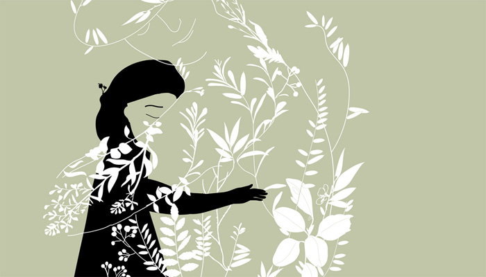
Jesús:‘El Sueño’ (The Dream), written by Antonio Ventura, tells the story of a young birch tree fascinated by the singing of a bird. It can be read as a metaphor of our desires: our dreams which sometimes look unattainable, impossible.
The illustrations for this book appeared very slowly. I worked without a definite storyboard. I wanted the artwork to guide me, accepting and incorporating what I found along the way.
The core of the story was something which was hard to represent: the singing of a bird. It was also what attracted me the most. I thought of the relationship between colour and music. I thought of the sounds’ rhythm and the rhythm of the visual composition. I thought of the musical inspiration of some painters, especially Paul Klee, who was a musician and painted music.
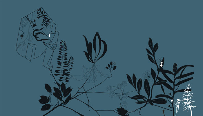
Another subject that interested me was the representation of the forest and other animals.
I drew the animals; the colour was reserved for the singing. Colour could be intense and precise, or more blurry, soft and distant.
For the forest, instead of a realistic representation of the scenes, I was looking for an environment, an atmosphere close to the text’s intimate tone. I used oil-transfer on paper, heavily diluted in oil, and a range of neutral colours: greys, ochres, earths.
In contrast, I wanted the singing to be luminous, vibrant. In the end I worked with silk paper which I coloured and cut into pieces, sometimes very small.
Along the way, I decided to change the shapes so they transformed from one page to another.
In ‘El Sueño’, there are several stories intertwined. Even if they cannot move, the two trees – one young and one old – feel, aspire. There is a relationship between the two that has a magical outcome at the end of the story.
Although this is not mentioned in the text, these trees see themselves reflected in a couple of stags, male and female, as if they were a mirror. It is in the forest, transfigured by the singing birds, where these two stags will meet. The result of this encounter is the new life with which this book comes to an end.
Every year in early spring, everyone’s hopes and dreams blossom. A young birch tree dreams of birdsong and waits for birds to land in its branches… but the birds do not venture out of the forest to the gorge where the birch lives. An old oak watches the young tree in silence, touched by its longing. The oak wants to help…
Cristina Sitja Rubio was born in Caracas and studied Fine Art in Montreal, specialising in printmaking. She later completed an MFA in colour photography, using homemade pinhole cameras. In 2007, she decided to become an illustrator, and has since created a number of successful picturebooks. Cristina lives in Berlin and Barcelona.
In this post, Cristina talks about three fantastic picturebooks: ‘Etranges Créatures’ (Strange Creatures), published by Éditions Notari – plus ‘Objets Perdus’ (Lost Property) and ‘Amis Retrouvés’ (Found Friends), published by Editions Les Fourmis Rouges.
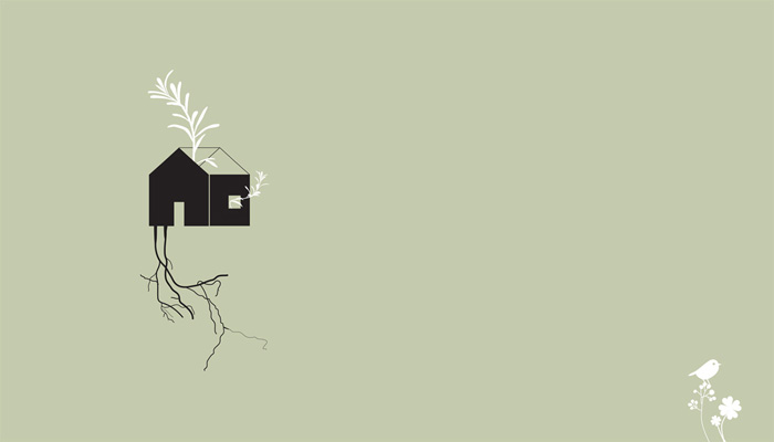
Cristina: One day in 2011, I drew a tower of garbage that was transformed into a tree for animals. This was the beginning of the idea for ‘Strange Creatures‘.
I wanted to make a children’s book that dealt with the effect human actions have on nature, but not make it sound as though I was nagging or feeling superior.
When making a book, I rarely make any sketches. I simply dive in to the original drawings right away. Sometimes I will make mini-sketches on the side of the illustration, but will not make any preliminary sketch drawings, enabling them to feel more loose.
The first idea for the book was to use pencil for the animals and collage for the surroundings.
I made four collages and then lost inspiration and left the story for about a month. I then decided to change the aesthetic of the book, and in the middle of the Berlin winter, started on new illustrations, using gouache and watercolours. The results were satisfactory and I continued making spreads for the book, with no written story – just a story in my head.
After making six or seven illustrations, I hit another roadblock and stopped. At this time a friend, Cristóbal León came to Berlin for a visit (May 2012), and when he saw that I had not finished my book, he said he would help me write the text and suggested making a storyboard. So I did. Using Chinese ink, I made very quick and small drawings.
Then we each wrote text to accompany the images and subsequently merged our texts and simplified everything. Cristóbal also helped me change a specific part of the story. In the original version, the animals break into the humans’ houses and steal their furniture. Cristóbal told me that it would be easier to just make the animals steal the houses. This is the beauty of children’s books: anything is possible.
Extra help came from other illustrator friends who had more experience illustrating children’s books. I showed them my illustrations and they gave me tips on how to improve some of them. For example, when the animals go back to their forest and find it destroyed, the original idea was illustrated with a single image. A friend gave me great advice: To create suspense, illustrate the animals looking at something, so the reader will not know what it is until they turn the page.
The illustrations were finished in two months – then the text was polished with Cristóbal, and we came up with a title. The story was originally written in Spanish and English. The title, ‘Extrañas Criaturas’ sounded good, as it did in English: ‘Strange Creatures’. As there was very little text, it was written by hand, which proved to go well with the style of the illustrations.
I had been to the Bologna Children’s Book Fair that year and met Paola from Éditions Notari on a bus. The illustrator, Ana Ventura introduced us. I gave Paola a card and she told me to send her something when I wanted.
Well, five months later I had something to send, so I sent Notari and nine other publishers a PDF with the story and the illustrations. Paola called me thirty minutes later and told me she wanted to publish the book! I was so happy, since it was my dream to be published by Éditions Notari.
The process was very quick and the book was published in May 2013. ‘Etranges Créatures’ was selected for the Pepites Awards at the Salon du Livre et de la Presse Jeunesse in Montreuil that same year. Thanks to this exposure, I was approached by other French publishers, and have since published two more titles in French with Editions Les Fourmis Rouges, ‘Objets Perdus’ and ‘Amis Retrouvés’ (I will talk about these books next), and I illustrated another book for Éditions Notari called ‘Octobre’.
After drawing so many bears and pink rabbits, I decided to send them on vacation. So I made a few illustrations with the bears and rabbits in Berlin, Caracas and in the jungle.
‘Objets Perdus / Lost Property’ & ‘Amis Retrouvés / Found Friends’
I created a character in the mid-90s named Cuchuplum. At this time, I was in art school but I had no intentions of being an illustrator. Cuchuplum was just used to illustrate cards, postcards and ceramics for family and friends.
After finishing ‘Strange Creatures’, I was eager to make another book. The characters from that book were still so present in my mind, that the first storyboard had bears and rabbits as protagonists! Then I remembered my father’s advice to make a book with Cuchuplum as a main character. I sat down and started making illustrations, and created three characters to accompany Cuchuplum. The story takes place in the Venezuelan jungle, and I drew how the characters met and what they did together. After finishing all the illustrations, I realised they needed text to make the story more comprehensible.
Since I was living in Berlin, I thought the book should be in German, and contacted a German writer to write the text. This was not very successful, so I decided to show ‘Lost Property’ to Valérie from Editions Les Fourmis Rouges during the Bologna Book Fair. There was still no text, but she liked it anyway – as well as the sequel, ‘Found Friends’, which was only a storyboard at that point. Valérie later helped me put together the text for ‘Lost Property’ and ‘Found Friends’. She wrote it in French and sent me PDFs for approval.
Another friend, Laia Jufresa, a wonderful writer, also helped me with the original text for both stories, but unfortunately this was not used. The titles for both books were Laia’s idea though, and I am very grateful that she allowed me to use them.
Another drastic change was in the covers. Valérie thought it would be best that the characters appeared on them. Here are the first and final cover illustrations for ‘Lost Property’:
And here are the first and final cover illustrations for ‘Found Friends’:
The result was two simple stories about how some friendships are formed, with a bit of adventure in the process.
After finishing the illustrations for the books, I decided to travel to Venezuela (2014–2015) and go where Coutchuplum (Cuchuplum’s name in French) and his friend Oisoletto had gone, and where the other characters, Azur and Lapinito lived. I had been to the Angel Falls a long time ago, but had never walked up to Roraima. It took me one week to go up and down and it was the most wonderful experience. I guess I did the travel research a bit too late, but oh, so worth it!
Hopefully there will be more books about these four friends’ adventures in the future. In the meantime, they will keep appearing in my ceramics, prints and drawings.
Cuchuplum and Vogelito (the Spanish name for Oisoletto) will appear this year in another book published by Camelia Ediciones in Venezuela with the title, ‘¿Qué Hacer un Domingo?’ (What to do on a Sunday?). The illustrations were made using drypoint etching and watercolour. The text, as always, came afterwards, again with a little help from Cristóbal León.
All in all, this has been a great experience so far and I hope to continue making picture books with lovely publishers.
One boring day in the woods, the animals organise a big party. But afterwards, they discover that all the trees have been cut down by some strange creatures living in a town not so far away. How can the animals fix the situation? It seems hopeless! Eventually, they realise that what’s needed here is collaboration.
A beautifully illustrated picturebook about how easy it would be to make our planet safer and happier for everybody if we all respected and took care of nature and listened to others’ needs.
Coutchuplum and Oisoletto live in the city. One day, the two friends pack their bags and fly off in a balloon to live their dream of visiting the jungle. After much exploring, Coutchuplum and Oisoletto fall asleep under a tree, and some thieving monkeys steal their stuff! The pair set off in search of their belongings, and meet Azur and Lapinito, who will become their good friends.
This richly-illustrated picturebook immerses the reader in nature, brilliantly showing the disorientation of the traveller crossing from urban life into the wild.
Azur and Lapinito live in the depths of the jungle. One day, they pack their bags and begin a long journey to visit their good friends, Coutchuplum and Oisoletto in the heart of the city… In the city, everything is amazing and they don’t even have bugs or lizards in their houses! The city also offers incredible opportunities and magical places like the movies!
In this second picturebook featuring Cristina Sitja Rubio’s four eccentric friends, we all explore the great, colourful, joyous city together.
Sooyoung Kim specialised in industrial design at college and then worked as a designer for an IT company. When she realised what she really wanted to do, she left her job and studied illustration and picturebook making under Sunkyung Cho at the Some Institute in Korea. Sooyoung is now a successful artist and illustrator.
In this post, Sooyoung talks about the creation of ‘The Hair’, a handcrafted picturebook from Sunkyung Cho’s innovative publishing house, Somebooks. This stunning debut received a Special Mention in the Opera Prima category of the 2014 BolognaRagazzi Awards.
Sooyoung: I have the habit of sensitively looking at my inner self and recording it. One day, when I took out and read all these records, there was something I discovered about myself: I repeat the same mistakes and repeatedly regret them. Although, on the outside, I had endeavoured to look like a person who was all good, I realised to my dismay that my dark side could not be hidden. I wanted to express this darkness – and the dark side of human beings – in a book.
Human beings know what it is to be good. As such, laws, moral attitudes and canons have been created. And we live our lives to these rules. I believe that, even if there were no rules with regard to human relationships and personal issues, the conscience of people is, on the whole, similar. We endeavour to behave in a way that maintains the good in our society.
I believe that although human beings make great efforts to behave well, the cause of our repeated failures lie in our instincts. There are the basic instincts of the human body like appetite and sexual desire, but we are also born with many other instincts, including the desire for possessions, the desire to rule or dominate somebody, etc. Something that is different between human beings and animals is that human beings make an effort to control or suppress individual instincts. But by making this effort, can our instincts be controlled forever?
As human beings, we must fight our overwhelming instincts until the day we die. The instincts themselves are not bad though. It is only when we lose the fight against these instincts that we see them as bad.
In the beginning, I started searching for ways to represent ‘animal instincts’ and ‘being unable to hide them’, rather than the thought of making a story. During the ceaseless process of speaking metaphorically and creating the images, I decided that the concept of ‘hair’ was the most suitable for expressing my thoughts. This is because hair grows and grows again after cutting it, and the appearance of human beings with long hair is like that of an animal.
I tried using watercolour, gouache, pencils and charcoal, but I was unable to bring the hair to life. In order to express the hair more realistically, I ended up using pens. And in order to draw the hair really well, I searched for the most suitable pens and did a lot of practice to get the right expression in the lines.
My hair was long at the time, so to understand the lines within hair even better, I cut and scanned my hair, and looked at it closely.
As hair (especially cut hair) is a collection of fine lines of which the directions and lengths are different, if things went wrong when creating the artwork, the images could become weak. In order to solve this, I worked on the overall surface area of the images to create more strength. This also had the effect of the hair looking like a relief carving.
To express people’s collective behaviour to maintain the good in society, I used the technique of stamping. I’d already used this technique when exploring concepts in the beginning, but it ended up becomming an important element in the images, which I employed in various ways.
The stamping technique was used on a selection of textured paper. The textures created by the paper and the paints created variety, reduced monotony, and made the movements of the people more lively.
The reason why the characters’ bodies were made to look the same was to portray people behaving in the same way. In contrast, the intention behind the different faces was to show that people find their own ways to hide things about themselves, much like the protagonist wants to hide his hair.
Going back to the significance of suppressing one’s instincts: the artwork intends to highlight the ‘mask’ and ‘make-up’. I also tried to give the work an overall unity, and used diverse portrayals of the characters to emphasise their individuality.
This book was first made as a graduation project at the SI Picture Book School. At the time, the content of the book was the protagonist repeating the work of cutting their hair. In that simple story structure, with regard to the portrayal of despair coming from the repetition of the actions, there was success to a certain extent. But despite the fact that hair is a part of my body, it cannot be perfectly controlled even if I use all my strength – and I realised the story needed to show the innate limitations of human beings.
In order to solve such problems and give the story a sense of completeness, the dummy book was reworked many times. Through this process, the images were created while considering in even more depth the eyes of the readers, the flow of emotions, etc. And so, my many ideas for the scenes were sketched out. However, I found that some sketches were good on their own but did not work well in the dummy book, and some sketches worked well in the dummy book but were not what I expected when I created the final versions. I felt that to work diligently and to keep moving my hands was the only way to solve the problem.
I became pregnant while making this book, which made it very difficult to work. So I am thankful that I was able to make it through that period and get the book published. This is my first book, and because its publication coincided with the birth of my child, it means a lot to me.
As this is a picturebook without any words, I hope that the reader’s inner voice will be added. Because my way of storytelling can be difficult to understand, there have been readers who have needed to look at the book several times. If by reading the book multiple times, the images are seen properly and if it becomes possible for readers to think deeply, it is a delightful thing for me as the author.
In the future, I would like to throw out more questions to people, and make books that inspire them to think.
‘Sooyoung Kim creates an intense and disturbing world in this handcrafted production… The suffering and pain of the central character in transition is described with powerful drama and intensity. A strong left to right linear dynamic heightens the sense of the character’s physical and metaphorical journey. Disturbing and enigmatic, this is a highly compelling debut.’
—The BolognaRagazzi Award Jury
Mārtiņš Zutis is an illustrator, animator, graphic designer and writer, currently studying for a Masters in Visual Communication at the Art Academy of Latvia. He’s a long-time contributor to kuš!, a comic art anthology which features artists from Latvia and beyond. Mārtiņš lives in Riga, the city where he was born and grew up.
In this post, Mārtiņš talks about the creation of his debut picturebook, ‘Nenotikušais atklājums’ (The Discovery That Never Was). This original and beautifully illustrated take on the traditional counting book is published in Latvia by Liels un mazs.
Mārtiņš:‘Nenotikušais atklājums’ (The Discovery That Never Was) is my debut as a writer, and a counting book that tells a story about an old naturalist named Karl Darwing, who finds himself on the verge of discovery on a cold winter morning.
As Karl heads back to his house after checking his post box, he finds some trails in the snow. He follows them and finds out that the number of footprints grow arithmetically. Every time additional footprints are found, Karl proposes multiple theories about who is he tracking, not knowing it is actually him who left the trails in the snow.
For example, when he finds six footprints, he assumes it could be either a giant louse with six legs, or two three-legged creatures, or three two-legged ones. Ten footprints would make him think of two starfishes, five robbers or a ten-legged alien.
In this way, I wanted to show the reader that the numbers don’t consist only of ones, but can be a result of other numbers multiplied and added. As with the unknown creatures leaving a number of trails in the snow, the only property numbers have for sure is the count, whereas the rest (their size, hairstyle, intentions, etc) can be imagined.
The time spent working on the book spanned over two years. The initial idea was submitted to the Picture Book Quadrennial in Riga, then it was developed into a dummy which was brought to the Bologna Children’s Book Fair. After this, it was completely redrawn and published in Latvian by Liels un mazs.
Although the initial drawings were rather dark and created using ink, the final version used a mix of digitally coloured ink and pencil drawings, using a limited colour palette. All the text in the book was handwritten in capital letters to make it more readable for those who are just starting to read. The book seems to be well-received by kids and parents as it encourages the former to come up with their own stories about various combinations of beings leaving trails in the snow.
Unfortunately, the book does not cover all of the natural numbers out there, identified by mathematicians. Karl Darwing has a very vivid imagination, and finding the trail of a tenth foot really scares him because it could be a ten-legged alien or bandits he’s following. Saving himself from this infinitely great danger, he runs back home.
Naturalist Karl Darwing notices the footprints of a one-legged creature in the snow. As the naturalist attempts to follow the trail and make a discovery, he is surprised to find the number of footmarks increasing.
By the time Karl’s guesses go as far as a ten-legged space alien or five bandits, he decides that the potential discovery is best given up for now. The reader can have the pleasure of getting to the bottom of things.
Mikel Casal is an artist and illustrator from the Basque Country in Northern Spain. He’s produced work for a wide range of publishing and editorial clients around the world, including The Guardian (UK), Tatler (Hong Kong), Courrier International (France), El Comercio (Peru), The Boston Globe (USA) and Media Vaca (Spain).
In this post, Mikel talks about ‘Así es la dictadura’ (So this is a dictatorship), one of four books originally published in the 1970s and republished by Media Vaca in 2015 with new illustrations. This brilliant series won the 2016 Bologna Ragazzi Non-Fiction Award.
Mikel: I’m from San Sebastián, a coastal city in the Basque Country in Northern Spain. My illustrations appear in various newspapers, magazines, and books from around the world. I have also received some awards, like watching the sun rise as I try to surf a good wave.
I was ten when the dictator Francisco Franco died. I was old enough to be aware of the pain and the years of repression suffered by an entire country. Especially when you see that pain and repression reflected in your family and in the place where you were born.
‘Así es la dictadura’ (So this is a dictatorship) is one of four books that were originally published between 1977 and 1978 by the publishing house, La Gaya Ciencia from Barcelona, under the generic title, ‘Libros para mañana’ (Books for tomorrow). Media Vaca’s publishers thought that despite it being almost forty years since those first editions, the text was still current, sadly. So they decided to republish them with new illustrations.
For me, as an illustrator and as a parent, the proposal could not have been more interesting: to collaborate on a book about politics for children, for the critical and reflective education of a child, maybe a ten-year-old boy as I was when the dictator Franco died – and in these times where there is little reflection and political criticism.
Dictators are vicious and terrible, but also a little ridiculous and megalomaniacal. With their medals, uniforms, and bombastic, exaggerated and theatrical gestures. They do look rather comical sometimes.
When searching for the right tone for the book, I couldn’t help being inspired by the Ernst Lubitsch film, ‘To Be or Not to Be’, and Chaplin’s ‘The Great Dictator’.
I never considered a serious and harsh look for the illustrations, despite the seriousness and harshness of the subject matter. I wanted to emphasise the almost theatrical, tragicomic aesthetics of every dictatorship, full of ridiculous lies.
An interesting part of the process was coming up with the endpapers for the book. At the very beginning, Vicente Ferrer from Media Vaca suggested the idea of drawing caricatures of dictators throughout history. Unfortunately, there were so many I could have drawn! So we made the decision to feature the most emblematic ones, and also make sure they were contemporaries. We also wanted there to be a balanced representation of countries and continents. And finally, we couldn’t focus on dictators of a specific ideology, so we included both right-wing and left-wing dictators. With these premises we made a list, and – after discarding some and adding others – we arranged them by date of birth on the front endpapers and by date of death on the back endpapers. Some of them are still alive…
I would like to finish by repeating some words I heard from my publishers: “Children are interested in everything adults are interested in. You must explain things to them, even if it requires effort.”
If we lived in a dictatorship, a book like this wouldn’t be possible. But we mustn’t be too complacent. Today, dictatorship still continues to be the existing form of government in many countries, while others who claim that they’re democratic, unashamedly repeat many of the characteristics of totalitarian governments: There’s a high level of corruption, they fail to respect human rights, laws are made behind citizens’ backs, and those who govern never provide sufficient explanations.
Hanane Kai is a Lebanese illustrator and graphic designer who studied at Notre Dame University—Louaize near Beirut. She was shortlisted for the Etisalat Arabic Children’s Book Award and the Mahmoud Kahil Award, before winning the 2016 Bologna Ragazzi Award in the ‘New Horizons’ category.
In this post, Hanane talks about her approach to illustrating the highly-inventive ‘Lisanak Hisanak’ (Tongue Twisters). This Bologna Ragazzi Award-winning picturebook was written by Fatima Sharafeddine and published in the United Arab Emirates by Kalimat.
Hanane: One calm Sunday, I got an email from Kalimat Publishing. The email read: ‘Would you like to illustrate this tongue twister book (text attached)?—Diana’
I had to research what ‘tongue twister’ meant. Then I read the text and I felt a beautiful contained excitement… It’s a challenging project! I love design challenges. For me, this is where really good work can be done.
‘How much wood could a woodchuck chuck if a woodchuck could chuck wood?’ Imagine you had to create a visual for this tongue twister. Would you illustrate a woodchuck ‘chucking’ wood?
This is what the tongue twister talks about, but not what the tongue twister and all tongue twisters are actually about. Tongue twisters are about the amusing confusion that happens verbally when read out loud. And it was very clear to me that this was exactly the concept that I wanted to give a visual form to.
What actually makes tongue twisters confusing is the repetition of one or a couple of letters in one sentence. This repetition is as much verbal as it is visual, which is how I immediately got the vision of the book: I decided to use modular Arabic letters to create illustrations that would take readers to a world that is as confusing and fun as the verbal one.
I imagined the letters of each tongue twister tangled together. But I also didn’t want the illustrations to be just an abstract composition. So I made each illustration hint at the meaning of each tongue twister without it being too literal or obvious. It’s a puzzle, and needs to require some effort for readers to figure it out. For example, if a tongue twister is about carrots, you’d see a rabbit instead. The illustrations also hide the words of each tongue twister in them.
Now I had the vision, it was time to create the illustrations for each tongue twister. Some of them were instinctive. Like this one that says: ‘Rudi turns and gets dizzy’. The first part of this tongue twister transliterates to: ‘Rudi idur’.
If you reverse the word R-U-D-I you get I-D-U-R (which means turns). By flipping the word ‘Rudi’ upside down and positioning it above the word ‘idur’, I got a beautiful shape and I made readers have to turn the book upside down to be able to decipher the illustration, and get dizzy with all the turning.
Another example is this tongue twister: ‘The words of Kamal continue the words of Malak’.
By repeating the tongue twister without any space between the words, and by randomly colouring the letters, I created this simple visual that readers have to decipher. The riddle is to know where the sentence starts from and where it ends. This is a visual play on the meaning of the tongue twister: the words of Kamal and Malak continue each other.
Many tongue twisters were instinctive like Rudi’s and Kamal’s. Others needed more brain-picking. And by trying to create something puzzling, I got myself puzzled more times than I can count.
Diana, art director at Kalimat Publishing, told me one day: ‘Between Rudi turning, and Khaled moving to and fro, Diana is getting really dizzy!’
To further reinforce the repeating aspect of tongue twisters, when multiple books are displayed side by side, the front cover illustrations continue seamlessly across the books. Same for the back cover.
One of the most challenging of all tongue twisters was: ‘Aata and Aatwa in Tanta’. Aata and Aatwa being names of people, and Tanta being a city in Egypt. Try and create a meaningful visual for a sentence about two people in Tanta… Except that Tanta isn’t any city; it’s one of the most populated cities in Egypt. I had heard about Tanta before, but I needed to know more about this city. After some research, I discovered that most people visit Tanta to go the famous Mosque, Sayid Ahmed el Badawi, during the Moulid festival in October. This created context and content for the illustration.
Can you solve the riddle of this tongue twister? ‘Silk thread on my aunt’s wall’.
What about this one? ‘The figs of our garden are from the figs of our neighbour’s garden, and the figs of our neighbour’s garden are from the figs of our garden’.
The process of the book was mesmerising to me – from creating the concepts of the visuals, to the hand-colouring. The hand-colouring involved applying each colour on its own. Some of the illustrations would be so nice to look at when only one or two colours had been applied. I would get these beautiful unexpected shapes that no-one would have actually designed as a final outcome, and yet they formed surprisingly interesting compositions.
Last year (2015), I was selected to participate in the ‘Etisalat Award for Children’s Books’ workshop. The workshop offered me a trip to attend the Bologna Book Fair. I was overwhelmed by the amount of talent in the illustrator’s exhibition, and that was when I decided that my work was going to be hung on this wall some day. Fast-forward a few months: ‘Lisanak Hisanak’ wins the 2016 Bologna Ragazzi Award in the ‘New Horizons’ category.
Although this is my fourth book, I can’t help but feel that this achievement marks the beginning of a life-long journey dedicated to creating books that open up readers’ imaginations and make them think.
‘The inventive modular composition of this vibrant book combines a repeated series of simple geometrical shapes in primary colours… Cleverly crafted juxtaposition of the images hides the words, which if pronounced wrongly, lead to an amusing jumble of the patterns.’ —The Bologna Ragazzi Award Jury
Germano Zullo studied economics and management before becoming a prolific author. Albertine’s illustration career began after graduating from art school in Geneva. The couple marrried in 1996 and have since collaborated on many books and won awards such as a Biennial of Illustration Bratislava Golden Apple and a Bologna Ragazzi Award.
In this post, Germano and Albertine talk about their profound and beautifully illustrated picturebook, ‘Mon tout petit’ (My little one), which is published by Éditions La Joie de lire, and won the 2016 Bologna Ragazzi Award in the ‘Fiction’ category.
Germano: Ever since Albertine and I first met in 1992, we have always strived to establish a dialogue. A dialogue may appear to many as obvious. But it is not. Most of the time, people do not have a dialogue; they have a monologue. One of the hardest things in the world is to know how to listen to each other. Knowing how to listen to each other is difficult because it involves the notion of self-criticism. But we need to face the facts: once our ego is put in its place, the possibilities of existence are much more interesting and rich. It is therefore out of the question for us, in any of our collaborations, that the muses of one of us interfere with the muses of the other. A book is always, first and foremost, the fruit of a dialogue between text and image.
The idea behind ‘Mon tout petit’ (My little one) comes from a feeling I have about my father. As he grows older, his mind seems to infiltrate my body. It is not uncommon in Southern Italy that men keep their inner selves a secret; their past is often vague, improbable and mysterious. Little is told or explained to the next generation. Questions do not find answers, and what needs to be told is left unsaid. The family puzzle is vast and the visible pieces are far too rare.
Despite this fact and simply by permeation, transmission does take place, identities are built and new pieces of the puzzle are generated, quite similar in appearance to the previous ones and left to the passing of time. Whatever our singularity, we carry within us our fathers and thus a great part of the universal narrative.
Albertine: The visual of the book had to evoke this dance of life, from birth to death, while illustrating that wonderful feeling of love. It also had to show empathy and reflect this back to the reader. The simplest things are often the most difficult to achieve and I searched a long time for the right means of expression.
Various techniques were explored: Indian ink, gouache, coloured pencils… Ultimately, the lead pencil emerged as the best means to evoke sensuality in black and white. It evokes a certain amount of spontaneity, just like sketches which blend lightness, fragility and melancholy. One can also find in it the spirit of a previous book of mine, ‘Bimbi’, published by La Joie de lire, which deals with childhood.
The other challenge was to build the choreography of this dance. The movement needed to be continuous, like an animated film or a flick book, and a balance between the proportions of the character growing up and the other growing smaller as the story unfolds would somehow mark as a metronome for the rhythm of the sequence. The lightbox proved essential for this operation.
To serve the narrative and to emphasise the universality of the story, simplicity quickly appeared obvious. The mother holds a monologue in which she expresses her love for her son. She wants to tell him everything, teach him everything. But although this impulse is irresistible, the amount of energy and time required to transmit all this knowledge is insufficient. The mother disappears and only her intentions seem to have been bequeathed to her son. The latter, when he becomes a man, appears nevertheless to have acquired an immense knowledge. He displays a wise maturity which he is ready, in turn, to pass on.
Finally, ‘Mon tout petit’ is the result of two other books dealing with transmission: ‘Les Oiseaux’ (The Birds) and ‘Ligne 135’ (Line 135).
The three books can be read as a trilogy on a theme which we have not yet finished exploring. It is essential for us to continue, as much for its beauty as for its mystery.
‘This is a book about love, the passing of time, and the cycle of our lives. It is also about relationships. Slowly, page after page, the sparse black pencil illustrations on milky white paper tell a restrained, eloquently poetic universal story.’ —The Bologna Ragazzi Award Jury
Johanna Benz studied book-art and illustration at the Academy of Visual Arts in Leipzig. She illustrates for several magazines and publishers, and does live drawings and performances at events and festivals. Johanna’s awards include a Hans-Meid Förderpreis, an Ilustrarte Grand Prix and a Bologna Ragazzi Opera Prima.
In this post, Johanna talks about the creation of her bold and energetic debut picturebook, ‘Pacho Rada, la légende!’, which is published in France by Éditions Magnani, and won the 2016 Bologna Ragazzi Award in the ‘Opera Prima’ category.
Johanna:“I’ve never wanted it, but without my accordion I’m nothing.” “No music, no money, no women.”
—Pacho Rada. The Legend.
The true story of Pacho Rada is also the history of the accordion, connecting Germany and Colombia through music. Through large and colourful picture and text panels, my book tells the legendary story of the Colombian musician who found an accordion and conquered the hearts of Colombians with his music.
I heard this great legend of how the accordion made its way to Colombia in the first place, in 2012. For well over a hundred years, Germany has manufactured many accordions for Argentinians who are crazy about Tango.
However, one shipment of accordions never reached Argentina, but instead got stranded on the coast of Colombia after a devastating maritime disaster in the Atlantic Ocean.
With the help of the devil, Pacho Rada found the instrument on the beach and began playing like no-one else had ever played the accordion before. Fortunately, there were no textbooks, no manuals and no strict accordion teachers in Colombia, so Pacho Rada was able to play in his own way from the very beginning.
He became a famous man and played in festivals, weddings and funerals. In doing so, he met many women, Death, and the mayor.
This adventurous life inspired me to create a series of wild pictures. I searched for his life story, and on the internet I found his own texts about love, as well as 1000 additional anecdotes and truths that other people are currently telling about his life.
I listened to his music while I was drawing, until I couldn’t stand hearing it any longer, and I wrote down my own version of his story. The biggest challenge was the connection between the text and the pictures. I drew the text on large sheets which I placed between the pages of pictures, just like I had seen in silent films with Buster Keaton or Murnau. These pages of text appeared very relaxing. They connected the very different drawings in an uncomplicated way into a choreography. On a grey day, one can simply look at the colours in the book.
I can sit at my desk for an entire day when it comes to book-making. I am inspired by curiosity, superficial knowledge and tall tales.
I have never been to Colombia and had never seen the Atlantic Ocean when the book was finished. Fortunately, Bernardo Carvalho, a Portuguese illustrator from Lisbon whom I like very much, took me with friends in the boot of his car to the Atlantic Ocean. It was my first encounter with this ocean. The Atlantic is beautiful and dangerous.
Pacho Rada was self-published in 2013 in Germany at the Academy of Visual Arts in Leipzig as a small but elaborately made book with a screen printed linen binding. Then, at the book fair in Paris, Montreuil, I met Julien Magnani, the publisher from Éditions Magnani, and we decided to publish the book in French.
The collaboration with Julien and the translator was fantastic, and I redrew all the text – in other words, half of the book – in the French language. We presented the book for the first time in Paris in March 2015 and were overjoyed to travel with Pacho Rada and his accordion to Bologna this year. Hasta Luego! Ciau! Ahoi!
‘The sweeping flourish of the illustrations lends a mischievous irreverence to this book that speaks directly to the reader. The decisive use of colour here takes on symbolic significance. Empty spaces and apparently unfinished, floating lines are all carefully crafted. This is a book that combines graphic art and illustration to perfection.’
—The Bologna Ragazzi Award Jury
Katsumi Komagata was born in 1953 in Shizuoka, and studied Graphic Design at Nippon Design Centre. He founded One Stroke in 1986, which began as a graphic design studio and later expanded into children’s book publishing after the birth of his daughter. Katsumi is now world-renowned for his exquisitely crafted books.
In this post, Katsumi talks about his beautiful new picturebook about colour, ‘When the Sun Rises’, which is published by One Stroke, and for which Katsumi was awarded a Special Mention for Lifetime Achievement in the 2016 Bologna Ragazzi Awards.
Katsumi: I would like to tell you about the process of creating a book called ‘When the Sun Rises’. It was published last November.
The original purpose of the project, which I started last summer, was to create a picture book for children with impaired colour vision. I wanted to do this so children and their parents could discover and work through certain problems through the book.
At the age of ten, my teacher thought it was likely that I had abnormal colour vision because I had painted a white school building garish pink. So I had to take a colour vision test. The results indicated that I was normal, but from then on I developed a complex related to colour. I believe that even the fact that I chose the profession of a designer was because I was so determined to get over this complex.
Nowadays, no colour vision tests are conducted at elementary schools. But abnormalities are still found and can lead to children being treated ‘differently’. Symptoms of this colour abnormality manifest themselves in 5% of males. In the future, when they become adults, this problem could well lead to discrimination in the workplace.
I have been involved in other projects for blind children and have created a number of books, such as ‘Plis et plans’ and ‘Leaves’.
I did job after job, and I wanted to be able to do the colour vision project as well. However, while I was manipulating a great many circles with differing colours on the computer, I came under a lot of stress. My vision became blurry and I developed astigmatism. For that reason, I decided to take a break and abandon the project for some time. But I still wanted to produce a book about colours, so rather than making a book relying on an intricate colour makeup, what I had in mind was a book that would be very simple, using vivid colours: a book that would be splashed with the colour itself. ‘When the Sun Rises’ is this book.
At the trial stage, I produced the book at a small size and then tried to enlarge it to 25cm x 36cm. As was to be expected, just enlarging it caused problems with the volume of white and the colour makeup. It became necessary to make adjustments because of this.
When we sent the book to the printers, besides checking the colours on the proof, we scrupulously verified the colours by joint inspection during the printing process. As a result, almost all of the colours had to be printed using special inks.
Although there were a lot of twists and turns, the finished book went as far as to receive a Special Mention in the 2016 Bologna Ragazzi Awards. This was hugely encouraging. The next thing I want to do is complete my stalled ‘Colour Vision Picture Book’ project.
‘Once again the masterful Komagata demonstrates that unstinting application and perseverance are the path to exquisite, aesthetically stunning achievements. Iconic forms, negative spaces, pointed detail and a lightness of touch are the ingredients that give this volume its universal poetic. The images remain impressed in the folds of memory like a sunset seen for the first time.’
—The Bologna Ragazzi Award Jury
Ethan and Vita Murrow work collaboratively on a variety of artistic projects including writing, video, film, drawing and photography. In addition, Ethan exhibits his drawings, paintings and sculptures internationally, and Vita is the director of a literacy project in Massachusetts. They live in Boston with their two children.
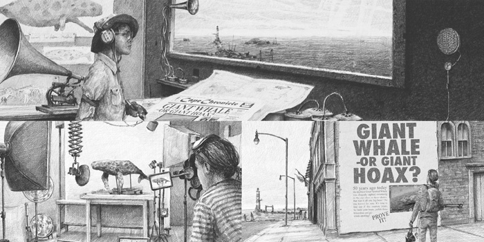
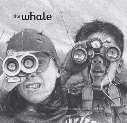
In this post, Ethan and Vita talk about the creation of their debut picturebook, ‘The Whale’. This epic, wordless adventure is published in the United Kindom by Big Picture Press (Templar) and in the United States by Candlewick Press.
Ethan: We started working together over ten years ago in a small holiday cottage in western Ireland where we first met. It was there around our kitchen table that we began writing stories, collaborating on drawing and generally making things up.
In the years that followed, we continued to step in and out of one another’s work as artists. Vita as a video artist and me as an artist working across drawing, painting and sculpture.
Vita: In 2007, we made a short film in the desert outside of Los Angeles – working in collaboration with Harvest Films of Santa Monica. The story followed a community mining for dust, ostensibly the last valuable resource on earth.
‘Dust’ was a massive effort, involving hundreds of creative minds and generous souls working together to tell a story about environmental concern and the ingenuity and absurdity of humans. This project brought together two of our favourite things: crafting tales about people who go above and beyond, and collaborating with other creative professionals. The latter often requires the former and we love how much we thrive in a group and learn from a team.
When Rachel Williams, our first editor at Big Picture Press, encouraged us to consider a kids’ book, we knew we wanted to go about it in the same way as our prior work, and we approached the book as if it was a film project. We are indebted to Rachel’s support of our method and ideas. Her advice, along with Mike Jolley, who was the Art Director for the book, had a huge impact on the story. Our goal all along was to tell a wordless or semi-wordless story about kid inventors and, ultimately, friends.
Ethan: We drew upon a narrative we had explored in earlier work: a hoax concerning a whale. After a few false starts, we built a treatment (or synopsis) for a story about two kids who were shipwrecked and trying to reach one another. We built a dummy for this story, constructed props, organised wardrobe, then hired two young actors and professional photographers to act out and capture the narrative.
After reviewing the images with Big Picture Press, we realised that the story was missing something. We reshuffled the narrative entirely and conceived a tale about two kids who began as competitors but ended as friends. Our actors, Brandon and Alexandra, came back into the studio and we shot new imagery with our photographers. As you’ll see in the mockups we built after the shoots, the landscape and settings were added later, so our actors functioned like they were in front of a green screen as we said things like, “pretend like there’s a whale jumping over your head”. It takes a real professional to make that kind of thing feel real, and these two young talents were extraordinary, bringing real vitality and subtlety to the project.
Our next step was to create collages for each page by combining our recorded imagery with found photographs, paintings, film stills and more. This was an exciting part of the process: a time to sort, plan and debate every little thing in the images, from point of view, tone, gesture, composition and pace (to name a few).
Vita: Through all of these stages, we work as partners, co-creators, directors, editors and critics. After some healthy culling and reformatting, our roles switch. The drawing starts, and here, Ethan becomes the illustrator and I become the critic and producer. Again, the best corollary is a film set, with a producer monitoring the whole project while a director or cinematographer collects the imagery. As drawings were built, we would view them as a team and discuss strengths, weaknesses and changes.
We are both artists, and after many years of working together, we bitch and moan, exclaim, question and praise with real honesty, directness and humour. These moments, in the end, are a big reason we make the work. As a team, we discover much about our own abilities and limitations, and it is always exciting to see how different attributes combine to form a whole. It is this spirit that we imbue in our characters, our work and our story. We hope readers find in ‘The Whale’: play, creativity, drama, inspiration, friendships and art.
There is a legend that a Great Spotted Whale lives in the ocean, although a sighting fifty years ago was never corroborated. Now, two young whale watchers each set out to find the whale. When their boats collide, they pool their resources to capture proof that the mythical whale exists. This wordless adventure conveys the drama and haunting beauty of the ocean and captures the majesty of the awe-inspiring whale.
Joel Stewart is an award-winning writer and illustrator who has illustrated books by contemporary authors such as Julia Donaldson and Michael Rosen, as well as classic texts by authors such as Hans Christian Andersen and Lewis Carroll. Joel is the creator/director of the hit children’s animation series, The Adventures of Abney & Teal.
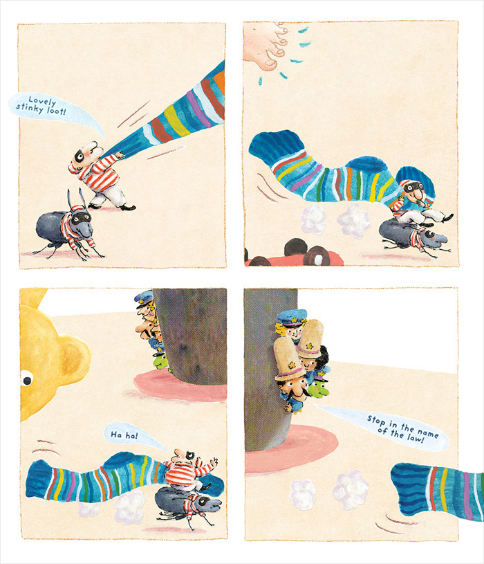
In this post, Joel talks about the creation of his latest picturebook, ‘Tiny Cops and Robbers’, and he shares some fantastic illustrations and work in progress. This brilliantly anarchic tale is published by Oxford University Press in the United Kingdom.
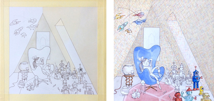
Joel: Hi there. ‘Tiny Cops and Robbers’, the picture book that I’ll mainly talk about here, is my fifth outing (I think) in picture books as both author and illustrator.
I’ve illustrated many others, written a couple of chapter books, and I co-wrote the 52 episodes of my animation series, The Adventures of Abney & Teal.
Here are some of the very earliest sketches I did for Abney & Teal. The show was a huge project, and drew heavily on all sorts of things from my childhood.
After the years spent making the show (which is really another story and which you can read about in the blog that I wrote for the BBC), I was pretty much burned out for a while. Though I never stopped drawing, making new books felt like a huge challenge. I can certainly get as frustrated as anyone both with writing and with drawing, and I can definitely go round in circles when it’s up to me to do both!
Usually, as in the case of both Abney & Teal and ‘Tiny Cops and Robbers’, I’ll begin with drawing. Playing both with the form and the content the way you can with a pencil is the closest thing I have to a sure-fire method for coming up with ideas.
With ‘Tiny Cops and Robbers’, I think that I drew a little robber character first. He seemed to be riding on something. I added a beetle underneath and there was the idea: a tiny robber! And of course, where there’s tiny robbers there must be tiny cops…
Then came a million different versions of the story, and all sorts of suggestions of the kind of thing it could be. To me, the fun was there in the initial idea, and I was interested in using archetypal characters almost like in a silent film (I suppose that kind of action often appeals to illustrators since it is such pure visual storytelling).
It’s actually too depressing to recount here all the different iterations of the story (long, short, rhyming, past, present etc, etc). The happiest of these ideas though was one suggested to me by my better half, who works as an editor of picture books (though not officially on this one!). This was the idea that the narrator could be the teddy bear who, in an earlier draft, was already being subjected to the indignity of being stolen, but who wasn’t telling the story.
I found this funny and it also gave a new level of emotional investment to what was otherwise just a caper. I’m glad that it allowed the rest to remain a simple story, set in a world with its own rules and action that appears to roll around night after night.
With the artwork, I had to piece some things together, partly because the story kept changing and partly because I‘d done a lot of line drawings on the computer that I liked but wanted to colour with real paint. So a lot of the black line drawings were drawn digitally and then printed (with pigment inks) onto watercolour paper for painting. The rest was painted separately with watercolour and gouache all in an effort to keep things lively and free. Then I scanned the various pieces and put them together in the computer. That balance of control and liveliness is what I’m always chasing. I pretty much got there in the end, though I’m sure there’s an easier way!
Before this book, I’d just had some experience doing a couple of things completely digitally, with brushes in Photoshop. Some of the simpler things turned out ok, but I was ultimately frustrated with the mark-making and energy of the drawing, and with working at a very different resolution to the finished printed image – which I blame for some rather odd compositions.
So for ‘Tiny Cops and Robbers’, I returned to making much more of the work on paper, and I was more satisfied with the images. (Incidentally, I try to avoid using the phrase ‘by hand’ when referring to work that isn’t done on the computer as I don’t do the digital work with my teeth!) As mentioned, working in bits was somewhat frustrating and long-winded in itself however.
Currently, I am working on various picture book ideas and black and white drawings for older fiction. One picture book that is quite far along is a sort of sequel to ‘Tiny Cops and Robbers’.
Since I finished Tiny Cops, I have been drawing a lot with an iPad Pro and an Apple Pencil. The software is in its infancy (I’m using two main programmes currently: ProCreate and Paintstorm Studio), but the feel has much more of the subtlety of working on paper, with the immediacy and control of working digitally. We’ll see what happens (hopefully there won’t be too many more hours just spent editing brushes!). I drew the line work this way for some illustrations for a new book by ‘Paddington’ author, Michael Bond. Again, I printed the line with pigment ink and added watercolour and chinagraph pencil.
I’m excited because I’ve just recently succeeded in making some art-quality, archival, pigment ink prints in colour onto paper that also works with paint and pencils, allowing me to get some finishing touches of real paint and pencils onto work that takes full advantage of the digital side.
Wanted – the tiny robbers are on the loose! They are a mischievous lot, always looking for something they can take, especially if it’s mummy’s glasses, daddy’s socks, or even grandpa’s wig!
But don’t worry, here come the tiny cops! They’ve polished their boots, shined their badges, and now they’re ready for action! Which is a good thing, because the tiny robbers are after something really BIG this time!
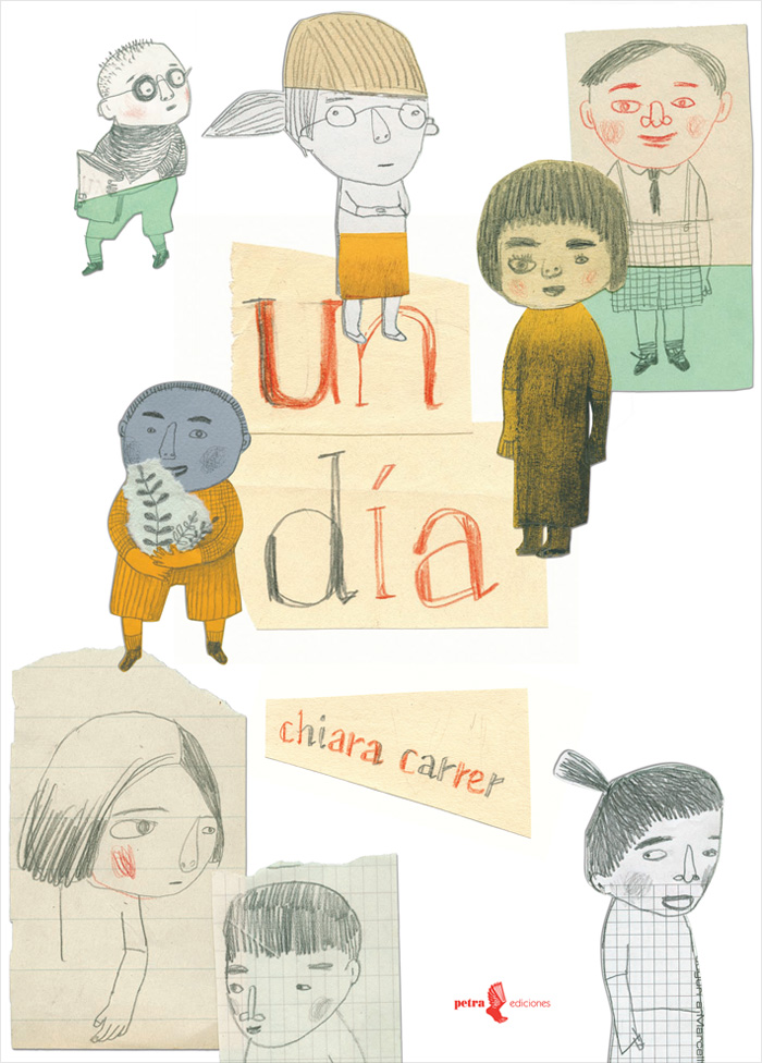
Chiara Carrer graduated from the Academy of Fine Arts in Rome. Since 1990, she’s worked on over a hundred books and has received many accolades, such as a Biennial of Illustration Bratislava Golden Apple, plus Special Mentions in the Bologna Ragazzi Awards and ILUSTRARTE: the Biennial of Children’s Book Illustration.
In this post, Chiara talks about the creation of ‘Un dia’ (One day). This beautiful picturebook was first published in Mexico by Petra Ediciones, and it received a Special Mention in the New Horizons category of the 2011 Bologna Ragazzi Awards.
Chiara: A voice tells of its sadness and loneliness, but gradually we are aware of lots more voices and movement. Different people arrive in no particular order to tell their stories.
It is only at the end that we realise the narrative voice is that of a home which welcomes unexpected guests.
The project grew slowly in the form of a list, with no real story. In the beginning, I had the descriptions and feelings of the boys and girls, each drawn using different techniques and tools. Then I realised that to combine these figures and give them more of a narrative, I needed a place to bring them together.
An abandoned house which could express its feelings was the ideal place to bring together the characters I had imagined.
Each character brings a memory, a way of life, and a viewpoint. They are silent fragments: hints that invite us to imagine their lives. They are emotional presences that come and go. Maybe some will stay, others will leave again; we do not know if they will meet or if their lives will change; they are just the opening words of a life.
The techniques used – the collages, cards and symbols – are all the result of material produced and accumulated over time, adapted to the various needs of the project.
A mixed-up technique in which pencils, graphite and acrylic are used alternately, and complement each other to create rhythm, harmony and beauty.
It could happen that one day, only one word can describe us, that one image reflects our emotions when a character tells us their story. The journey through the space of each one of these stories told from different perspectives can wander in space, trying to find us.
One day, Isabel, Omar, Lola, and the others arrive, all eager to tell you their story.
‘Un día‘ received a Special Mention in the New Horizons category of the 2011 Bologna Ragazzi Awards.
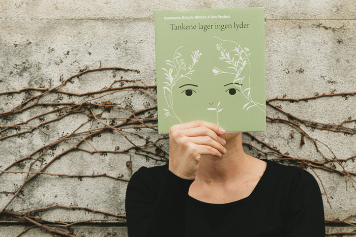
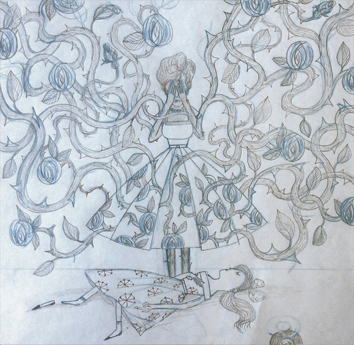
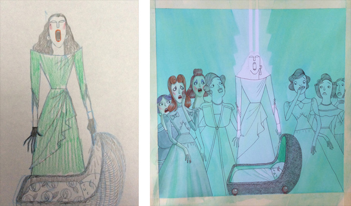
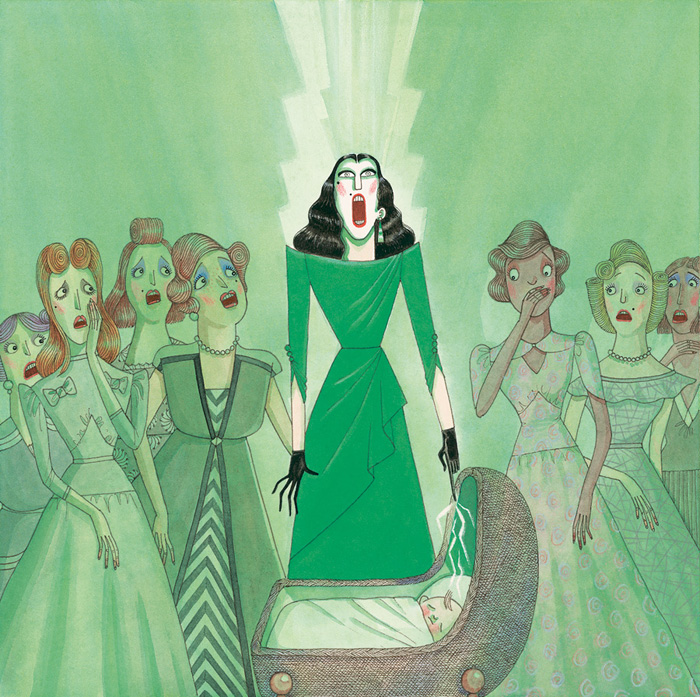
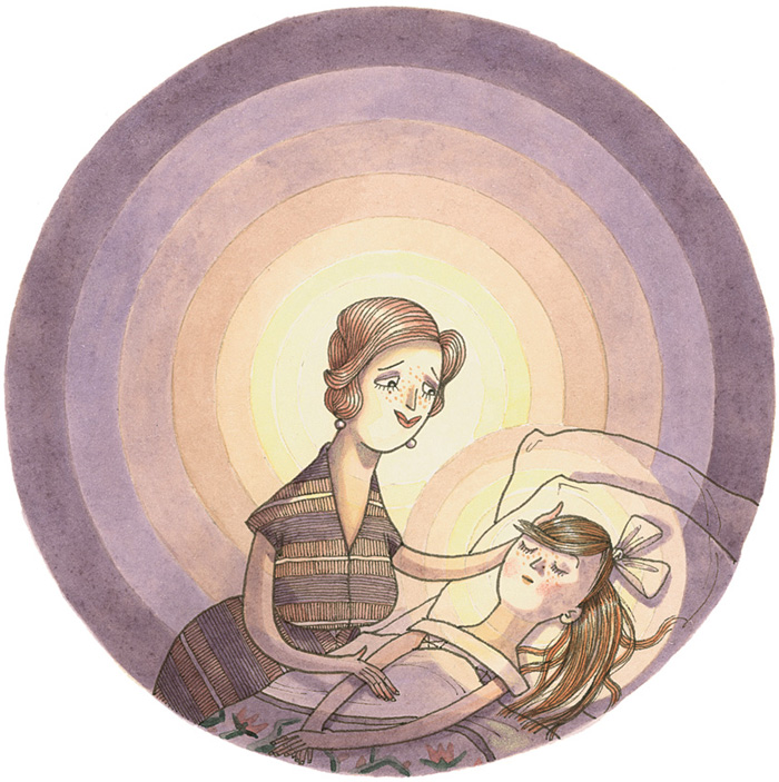
Constance Ørbeck-Nilssen is a Norwegian children’s book author who studied journalism, pedagogy, literature and art history, and worked as a journalist and teacher. Ana Ventura is a Portuguese illustrator and artist who studied printmaking, illustration and painting, and now illustrates for books, clothing, and many other things.
In this post, Constance and Ana talk about their collaboration on ‘Tankene lager ingen lyder’ (Thoughts make no noise). This poetic and beautifully illustrated picturebook is intended for older children and adults who work with children. It’s published by Magikon Forlag.
Constance:‘Thoughts make no noise’ represents a deep and important cooperation between myself and the illustrator, Ana Ventura. Together, we invite people representing all aspects of life to join us on a journey through a little girl’s eyes, hereby highlighting a problem that touches us all. Thanks to Ana’s vulnerable and symbolic approach, her poetic illustrations manage to capture the story of the little girl, Shi, and make her story larger than life.
Through every illustration, Ana communicates a story about a girl who becomes separated from the safe and predictable family life with her mum and dad. The illustrations change expression when Shi’s father dies, showing a journey of contrasts: from light to dark, from strength to weakness and from nearness to distance, all describing the strong influence of her father’s death on her life.
But through every image there is always a drift of light and hope. Life is a process, an eternal nature that never takes shortcuts. If you stick to your path, you will find your way.
The challenges make Shi forget her age and position, and she becomes the ‘adult’ who helps her mother. She comforts and supports her beyond what is expected of a girl at her age. One day, Shi’s mother disappears. Shi is left alone and has to move to another family. This event alters the direction of her life radically.
Thank you, Ana, for bringing my story to life.
Ana: Having the chance to illustrate the words of Constance was a pure delight.
The story is very beautiful and full of sad poetry. Svein, the publisher at Magikon Forlag, thought that my illustrations could bring some light to the book, and so, with commitment and satisfaction, I accepted his invitation.
My main concern was how to illustrate the feelings of the story’s characters in order to show what Shi felt at all the different moments throughout the story. The text is so beautiful that it made me want to illustrate more and more pages. One of the main sources of inspiration I use are pictures of plants and roots, either taken by me outside with my camera or from Tumblr. Browsing my Tumblr account, you’ll get a glimpse of how the process was initiated.
In the following illustration, we can see Shi’s mother’s hair. Shi combed it, treated her lovingly, but it was hard work, complicated and delicate. A lonely place where the unfolding plot was always disastrous.
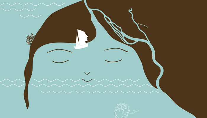
The next picture illustrates the peace and tranquility that Shi feels while thinking about her father. Shi has few memories of him, but the hat he wore is one of the strongest and most present memories in her mind. A hat/nest that welcomes and protects her.
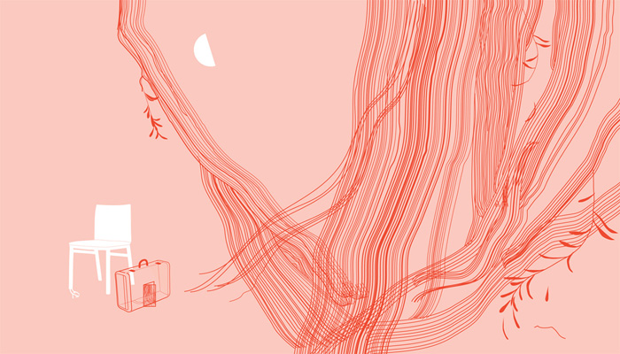
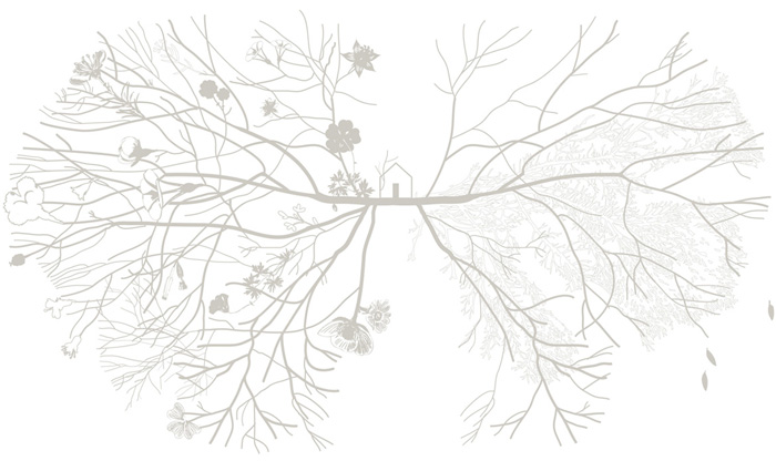
Two worlds in one life, in one home. Two separate times… two hemispheres.
This picture – with trees, branches and a house – is like a brain with two hemispheres. The left side corresponds to the past: flowery and happy. The right hemisphere belongs to the future: wintry, sad, and collapsing. Shi lives in-between these two worlds. Between the strong and heavy presence of her mother and the ethereal and light presence of her father.
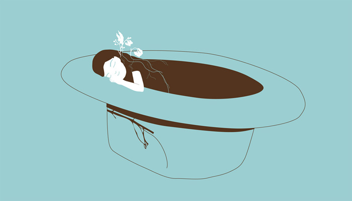
The space where Shi can still see and feel her father is in her garage, in the car…
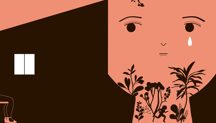
Once again, I wanted to illustrate her deep feelings more than the place itself. I recalled the feeling we get when we walk into a garden or a forest: The intense smell of the plants, earth, dust, or when you stick your nose into a flower and you are overwhelmed by the soft smell. I personified the father in a scent that emanates his image and surrounds his daughter.
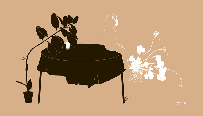
The decline and depression of Shi’s mother:
I built the image of Shi’s mother from two images donated by Paula Valentim.
The memory of Shi’s father: The comb lines continue as hairs that form the silhouette of the father; it’s not a very defined silhouette, but it’s present.
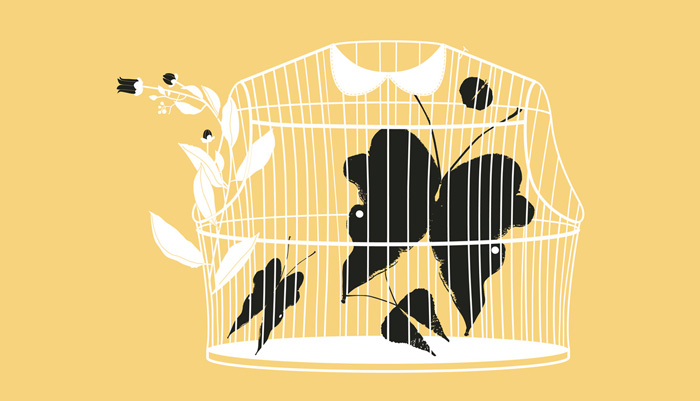
A cage with butterflies, inside Shi’s chest:
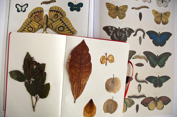
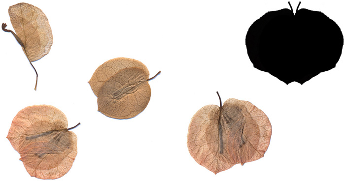
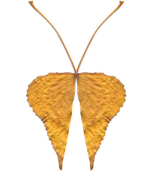
This is how I draw butterflies – from my herbarium collection:
The girl as a forlorn house:
A happy ending for the story: A new house and a new family where Shi will plant roots and have a better life.
The invisible children. The voices we don’t hear. The eyes we don’t see. Those who take up no space. Those who need only a desk, a chair, a pencil, an eraser and a sheet of paper. And when the school day is over, they take their bags and leave quietly, through the corridors and back home.
Why are these children so difficult to see? Maybe because thoughts make no noise.
David Roberts studied fashion design in Manchester before moving to Hong Kong to work as a milliner and fashion illustrator. Since returning to the UK, he’s become a hugely successful children’s book illustrator. Lynn Roberts-Maloney is a children’s literature specialist and writer who has worked with her brother David on four fairy tale books.
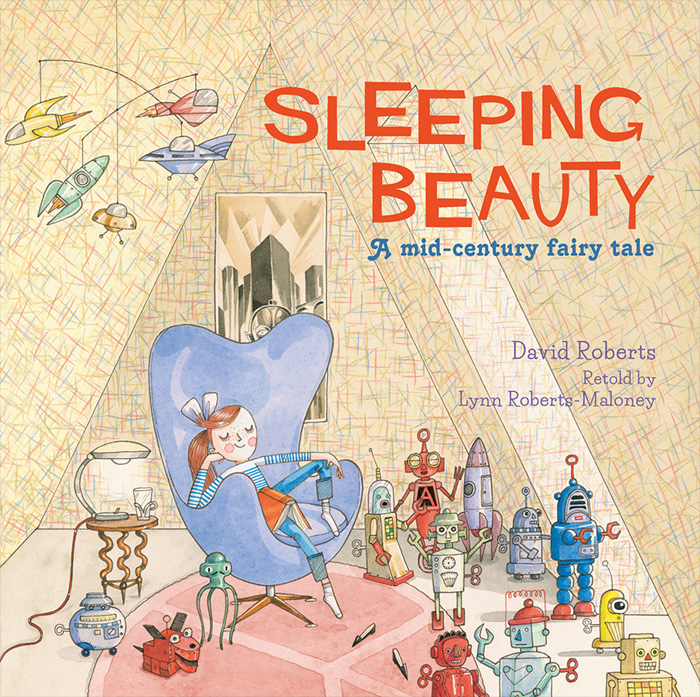
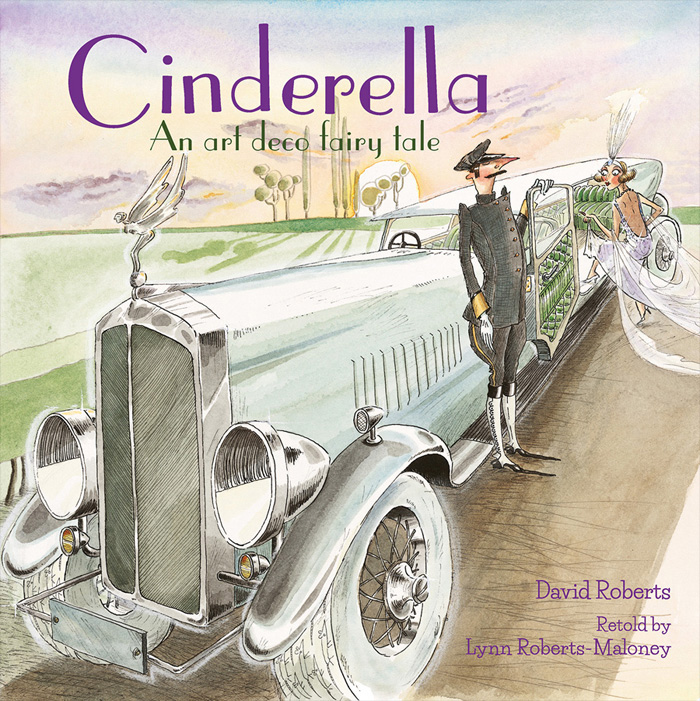
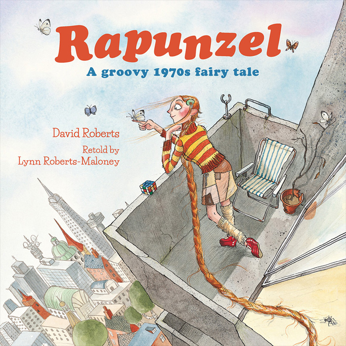
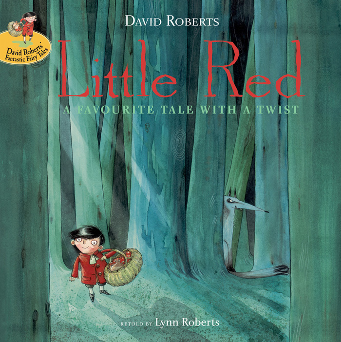
In this post, Lynn and David talk about the creation of the latest book in their reimagined fairy tale series. From the witty period detail of 18th-century England in ‘Little Red’, to the glamorous roaring ‘20s of ‘Cinderella’, to the retro charm of 1970s ‘Rapunzel’, we now arrive in the 1950s for a brilliant retelling of ‘Sleeping Beauty’.
Lynn: After ‘Little Red’ was published in 2006, David and I thought about doing another fairy tale, and ‘Sleeping Beauty’ was among a few ideas. We had some discussions, but various things stopped us from going further with it at the time. I was studying for an MA in Librarianship and David was busy on other projects.
In 2011, the publisher made enquiries about whether we would be interested in doing another book with them. And so David and I began to talk about it again, and ‘Sleeping Beauty’ was definitely the story we were interested in telling.
David usually isn’t involved with authors at the beginning of the project, but as brother and sister we have always collaborated right from the start. With everything I’ve written, even if it’s just a short rhyme, David is usually the first person I’ll show it to, as I know he’ll give me an honest review – plus give me tips on what changes to make. With the fairy tales, we come up with a few ideas together and then I go and write up the text and we take it from there.
With ‘Sleeping Beauty’, we sat in a little Portuguese cafe in Seven Dials, London, and talked through our ideas. The book was always going to start in the 1940s/1950s and then move into the future. The idea was to make the actual future look like the imagined future that was depicted in 1950s sci-fi films and TV shows, so David had a basis on which to develop the drawings. After that, he pretty much had free rein to design how the future would look.
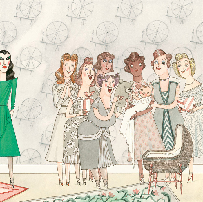
We tried to avoid the idea of Sleeping Beauty having to be ‘rescued’ as such, but we did want another character to come into the story from the future. So we needed a reason for the character to be there. Initially this character was male, but after a few drafts we discussed the idea of having an all female cast of characters, and the publisher was happy to go with this idea. I always write lots of drafts as it helps me to define the characters and situations, plus it helps me to cut down the text to the required length as I always write too much!
With each draft, David would get new ideas for the illustrations and we would discuss what should stay in or go. Doing this helped me to refine the story and it gave David plenty of time and inspiration to develop the look of the book.
Once the story was agreed on, David talked me through his ideas for the illustrations and we met with the publisher last April to finalise the project. I had just found out I was pregnant, and although I couldn’t tell anyone, it was extra exciting for me to know that when the book came out I would be a mum! Every few days last summer, I’d get an email from David containing the latest illustration he was working on, and it was wonderful to see the book coming together. At the time of writing, I actually haven’t seen a copy of the book, but I know it will look stunning and hopefully people will enjoy the story too.
David: It’s been a really interesting and fulfilling process working with Lynn. I never normally involve myself with the text when working on a book, but with Lynn I was able to make suggestions right from the start.
This is the fourth book in a series of fairy tale retellings where we have set the story in a different time period: the 1930s for ‘Cinderella’…
the 1970s for ‘Rapunzel’…
and the 18th century for ‘Little Red’.
After we had come up with the initial concept for ‘Sleeping Beauty’, Lynn did an initial draft and I made suggestions of the story I wanted to tell through the pictures. I think it is so important that the pictures tell the story just as much as the words, if not more so that the pictures tell an ‘extra’ story: the bit happening slightly ‘off-screen’ so to speak.
I talked to Lynn about some themes that I wanted to run through the book. It was clear right from the outset that we both wanted to start our tale in the 1950s (actually the story starts in the 1940s, as this is when our Sleeping Beauty is born).
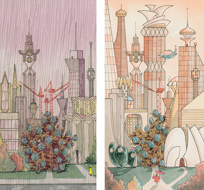
I have always loved that 1950s imagery of how they saw the future; it seems so clean and hopeful and happy, and I wanted to use that style throughout the book. I thought to myself, imagine if the future does turn out to look just how they imagined it.
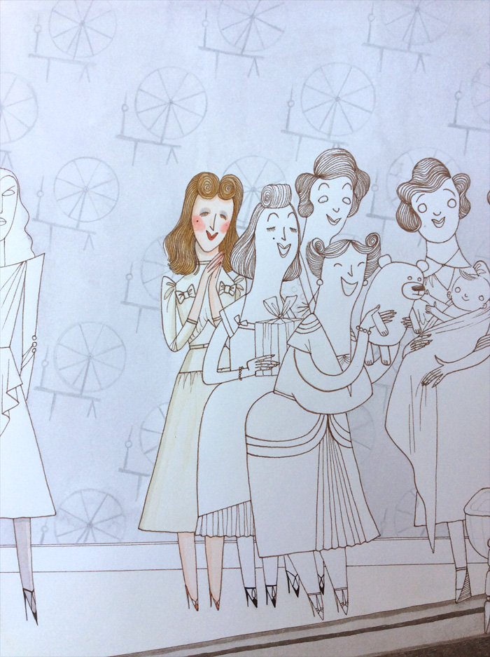
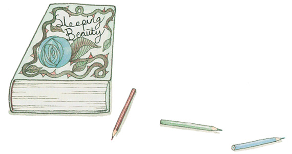
We needed something to replace the spinning wheel that Sleeping Beauty pricks her finger on, and we both agreed it had to be a record player needle. Both Lynn and I are big music fans, and we thought this would be so much fun and a great progression from the traditional story.
I then worked the theme of the circle through much of the design and pattern in the book. The spinning wheel from the traditional story is represented throughout our book in the design, from Sleeping Beauty’s dress, the wallpaper, the spinning record, the spiralling background when she falls under the spell, and the window where the evil witch watches her spell unfold.
We thought about things a 1950s teenager might be into, hence the sci-fi aspect, the robots Sleeping Beauty collects, the film posters in her room, and the CND symbol on the rug on her bedroom floor.
As Lynn is a librarian and we both greatly value our libraries that are now sadly so much under threat, we loved the idea that the library of the future, 1000 years hence, was bigger and better and still going strong – and filled with shelves full of ACTUAL BOOKS, not computer screens!
I continued the circle motif within the library, making the building cylindrical in its design, with robots resembling those from Sleeping Beauty’s past busily keeping the shelves tidy.
I also thought about how written language may develop in the future and, again working on my circle motif, thought it would be fun to have it come full circle back to the old Norse symbols of the past.
And outside the library, amongst the flying cars, we see St Catherine, the patron saint of librarians, holding a book against ‘her wheel’.
I settled on a pastel colour palette for this book, only bringing in a strong shade of green to represent the evil witch and her spell.
I liked how the pastel colours express a sort of dreamy, carefree feel that I thought worked nicely for the 1950s alongside the future of the 2950s!
Young Annabel lives in the 1950s and dreams of a future with jetpacks, flying cars and robots. Little does she know that she’s living under a witch’s spell which means she could have no future at all. The evil spell comes true on Annabel’s sixteenth birthday and she falls asleep for a thousand years…
A young explorer called Zoe discovers the story of Sleeping Beauty, but can she rescuse Annabel in time and show her what the future really looks like?
Oliver Jeffers is an artist and storyteller whose work takes many forms and whose bestselling picturebooks are loved all around the world. Sam Winston is a fine artist who exhibits widely and whose artists’ books are held in the permanent collections of Tate Britain, the British Library, MoMA, Stanford University and many other places.
In this post, Oliver and Sam discuss their exciting picturebook collaboration, ‘A Child of Books’. This homage to the power of stories features illustrated characters by Oliver and landscapes which Sam crafted from excerpts from classic children’s stories and lullabies.
Oliver: Apparently I’m logged in as someone different.
Sam: Are you going to tell me that you’re actually in charge of the whole economy of Azerbaijan and if I give you my bank details I’ll be rich?
Oliver: Are you there? Hello? Testing, Testing. One, Two.
Sam: Yep. That’s better.
Oliver: I’m on my computer now rather than my phone.
Sam: Ahh, okay.
Oliver: The question mark button doesn’t work on my phone, which would have made the conversation fairly one sided.
Sam: That is important as how would you ask anything? You could just use exclamations and make many outlandish statements.
Oliver: This is a criticism my wife makes of me constantly! Okay, let’s begin… Hi Sam. So, what are we supposed to talk about for our readers at the Picturebook Makers blog?
Sam: Hello Mr. Jeffers. I think I get to ask you hard questions and you come up with funny yet insightful answers.
Oliver: And vice versa?
Sam: Absolutely, minus the insight and humour. So, do we start at the beginning, middle, or end?
Oliver: Eh… the end? We finished making a book! It took us nearly five years but we did it. Eventually.
Sam: I think that’s because we’re easily distracted/too excited by many beautiful ideas – hence the long time to complete – but the journey was mightily enjoyable and perhaps the most important part I think. In one sense that book is finished, but we’re still motoring along with ideas and stories. Personally I think all of making is process and every now and again a full stop appears in the form of a book or exhibition.
Oliver: Can you remember how it started?
Sam: How did we meet? The first words of hello were on the Internet I presume, but we first sat down face to face in London in 2011 after a friend – Sam Summerskill – thought we would get along handsomely and introduced us. Do you remember what we chatted about?
Oliver: We did. Sam (the other Sam) reckoned we’d get along mightily, and showed me some of your work. I studied typography in art college, but I’d never seen anyone doing anything like you were, and was very intrigued. I probably picked your brain about that a bit, and we probably shared stories about Sam (the other Sam). What I really remember was a few hours later, as we were leaving, it felt like I’d always known you. Anyway, I think somewhere either that day, or in the next few days, we decided we should work on a project together. Although it was not immediately obvious what kind of format that would take.
Sam: I looked back through those emails and we were going to fill shop windows with words/stories (don’t know where that went?!). But yes, I was interested in the fact that you did picture books and had a contemporary art practice – and I think that was something we discussed – broad tastes and how creative practice didn’t make distinctions between genres – rather staying true to what felt most interesting. And on that foundation I got a real strong sense of trusting you. That’s rare I think. To open up what you do and share your practice – to take both compliments and criticism and incorporate it into something you put your name to. But within a few hours, my sense was that we trusted one another with each other’s art. Definitely.
I think from there we began to grow a project from a previous text of mine called ‘Orphan’.
Oliver: We definitely came to the conclusion that it should be a picture book fairly quickly. It seemed to make the most obvious sense that characters I created would inhabit a world of type you created. Though what that type should be and what those characters should be was not immediately obvious.
Yes, we took our next cue from an old project of yours called Orphan, about the idea of a character who lives inside books. And it was there that the project really began in earnest. I think we got the meat and bones of the general direction down fairly well after our next meeting, but at that point we hit the most obvious of obstacles – namely, the geographic border between us: the Atlantic Ocean, and what became the first of several points of stagnation. If we weren’t both together in the same room, this project tended to get sidelined in favour of other more pressing things. I think it went that way for a few years.
Sam: A lot of the progress came when we were in the same space together – because of the nature of the images. The work became increasingly layered and entwined, with us working in many mediums and formats. Oliver, you could work in pen ink/pencil/collage, then it would be transferred to me and I would take it into InDesign or Photoshop, sometimes going between each format multiple times. The files for this alone became a labyrinth.
Oliver: One of the reasons I thought it would be a good idea to get a publisher involved perhaps earlier than we were ready, was because I thought a third party deadline might kick our arses into gear a bit, and force us to dedicate the time to really figuring it out. Which worked!
Sam: I think the result works. I think it’s a compliment that it became almost impossible on certain images to distinguish who did what. I also think that marries very well with the ethos of the book – since we were paying homage to multiple authors across multiple generations. A lot of projects say ‘it was collaborative’, but I really do think this project took the idea of collaboration and fully explored it down to some interesting roots.
Oliver: Yeah, I think it’s confusing people slightly to say we both wrote it, and both illustrated it.
Sam: If you want to be fully true to authorship: Lewis Carroll also wrote it.
Oliver: Though he was fairly sensitive to criticism. He’d throw up an awful stink if he didn’t think his genius was being fully respected. Not sure I’d collaborate with him again!
Sam: Yeah, but he did have one pill that makes you smaller… and one pill that makes…
Oliver: Anyway, as you’ve said before, it’s difficult to say where this project really began. And also, where it will end.
Sam: I am fully up for questioning the notions of authorship – I think our brains are magpies and we are constantly taking words and pictures from our environments and personal histories. Words and images that weren’t ours to begin with but ones that we are happy to lay claim to if we stick them together in a nice order!
Oliver: I agree. No one creates anything in a bubble.
Sam: Except for this chat – these words appear in a nice blue bubble.
[Oliver and Sam are using the Messages app]
Oliver: We could veer off here on a tangent between the difference between influence and plagiarism… where in my opinion, inspiration is where you observe, then digest, then create, and mostly forget where all the little bits came from. Plagiarism is where you know exactly where something came from and lift wholesale. Which, now that I think about it, is exactly how we have used the texts in A Child of Books! Though I suppose that’s technically homage, as we aren’t trying to pass off Lewis Carrot’s words as our own.
Sam: Absolutely. I am not saying that plagiarism is anything good either! I think an author knows when they haven’t had a good idea and they are being sloppy, and just encroaching on another’s idea. You can tell how they talk about it – everything sounds cliché. I think original work makes new thoughts and that has a real sense of excitement to it.
Lewis Carrots!
Oliver: Did I type that? It must have been autocorrect.
Do you think autocorrect is a good thing for the future of education? Is the choice between reading proper spelling that’s autocorrected, or incorrect spelling that’s been sloppily typed?
Sam: I think William Burroughs would be pleased – it’s taken the cut-up technique to a new level.
Oliver: One more big question each?
Sam: Sounds good. So Oliver – you’ve made a lot of picture books over a decade now. Where do you think this fits into your oeuvre? And broadly speaking, where do you see picture books heading in the next 10 years?
Oliver: Well, this book is obviously a departure for me. I have collaborated before, but not quite like this. For the first Crayons book, I collaborated with an editor, and didn’t meet Drew [Daywalt] until after it was done. For Imaginary Fred, I collaborated with an author, but it was more straightforward: my bringing visuals to Eoin Colfer’s text. With the second Crayons book, Drew took the concept to a certain point, then we sat together with the editor in my studio and came up with a bunch of characters together. But this project is the first where the lines truly blur as you say. Because the nature and feel of this book is so different for me too, I wanted to break away from my normal style where, as Eoin Colfer says, I draw like a drunk one-eyed monkey. I wanted to create something that felt more timeless.
So as far as oeuvre, I think this is an important book and a real milestone in my career. Which leads me into where I think books are going in the next 10 years…
I think people were worried about the future of books with the dawn of digital publishing and the potential for technology to disrupt the way we make or read books. But I do not think that is of concern. Yes, new cool things will continue to be produced, but not at the expense of books. Humans have enjoyed the physical object of the book for thousands of years and we are not about to set them down. And our book is basically about a love of literature we both share with a huge percentage of the population (I was about to say English speaking – but the rate at which foreign language publishers are prepared to translate this made me retract that!)
They say that children reject their parents’ values and embrace their grandparents’ – and there may be some truth to that, which may explain some of the current trends in fashion, music, and food culture…
What we have attempted to do with this book is almost to stick a pin in modern picture books’ culture, having been shaped by generations of storytellers that have come before. So, rather than get lost in computer games and apps, I believe there is a real and insatiable appetite to enjoy stories. And as we have both discussed at length, stories are hugely important to our identities. So where will picture books go in the next 10 years? The same direction they have always been going. And I hope we will still be there, along for the ride.
Sam: Great answer to a hard question. Sorry. You can ask me a stinker too.
Oliver: Oh I’ll think of one.
Sam: Ask me what the square root of 36 is.
Oliver: What’s the capital of Outer Mongolia?
Also, what is the square root of 36?
Sam: What is the square root of 36? – Ulaanbaatar
What’s the capital of Outer Mongolia? – 6
Oliver: Okay, your question: This is your first picture book, though, perhaps unbeknown to your new audience, by no means your first book. What are your first impressions of the picture book industry, and are picture books something you’d like to continue to explore? Want an easier one? What’s for your lunch?
Sam: Cheese sandwich and packet of crisps – and now onto, “what’s for lunch?”
Oliver: I’ve often thought of the industry as a cheese sandwich and packet of crisps before.
Sam: So far, I am fascinated by the picture book industry. I have had the relative luxury of making artist books for 15 years, which has afforded me nearly complete creative control in my projects, which has really helped my practice mature. I think that’s why you and I worked well together, Oliver – we both have been making for many years and it meant there wasn’t so much of our egos to deal with.
That, combined with the incredible good fortune to collaborate with someone who is a master of their craft – it was an honour to watch how skilled you were around narrative and compositional decisions. That lead to a very fortunate entry into the world of picture books – and in that sense, I have loved it and am truly humbled that it’s come out the way it has.
Yet I also think the industry has got a pretty hard edge coming from an artist’s perspective. Within the art and poetry world, audiences are smaller and more intimate. You can expect certain levels of literacy and it’s expected that you take risks. My biggest surprise here was the number of similar books that have to be created to keep an industry solvent – once a trend takes off you can be sure to see 50 pastiches of it by the next season… In the long term that creates a real challenge for creatives, as there is far less incentive to take risks and explore ideas.
As to whether I will continue to explore? Absolutely. My words and images have certainly been very much welcomed by Oliver, Walker and Candlewick. In a word, it’s been an honour to work with these people.
Sam: Now what?
Oliver: I forgot what the question was, but that sounds coherent.
Right. Think we are done. I’m away for lunch. Thanks Sam.
In this inspiring, lyrical tale about the rewards of reading and sharing stories, a little girl sails her raft ‘across a sea of words’ to arrive at the house of a small boy. There she invites him to come away with her on an adventure.
Elegant illustrations by Oliver Jeffers are accompanied by Sam Winston’s astonishing typographical landscapes, beautifully shaped from excerpts from classic children’s stories and lullabies.
Nicholas John Frith is an illustrator, writer, printmaker and designer who grew up in the Chiltern Hills in the South of England. In 2016, he was shortlisted for the Waterstones Children’s Book Prize and was awarded the inaugural Klaus Flugge Prize for the most promising and exciting newcomer to children’s book illustration.
In this post, Nicholas talks about his wonderful debut picturebook, ‘Hector and Hummingbird’, for which he won the inaugural Klaus Flugge Prize. It was described by the judges as ‘graphically assured, stylish in its use of retro colour separation, and at the same time full of warmth and humanity.’
Nicholas: So, ‘Hector and Hummingbird’ is my first book. It’s a book with a familiar story of contrasts, and a sort of ‘you don’t know what you’ve got till it’s gone’ tale. An irritating sibling that you miss when they are gone. Or the incessantly chatty friend that won’t shut up when you just want some peace and quiet. Or the wife who just wants to get in the door and relax after a busy day at work, only to be met by her illustrator husband who has been home alone all day in the studio, with only the radio and houseplants to talk to!
But this story is set in the jungle of Peru, with two friends: a spectacled bear and a hummingbird.
If I recall correctly, the story came out of a bunch of character studies of a bear in a tropical setting, a lighthearted conversation about relationships, a trip to the Natural History Museum at Tring, and also the desire of my publisher for me to produce a book with broad appeal.
I was so adamant I didn’t want to make a book featuring a bear, but what-do-you-know…
I embraced the bear and the idea of creating a nice bright tale with bright colours!
(I was, at the time, more predisposed to odd tales and was previously working with a more muted/saturated palette.)
The jungle setting and its flora and fauna provided an extra element of inspiration and excitement and I thought of ‘it’ as a character too, in a way.
For this book, I intended to use my usual limited palette that I had developed over the previous two years for all my illustration work, but my publisher was concerned that it could be too limited. So I decided to overlay my colours to create secondary colours, which I’d learnt to do whilst teaching myself to screen print. I already worked by producing my artwork in layers on separate sheets of paper, one for each colour. So that worked out pretty well. It was a while later that I had a ‘Eureka!’ moment, and went, “Oh, so this is a thing!” What I was doing was referred to as preseparated artwork! A method that had been used extensively for much of the mid-twentieth century in children’s book illustration.
(Strictly speaking, what I do is not truly the same: it is slightly contrived or aided by the fact that I can edit any mistakes in Photoshop – a luxury which illustrators of the mid-century didn’t have.)
Due to the way I worked in layers and my embracing of brighter colours, it was mentioned by my art director, Zoe Tucker, that maybe we could look at printing it in spot colours (or Pantones, if you will), as they would have done years ago with preseparated artwork.
And, as they say, the rest is history. ‘Hector and Hummingbird’ was printed in four glorious Pantone colours. As is my new book, ‘Hello, Mr Dodo!’, and as will be my next book with Scholastic/Alison Green Books.
Making ‘Hector and Hummingbird’ was a challenge, to put it mildly. Maybe I underestimated it all. It was my first picture book. But I learnt so much from Alison Green (my editor) and Zoe Tucker during that process, and subsequent projects; they are an awesome team!
Working on ‘Hector and Hummingbird’ seems like such a long time ago now, but it really was a turning point in the way I approach my illustration work, and it taught me one hell of a lot about picture books.
In the mountains of Peru, Hector the bear has a big problem: his friend Hummingbird just won’t be quiet! Whether Hector’s trying to enjoy a snack, get a good scratch against a tree, or take a nap, Hummingbird’s always buzzing around, asking too many questions. The pair have always been best friends, but will Hector ever find peace and quiet with Hummingbird around?
Olivier Tallec graduated from the Ecole Supérieure d'Arts Graphiques in Paris and worked in advertising as a graphic designer before devoting himself to illustration. He’s created many illustrations for newspapers and magazines and has illustrated more than eighty books for children. Olivier lives in Paris.
In this post, Olivier talks about making ‘Quiquoiqui’. This hugely engaging seek-and-find book was originally published in France by Actes Sud Junior, and has been translated into many languages. The English edition, ‘Who Done It?’, is published by Chronicle Books.
Olivier:‘Quiquoiqui’ is the first book in a series that I started making three years ago.
The initial idea was a simple observation book where children find the solution in the pictures.
The solution/answer could be found in a specific detail, in the expression of one of the characters, etc… For example, the answer to the question, “Who is wearing a disguise?” can be clearly seen in the picture. But for a different question like, “Who played with the cat?”, the answer is found in the elapsed time within the drawing. In this case, it is not so much about depicting the action, but the moment immediately afterwards.
I decided to mix the children and animal characters together. They coexist without a problem.
Above all, I wanted it to be a funny and entertaining book.
I set out to create a world where the characters interact without speaking.
To highlight the characters, I decided to place them on a white background, avoiding scenery completely or just tracing fragments of it in pencil, to provide a basic sense of the location.
After creating the characters, my publisher and I then considered the book as a physical object: so the choice of paper, the format, which is horizontal and remained that way in all the foreign editions (this is not always the case)…
I have been working for a long time on storytelling through images, and conveying things without using any text. I consider myself to be a writer but I know my limits with narration.
So this book allowed me to work on the characters’ expressions and the humour in the situations… and it will possibly have several levels of readers (it is firstly for children and then for adults).
It does not worry me if a child cannot understand everything in a book. On the contrary, I think it is important that they learn some things later on.
After this first book, my publisher and I decided to make several others and develop a series. This led to ‘Quiquoioù’ and ‘Quiquoiquoi’.
We later decided to continue the series and also develop comic books for older children (with Laurent Rivelaygue) with some of the characters from ‘Quiquoiqui’. The series will soon be adapted into a cartoon for French television.
The six characters (Olive, Boulard, Pétole, Mixo, Pamela and Raoul) evolve in a white world while one of them (Olive) begins to draw… This creates the universe in which they will continue to evolve – a house, a forest, a desert…
We are always in a child’s imagination, trying to create a world through drawing.
For this book, I was inspired by a television series I used to watch as a child called ‘La Linea’. It is a brilliant series which was created by Osvaldo Cavandoli in the 70s.
Who ate all the jam? Who didn’t get enough sleep? Each page asks the reader a question about the line-up of characters. Sharp eyes are necessary. There’s only one right answer, and it’s not always easy!
Kirsten Sims is a visual artist, designer and illustrator who studied Applied Design and Illustration at the Stellenbosch Academy in South Africa. Her paintings have been exhibited in numerous galleries, and her debut picturebook was published in 2016 by Orfeu Negro in Portugal. Kirsten lives and works in Cape Town.
In this post, Kirsten talks about her beautiful debut picturebook, ‘Baltasar O Grande’ (Balthazar the Great). This charming story about the world’s greatest violin-playing polar bear is published by Orfeu Negro in Portugal, with an English edition due in 2017.
Kirsten:‘Balthazar the Great’ is a book about a violin-playing polar bear trying to find a safe place on the planet. He is freed from the circus by a group of activists and left in the middle of nowhere to find his own way home. Along the way he says goodbye to old friends and attempts to make new ones. He has to learn to fend for himself in a very big and often lonely world. Sometimes things work out well for him, but other times he gets a bit overwhelmed by the journey.
The book started out as a university assignment about two years ago. Narrative illustration was one module out of four I needed to complete for my postgrad illustration course. I was on holiday in Tanzania for most of that term and so I had to quickly make something happen in about a weekend to present to my lecturer when I got back. I locked myself in my bedroom for two days and just painted and painted. The first version of the book happened that weekend; at that point it was called ‘Henry Goes Home’. It’s funny because I had just been to Tanzania, so I really thought I would make a book based there, but instead I made a book about a polar bear. Perhaps the Zanzibar story will appear in years to come.
I didn’t actually start with a narrative at all. I started off just playing around with this bear character. I knew I wanted him to escape the circus and I knew he was going to go on some kind of journey, but that was about it; everything else happened organically.
I had also decided quite early on that I didn’t want it to be a text-heavy book. I wanted the text to compliment the illustrations, but really I wanted the pictures to tell most of the story.
Because of the nature of how I work, there weren’t very many preliminary sketches. I did a couple of character doodles of the bear and then just dove right in. My little personal challenge was for him to always be the negative space on the page – so he was always the remaining white of the paper once I had filled in the scenery around him. I think it was very much a case of the process dictating the story.
Near the end of 2014 there was a book fair in Cape Town, which is where I met Carla from Orfeu Negro. My lecturer organised for us students to have a table at the fair to showcase some of our coursework and work-in-progress. At that point, the book was a couple of spreads printed out and presented in a file. Carla spent a lot of time paging through the spreads and chatting to me about the story. It was the first real conversation I had about the possibility of publishing a picture book. A few months later Orfeu Negro contacted me and told me they wanted to publish my book. I don’t think I’ve ever been so thrilled about anything. It was one of those big rare firework moments where you realise a lifelong dream is actually coming true.
By the time we started working on the book together I had graduated, had my first art exhibition, and was working as a visual artist in Cape Town.
It was interesting to see how my newer style of painting on a large scale could be integrated and applied to the picture book format. I don’t see the two avenues of working as mutually exclusive; I think they feed into each other in a wonderful way.
The collaborative way of working with Orfeu Negro also added a new dimension to the story and I loved the process of putting the book together.
I feel like Balthazar and I are both on a very similar journey, and every new adventure the book goes on out there in the world is a new adventure for me too.
Balthazar is the world’s greatest violin-playing polar bear! Well, he used to be the greatest. Now he’s the ONLY polar bear left in all the world’s circuses. One night, he’s set free and his long journey home begins…
A touching story about freedom, homesickness and the quest for a safe place on the planet.
Jon Klassen grew up in Niagara Falls and now lives in Los Angeles. After working as an illustrator on animated feature films, music videos and editorial pieces, he debuted as a picturebook artist with ‘I Want My Hat Back’. Jon has since received many prestigious awards for his work, including the Caldecott and Kate Greenaway Medals.
In this post, Jon talks about his ‘Hat’ trilogy: ‘I Want My Hat Back’, ‘This Is Not My Hat’ and the just-published ‘We Found A Hat’. The first two books in this outstanding series have together sold almost two million copies, spent over ninety weeks on the New York Times bestseller list, and have been translated into almost thirty languages.
Jon: I’m going to talk about making these three books: ‘I Want My Hat Back’, ‘This Is Not My Hat’ and ‘We Found A Hat’. I’ve illustrated other books, but these are the only books that I’ve written, so this post will deal more with the writing side than with illustrating.
When I was getting more into making books full-time, it became clear pretty quickly that I needed to start writing my own if it was going to be a viable thing, but I had a problem in that I didn’t like drawing characters. I like drawing scenery and inanimate objects and I especially liked it back then. The challenge of making a piece where the subject wasn’t a living thing was really fun, and I liked how quiet the effect was.
‘Beach House’ – an illustration from 2007.
Drawing characters always seemed like cheating, somehow. Like it was an easy way to get the audience’s attention and focus. I like a story that allows the viewer to wander around a little bit and find it on their own. I think my distaste for drawing characters owes partially to sensibility and partially to me just being scared of making them up. Making up a character always seemed kind of impossible.
Around this same time I was asked to make some greeting cards for a company called Red Cap Cards, and I sent them some sketches of chairs and inanimate objects and they wrote back asking if I might try my hand at something a little more engaging, like some characters. I argued that I didn’t really do that, but they were (and are) friends and they were comfortable enough to come back and ask again. What I eventually sent them was a series of animals wearing birthday hats and holding balloons, but their faces and poses made them look, to me, like they had no idea what a birthday was and didn’t really care. I was excited by this approach. It made me laugh, and it got me off the hook. I wasn’t creating a character when I drew them; I was borrowing them for a minute to put them on this card, like a photographer who gets someone to pose for them and this is the best they could get.
I also liked the bear that appeared on one of the cards. Even though he was completely still and emotionless, he looked like potentially a threat. He was a bear, after all. I thought that since I had broken the seal on drawing a character I could maybe use him in a book. I thought of maybe taking his hat away and then calling the book ‘I Want My Hat Back’.
It was a while between deciding on that idea and figuring out how to write it. For a long time I had it written with narration. It sounded like this:
A bear has lost his hat.
“Where is my hat?” he said.
I hated it. I didn’t really know what I wanted the narration to do, what it was adding, and I had no real story anyway. I can’t remember what prompted it, but one night I thought of doing the whole thing only in dialogue instead, without narration, and using colours to show who was talking so I wouldn’t even have to name anybody.
Part of the text file from the initial writing of ‘I Want My Hat Back’.
The idea of just doing it in dialogue with the pictures next to them suggested that one of them might be lying, and we could show the audience that they were lying. After that the story came very quickly and organically.
The illustrations were kept really simple. I always liked picture books that were very clean, but I was afraid to do them too clean for someone else’s text for fear it would look lazy.
For my own books it was really fun. Also, when you leave out a lot your roughs come out pretty close to the final.
The book was written in very stiff language. It was stiff because I was nervous about writing a book, and I liked the idea that these characters were not very good at speaking their lines, so they came out stiff and they kept looking at the camera/audience instead of at each other like they should be when two characters are speaking to each other. They seemed baffled to be in a book, as I was baffled to be making one.
The process of making this book ended up loosely being the process for making the two books that followed it. Choosing a simple (and hopefully visual) problem – in this case a bear who wants to be wearing his hat again – then deciding how it will be told – in this case with dialogue between characters – and let that second decision suggest the story itself.
After ‘I Want My Hat Back’ was finished, I wanted to try other books using the same characters and location. I’d enjoyed the atmosphere of the book, however minimal it is. Along the highways in Ontario, Canada where I’m from there are these patches of low forest that grow when you travel north a little ways. The trees don’t get higher than six feet or so and they grow out of tall grasses and scrubby bushes. I always pictured these animals living somewhere like that, heads poking out of the plants, and I liked hanging out there and thinking about them.
I thought maybe there could be a book about the deer. He was the only one in the first book who took any real interest in the bear’s problem, and he looked to me physically sympathetic. Kind of hunched shoulders and thin and frail. I tried a few versions of books about him.
The first story was about the deer saying he liked to be alone at night (he doesn’t) and going around waking up other animals to see if they shared this feeling. The only idea in this book that I liked was that he goes to wake up the turtle, but the turtle is asleep and in his sleep describes a dream where he is floating off into the stars. It didn’t really fit into the story, but it was a nice little aside. The second story was about the deer trying to trade a stick that he found for other objects that the animals have now acquired. Eventually the mole creature from ‘I Want My Hat Back’ appears and shows him how to light the stick on fire, but that goes nowhere good.
After a few of these deer stories I started to realise that I was just copying the format of the first book and it wasn’t coming as naturally. My art director at Candlewick, knowing I didn’t like what I was getting out of this strategy, suggested I “go somewhere else” completely with the setting and characters. So I thought of doing a story with light characters on a dark background, and that suggested being deep underwater, so it might be about fish.
Rough illustration from ‘Ten Bad Fish’.
The first fish story really didn’t concern a hat at all. It was called ‘Ten Bad Fish’ and it was kind of a western about a gang of fish that ride into town and terrorise successively bigger and bigger fish until they wake up an especially big one and turn around and head back, but are now being eaten one by one from behind until there is only one left, and the book ends without showing if the last one gets eaten or not. It was a dark book, and again it didn’t really have anybody very redeeming in it. You didn’t like the gang, and you didn’t really like the big fish either, so there was nobody to root for. My editor asked if I could lighten it up at all, and I realised my favourite part of the story was the very end, when there was one little gang member fish left with a big fish somewhere off the page behind him, wondering if he would be spared.
The structure of ‘This Is Not My Hat’ came from two very well-known stories about feeling guilty. The first is ‘The Tell-Tale Heart’ by Edgar Allan Poe.
From the UPA’s animated production of ‘The Tell-Tale Heart’, 1954.
My favourite of his stories were his unreliable narrator ones; he always knew just how to remind you what it felt like to be in big trouble but trying to talk yourself out of feeling bad about it.
The idea of a character talking to you about how and why he committed the crime when you felt like all the while you were walking him to the gallows is a really good fit for a picture book because you can show that walk (or swim, in this case), and contrast it with what he’s saying in the text.
The other story that was a big influence was Alfred Hitchcock’s ‘Psycho’.
From Alfred Hitchcock’s ‘Psycho’, 1960.
The first half of the film is basically about guiltily running away, and getting tripped up in small ways as you go. Even though she doesn’t meet her end directly because of what she did, it did make it more acceptable to the audience that she was on the run instead of just an innocent lady who needed a place to stay. The little fish’s punishment is outsized to his crime, but he did have something coming.
The other piece from ‘Psycho’ is the weird silence the film has in it after the main character has been killed. Even though people continue to talk and the movie continues to roll along, there’s a weird void feeling to it now that she’s gone. The idea for doing it in monologue came from the Poe story, but the idea for ending that monologue three spreads before the book was over came from ‘Psycho’.
‘I Want My Hat Back’ and ‘This Is Not My Hat’ were done roughly a year apart. When Candlewick bought ‘I Want My Hat Back’ they gave me a contract for three books. Whether it was the contract or the more general idea of a trilogy I’m not sure, but for some reason I always wanted to do a third book on the theme (now that there was a theme).
This third book turned out to be much harder to pin down. The second book had been done largely in reaction to the first one. It is the same trim size turned on its side, it is light shapes on a dark background rather than dark shapes on light, it is about a thief rather than somebody getting robbed, and it is done in monologue instead of dialogue. Since they are opposites in all of these ways, I couldn’t figure out what the third book was supposed to do for a long time.
One thing I thought a third book could do is feature an ending where nobody ended up with the hat in question. Since both the previous books had established that you could be killed for stealing a hat, I thought a natural conclusion might be some sort of apocalyptic battle royale where everyone is killed in pursuit of the hat and nobody gets it.
The story I tried the most versions of along these lines was actually called ‘We Found A Hat’. The idea behind the title was that this book would be written as a group speaking, everyone speaking in unison. The group would seem solid in their words, but you would see the fraying in the pictures and attitudes of the characters.
There were a lot of variations on the story, but most of them included two or three characters standing around a hat they had found in the snow. They each tried it on in succession, coming to the conclusion that each of them liked it and wanted it. After a quick discussion about how the only fair thing to do would be to leave it and keep moving since they couldn’t all three have one, they promptly sat down and just looked at it, for fear if any of them left first, the one who was left behind would claim the hat.
Final art test for an early version of ‘We Found A Hat’.
Eventually it would start to snow and the hat would be buried, and finally so would the unmoving creatures. The book ended with just a page of white, with everyone under the snow.
I liked the setting, and I liked the idea of ending on a blank spread, but It didn’t work. Everyone dying at the end of the story came off as didactic and cold. It took a long time and a lot of drafts to make sure there was no way to do it, but eventually I gave up on this version of the story altogether.
Many different stories and scenarios later, I came back to the title, but tried a version of the story where the characters genuinely liked each other.
This version started almost exactly the same way, only instead of sitting and having a stand-off, the two turtles really do move away from the hat.
The second part of the book about them watching the sunset together shows that one of the turtles is still preoccupied with the thought of it.
The third part of the book is set at night and has the tempted turtle almost steal the hat while the other is sleeping…
… but, in a very strange coincidence, the turtle dream idea from the draft of the night time deer book almost five years ago saves the day, and they float off into the stars together instead.
This third book, at least the writing of it, was the strangest and most meandering of all of them, but it taught me a lot about how much the process can change an idea if you let it. Up until this book, if an idea didn’t work I didn’t think there was much I could do to salvage it, and I would give it up and try something completely different. But this book was at least partially salvaged from a number of old ideas that didn’t have anything to do with each other at first, and it’s been very relieving to see that this can lead to a book that I am just as happy with as a book that came by the other processes I’ve tried before. For that reason I think this last one is my favourite of the series, though that may just be because it’s such a relief to have finished it.
Two turtles have found a hat. The hat looks good on both of them. But there are two turtles. And there is only one hat…
‘Jon Klassen’s typical minimalism reaches a new level of refinement… in my opinion the best and most stirring in his hat trilogy. Klassen, who speaks the language of the picture book like few other authors and illustrators these days, has created a masterpiece of honest feelings, emotional tension and poetic restraint.‘
—The New York Times
Told completely in dialogue, this delicious take on the classic repetitive tale plays out in sly illustrations laced with visual humor – and winks at the reader with a wry irreverence that will have kids of all ages thrilled to be in on the joke.
‘A marvelous book in the true dictionary sense of ‘marvel’: it is a wonderful and astonishing thing, the kind of book that makes children laugh and adults chuckle, and both smile in appreciation. A charmingly wicked little book.‘
—The New York Times
Chloé Perarnau grew up in the countryside of Lorraine in France, and studied Illustration at the Royal Academy of Fine Arts in Brussels. Since graduating, she’s worked on children’s books, editorial pieces, art workshops and various other projects. In 2013, Chloé created the fanzine, Cuistax, with some other authors and illustrators in Brussels.
In this post, Chloé talks about ‘L’orchestre’ (The Orchestra), a wonderful seek-and-find adventure which takes the reader all around the world in search of missing musicians. This visually stunning picturebook is published in France by L’Agrume.
Chloé: I’m an illustrator (and sometimes author) and work mainly in children’s books, but also for the press and cultural projects.
The book project, ‘The Orchestra: Look and Find Around the World’ was born out of a meeting with the two publishers at L’Agrume. I had already drawn a small series of images for their thematic illustrated review, Citrus.
We really enjoyed working together and they suggested I create a full book.
L’Agrume’s children’s collection has developed around game-books and object-books with varied concepts and worlds. As for me, I had been working for a while on a book called ‘Look and Find’, doing large town scenes; we started on this basis. The idea of creating a world tour came up fairly quickly and I suggested the story of an orchestra conductor who has lost his musicians, as they’ve all gone on holiday on the week of a big concert.
The ‘Look and Find’ concept allowed me to move the conductor character from one picture to the next, from one country to another, and to thus draw different worlds, numerous scenes and details of daily life. Work on the book started off with this test image of Rio de Janeiro.
For all the other destinations, I had to do a lot of image research, on the Internet and in books. I had visited some of the countries and cities before, but not others.
I had wanted to convey in my pictures something quite realistic, with atmosphere and lots of detail. I looked at towns, buildings, people’s clothes, what they did on the street, at home, etc. At times, it was also important to be able to put these studies and images to one side, so I could reclaim each double-page spread and imagine a world of my own.
Each spread was constructed primarily around the architecture of buildings, houses or structures. However, I did sometimes begin with a group of people in the corner of a picture. The most difficult thing for me was having so many ideas for all these characters and mini-stories within the main story. It was painstaking work. In the end, I think it feels like we know every one of these little characters. I love creating this kind of image where many things happen simultaneously, allowing the viewer’s gaze to wander and discover details, and being surprised even after looking at it multiple times. In this book, the viewer’s gaze is slightly high up, but not a full aerial view.
Work on the text happened fairly naturally: In order to improve textual comprehension in the book (which is aimed at children of three and up), we decided to have text in speech bubbles, and in the left corner, a postcard from each musician.
I love writing postcards to my friends and family when I travel. It seemed to me to be a good way to introduce the story through postcards written by musicians to the maestro from their holiday destinations.
I also wanted to depict an orchestra because this is a world I know as a spectator and I find it fascinating. As with a dance troupe, the energy of an orchestra in action intrigues me, particularly in relation to the sometimes solitary work of the illustrator.
Finally, I also wanted to find a poetically subversive way to use instruments, bringing them and the orchestra into the town, among the crowd, a space much larger than that of a concert hall. My characters had to have a little fun, and so did I.
The big concert is in one week’s time, but all the musicians have gone on holiday! The conductor and his faithful assistant travel the world to find them – the violinists in Tokyo, the harp player in Porto, the trumpet players in Rio and the flautists in Abidjan…
‘The Orchestra’ is both a narrative and a treasure hunt. Each page features scenes typical of the countries visited, creating an exciting round-the-world trip!