Stian Hole is a Norwegian graphic designer, illustrator and author. He’s created numerous book covers and five picturebooks which have received national and international recognition. For ‘Garmann’s Summer’, Stian won an Ezra Jack Keats New Writer Award, the German Children’s Literature Award and a Bologna Ragazzi Award.
In this post, Stian shares some striking artwork from ‘Morkel’s Alphabet’, his forthcoming picturebook with Cappelen Damm. He also shares some fascinating insights into the art of picturebook making, which he wrote down during the creation of this book.
Stian: Thank you for your hard work in running this blog. Thanks also to all of my fantastic colleagues who so generously share their experience and working processes. Reading through these posts gives me so many new ideas.
As I write this, I’m in the final stages of creating a new picture book, ‘Morkel’s Alphabet’, which will soon be sent to print.
I’ve been working on the story for two years now, making notes throughout the entire process. I used to use notebooks, but nowadays I tend to note things down using my iPhone, which is always in my pocket. It’s a practical solution, particularly since ideas and connections often emerge at the strangest times and in the funniest places! I’ve gone back through these entries, and what follows are some of those notes, ever-so-slightly edited and in the following order:
The picture book becomes a space between incidental discovery and educated understanding, between the viewpoint of an adult and that of a child. It’s a space of interaction between the right and left halves of the brain, a space that sparks dialogue between the brain and the heart, between play and perseverance. A space for doubt, curiosity and fragility, because something feels important. Between memories and dreams, longing and wonder. The picture book becomes a place where words and images need one another and interact with one another, yet aren’t required to say the same thing.
Creating picture books is about seeing the world from two viewpoints at the same time: as an adult and simultaneously as a child.
You can be a child as an adult too. Like Picasso.
Listen to your heart. Engage with the vulnerability and doubt you find there. Trust your feelings and keep any intellectual tendencies at bay. Don’t stop yourself.
Creating a story is about making a series of logical and poetic decisions.
Consider the devices you use as if they were pieces in a board game. Try to observe and understand the rules of that game. What’s at play in the story?
Are you able to see whether the story has its own alphabet, its own grammatical rules? Can you see the possibilities that exist within? What is it that exists there, under the surface?
Be present. Be alert. Aim for the same kind of concentration that children have when they play.
Can you see the way in which almost everything resembles something else?
Clichés are your friends, but it often helps to remove them later on in the process - it liberates the story.
Make room for the reader’s collaborative role. Only the reader can bring the ideas that represent the breath of life that the story needs.
Try to minimise distance. The distance between yourself and what you are creating, but also the distance between the story and the reader.
Is there a sense of hope, a seed within the story that can sprout and grow on the story’s own terms?
Rearrange, condense, refine and distill. Use contrasts to create twists and turns and a dynamic feel to the story – a sense of progress and surprise.
Can you see what your picture book resembles? It’s a little like a theatre play where you see one thing, hear another and understand something entirely different.
Be mindful of everything you come up with during the working progress, including the things you don’t really think belong. Regardless of whether they’re right for the text, they succeeded in arousing your curiosity and they may well come in useful at a later date.
Keep going. Have patience and perseverance, and be sure to spend time deeply immersed in the story. Make use of your senses and try to view things afresh, several times over if possible. Can something be cut differently? Try to turn the elements on their head, removing and adding as you see fit. Imagine you are seeing things for the first time from the viewpoint of a child. Be alert and keep an eye out for coincidental elements that occur along the way.
Beware of asking others what they think about your work. Be your own reader and trust yourself. Don’t be afraid to engage with doubt: it can be a powerful motivating force.
Steal from the best. Make everything your own.
Beware of doing again what you already know you can do.
Get up early and work hard every day.
Read poetry.
Only ever drink good, freshly-ground coffee.
Keep the publishers and the alcohol they serve at arm’s length: remember how the Indians lost their land.
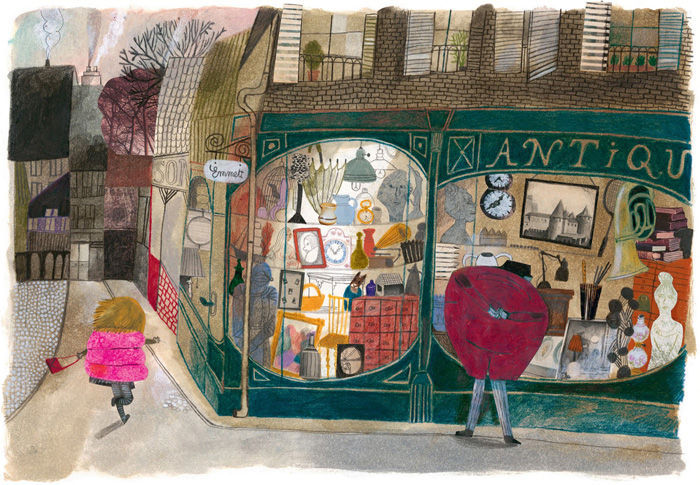
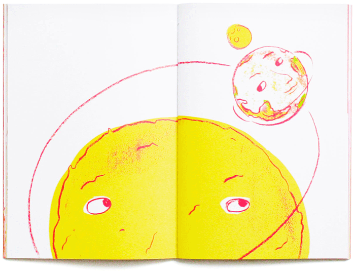
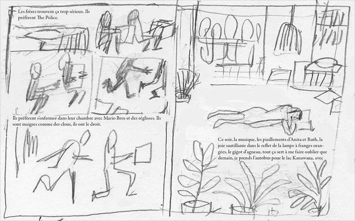
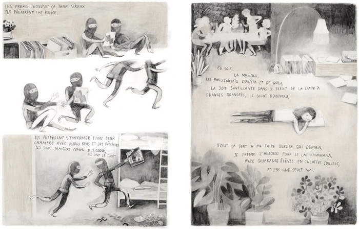
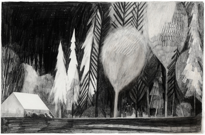
Morkel is in his cabin in the woods when Anna finds him. They are both very interested in words and letters. “Everyone has their own alphabet,” thinks Anna, “but it can take a long time to figure out the letters.”
One day, Morkel disappears. Anna longs to see him again. Maybe he’ll return to her in the spring? Like the birds that he loves.
A beautiful story about friendship and what’s important in life, from one of Norway’s greatest picturebook makers.
Klaas Verplancke graduated from the Sint-Lucas Institute in Ghent, and after several years working in advertising, he became a full-time illustrator and author. Klaas has won the Bologna Ragazzi Award, he was a finalist for the Hans Christian Andersen Award, and he’s been nominated for the Astrid Lindgren Memorial Award nine times.
In this post, Klaas talks about the creation of his hugely successful picturebook, ‘Appelmoes’ (Applesauce), and he shares previews from forthcoming books. He also discusses artistic freedom, the difference between the English-speaking and general European children’s book market, and the respect and admiration he has for children.
Klaas: One thing that I’ve learned over the past twenty-six years is that stories need time to grow and mellow. The initial thoughts for ‘Applesauce’ came into my mind ten years before the book was published.
I’ve always been fascinated by children. They are, at the same time, strong and vulnerable creatures: eager to explore, to experience, to discover, and to jump fearlessly into the unknown – so long as they know that at the end of every adventurous road, there are open arms in which they can find rest, safety, care and comfort. That’s what they expect from us as adults, parents, teachers… I wanted to capture this duality in a story, and started working on storylines where loneliness and snugness came together.
The first sketchy storyboard was conceived with a young polar bear that wakes up from his winter sleep. His mother is still asleep, but he can’t wait to get up, and leaves the warm hollow to discover the world outside. But he gets lost in the whiteness…
I created this Bare Scare Bear with tape for another storyline.
This story was based on the uncomfortable feelings of desertion in a king size bed (an experience that I remember from my childhood, when I stayed at my grandmother’s house and had to sleep in a large bed in a half-dark room, full of strange objects, paintings and vintage portrait photos). A good old teddy bear comforts the child from this annoying and frightening bedroom creature, and keeps her company.
There were more storylines that were easy to start but hard to finish. The ending is the most important part of a story. It must recall the beginning so that the story can go around and around…
But as a young father, everything changed. Simple, real-life stories were happening all around me. Every day in a child’s life is unique because there’s so much to learn. Every question, every doubt, every trouble can be the beginning of a tale.
I experienced that being a father is very complex and illogical as seen from a child’s viewpoint. How can you be a sweet friend and a strict and punitive boss at the same time? My son turned away when I, his best friend, was angry or severe. He ran away and hid, in his anger, frustration and confusion. Lonely, looking for a new father… and there it was: the story I’d been trying to find for years, ready-made. Fathers and sons, parents and children, can be very, very close – but far, far away from each other too. Just then, a father must open his arms as the doors of a welcoming home, when the anger and trouble is left behind and the child wants to return to his friend.
I tried a first version of the story with a bear (again!)…
But I decided to drop this idea. And it became the picturebook of ‘Applesauce’, about a real father and a real son, about real parents and real children.
For the artwork, I started with this self-portrait made by my son when he was five years old.
We have a preconditioned vision of childish aesthetics. We associate it with round and soft shapes. But look how sharply this is drawn. I was really fascinated by this drawing, and used it as a starting point for my character design. I slowly adapted and moulded it to my drawing, but tried to keep some references (like how the nose looks like it’s glued to the face).
I made the sketches in ballpoint pen. When I showed my storyboard to Guy Billout and his illustration students in New York, he suggested that I maintained this style and technique in the final artwork. I loved this idea, and it inspired the colour rhythm I used in the book. Alternating between warm colours and cold blues to enhance the warmth and the tension in the scenes. Thus, I tried to create a sort of wave effect in colours, executed in acrylics and coloured pencils.
This book also incorporates my typical filmic style, with great attention to composition, lighting, repetition and transition (like the staircase pillars that turn into trees – my son’s favourite spread).
The first storyboard for ‘Applesauce’ was longer, more complex and very different from the final one. The passage in the forest was longer and darker, and the whole story was written from the viewpoint of the father. I focused on the father’s anger and the child’s fear. This created so much contrast and such a dramatic effect, that it became really threatening from the child’s viewpoint – a result that I didn’t want, given my respect and admiration for children.
I absolutely didn’t want to put children in this difficult position, so I flipped the viewpoint and added self-respect to the boy’s reaction to his father. I worked hard on this scenario, with the help and feedback of my publisher, Marita, who pointed out and removed the imbalance and apocryphal elements. The storyline looks very simple and clear now, but I really had to kill my darlings to get to this point. You draw a lot to draw little.
The reason for the international success of ‘Applesauce’ must be the fact that it’s a very universal, recognisable story for all parents and children in the world who deal with the same daily situations. It’s my first translated picturebook in the English-speaking book market, published by Groundwood, a Canadian publisher.
Apparently, I found a good balance in this book, but even so, the most negative reactions come from reviewers in the United States. Different expectations lead to different evaluations. In particular, the scene with the angry dad transformed into a stupid kind of ape, and the passage through the forest seems ‘too scary’, ‘too sophisticated’, ‘disrespectful’…
In the late 90s, I worked for several UK publishers (with an agent), and I stopped after a few projects because I noticed that my artwork and artistic approach didn’t fit with the typical illustration style in (mainstream) UK picturebooks. We had several discussions. I didn’t feel comfortable with the adaptations I had to make to my illustrations and the final outcome of the publication. Mainly because most of these interferences weren’t essential (smaller nose, rounder eyes…) and didn’t relate to the storyboard.
I don’t want to generalise, and there are always exceptions that prove the rule, and the market has changed a lot over the past twenty years thanks to smaller publishing houses, but one cannot deny that there’s still a difference and a gap between the English-speaking and the general European children’s book market – caused by different expectations and intentions. Just walk through the halls at the Bologna Book Fair and you immediately see the differences.
Children’s literature on one hand can be seen as a romantic medium for social and/or religious education and easy entertainment, or on the other hand it can be considered as a form of art: confronting, reflecting and giving a voice to sometimes uneasy topics, emotions and thoughts. I’ve always worked according to these latter principles here in Flanders, where there’s a great respect for artistic freedom and authenticity.
As I wrote before, I do have the highest estimation and respect for children. Picasso once said that he tried his whole life to draw as a child. Children are wonderful creatures who turn a yellow sphere into a sun. Life could be that simple. I’m jealous of their guts, their happiness, and the smart, simple logic they apply to learn about and understand the world around them. They are not fragile creatures that should be protected from every conflict or evil, or grow up with the illusion that life is a Barbie world.
On the contrary. Children do have a malicious side, and they seek suspense and adventure. Their drawings of an angry dad are even more scary than what I’ve drawn.
Children are sometimes lonely, scared, angry or confused. Real stories can help to deal with real life, making us more prepared and confident. That’s why books and art in general is made. Recognition as a form of consolation.
In assessing books, one mistakenly starts from the perception that ‘not understanding’ is equal to ‘I don’t like it’. “We think we understand the rules when we become adults, but what we really experience is the narrowing of our imagination,” said David Lynch.
Maybe we should assume that ‘not understanding’ creates fascination and imagination – that friction stimulates solutions and nuanced thinking, that we should understand that there is something called mystery, and that children intuitively assume that they need to learn if they want to grow. Let me quote Guus Kuijer: “If we don’t want to learn, then everything is elitist and unintelligible, even opening a door.”
I always get curled toes at the discussion of the suitability of books for children. One always throws all children on a pile, as if ‘The Child’ exists. Like a baker would bake his bread for a particular kind of child. What if we applied this reasoning to adults? Not all adults understand and read Kafka’s books. So the books of Kafka are not suitable for adults???
I didn’t want to repeat myself or compete with myself immediately after the publication and international success of ‘Applesauce’. So I focused on other genres and target groups to change my horizon.
I illustrated some books for adults…
And I relaunched my career in editorial illustration (for The New York Times, amongst others).
My way of thinking doesn’t change, but variety in creative work inspires and exercises the flexibility of my brain, because every medium needs a different execution. An editorial illustration is like a quote: fast, catchy and substantive on its own, speaking for itself. Book illustrations are a chain of key moments, feelings or thoughts, all related to each other.
My first book for children since ‘Applesauce’ is a collection of funny monologues by daily objects. I created a new style and technique for this project, inspired by vintage Polish and Russian picturebooks. This also helped me to choose the remarkable colour palette. Every spread combines two objects in one surrealistic, weird or crazy scene. The text is enigmatic, so the child has to guess what talks. The objects are then shown on the next spread, in a collaged combination of illustration and photography.
Google translates the book’s original title to ‘Words of a pan and other odds’ (this title was then changed to ‘In a ditch I’m a boat’, with the subtitle, ‘Guess what talks’). The first book in what has to become a series will be published in March this year.
Here’s the cover, some development work and an exclusive look at two finished spreads.
I’m currently working as art director on an animation project called ‘The Happy Stonemason’. There will be a picturebook spin-off based on this.
And finally, I’m working on a new picturebook which is based on my own script – to be published this autumn by Zoolibri in Italy. But this is top secret at the moment, so I can only reveal this puzzling preview!
Johnny’s daddy has smooth cheeks, an apple in his throat and he sounds like a mummy when he sings in the bath. He has warm hands and his fingers taste like applesauce. But sometimes his hands are cold and flash like lightning; he becomes a thunder-daddy. When this happens Johnny wants to find a new daddy… But he eventually realises that thunder-daddies don’t last forever. And that there’s nothing like the comfort that comes from those we love.
‘Spare of words but rich in feeling, this love note tracks some ups and downs but circles back to an attachment so warm and close that only the stoniest of hearts will remain unaffected.’—Kirkus Reviews
Carson Ellis is an award-winning illustrator of several children’s books, including the New York Times Bestsellers, ‘Wildwood’, written by Colin Meloy, and ‘The Composer is Dead’, written by Lemony Snicket. Carson is also well known for her artwork for bands and musicians which include The Decemberists, Laura Veirs and Weezer.
In this post, Carson talks about the creation of her debut picturebook, ‘Home’, and she shares some stunning development work and final illustrations. Published by Candlewick Press in the United States, this unique picturebook is an exploration of the concept of home.
Carson:‘Home’ is the first picture book I’ve written. I’ve been illustrating books for nearly a decade and have worked on some projects that have meant a lot to me (namely the ‘Wildwood Chronicles’, a series of novels I collaborated on with my husband, Colin Meloy), but nothing’s been so thrilling as publishing something I wrote myself.
What took me so long? Man, I don’t know. I love picture books. I’ve been collecting them, poring over them, nerding out about them since I was a teenager and every year that I got older I guess it got harder to imagine contributing something worthwhile to an already massive heap of brilliant books. I’ve had ideas over the years but none of them seemed good enough to bother. At some point I had a little notebook with story ideas in it and at some other point I threw it in the garbage.
But a few years ago I was looking at ‘People’ by Blexbolex and thinking about how good it is. I thought, “You know what’s good about this book? The guy who made it didn’t spend ages trying to come up with the right story. Instead he started drawing what he loves to draw and just let a narrative unfold.” I actually don’t know if that is how Blexbolex made ‘People’ but that’s how it felt to me. And that’s how a lot of books I love feel to me – books by Richard Scarry and Tomi Ungerer, for example – they feel like the person who made them was in a kind of crazy drawing ecstasy that trumped every other aspect of the book’s creation. So I decided to let go of the idea of telling a good story and to start with something I love to draw: homes.
A painting of Carson’s farmstead in Oregon, where she lives with her family. Carson’s studio is on the left.
I love to draw homes because I love architecture. I love drawing buildings and all their angles and shingles and nailheads. I also love to draw homes because they naturally suggest narratives about the people (or what-have-you) who inhabit them. And I love to draw them because our own homes mean so much to us.
So with this in mind I wrote the manuscript for ‘Home’. It was very simple. I showed it to a handful of trusted friends, including my supportive but always very honest agent, Steve Malk, who liked it. So I sketched out the book in little thumbnails. It looked like this:
This mockup is miraculously close to the final design for the book. Though I counted the pages wrong. I always do. It’s a 40 page book.
Steve suggested I do a couple of colour pieces to help give potential publishers a better idea of what ‘Home’ might look like, so I made these two paintings, which together form a spread in the book:
I liked the idea that someone as seemingly staid as a Japanese businessman might live in a house this strange and wonderful. And I liked the idea that a real Japanese businessman’s house might be, in its way, as fantastic as imaginary Odin’s house, Valhalla. This juxtaposition felt like it captured the soul of ‘Home’ to me, so I chose this spread to try to sell publishers on it. It actually turned out to be the most confounding moment in the book to pretty much every editor who looked at it.
But no matter: the book did find its way to a great publisher, Candlewick, and into the capable hands of editor, Liz Bicknell, and art director, Kristen Nobles, who kept this confounding spread in. I got working on sketches for the book about halfway through my pregnancy with my younger son, Milo. I told Liz and Kristen that, for efficiency’s sake, I would do really fast, loose sketches. I was pregnant and working on the third Wildwood book at the time and just wanted to quickly flesh those thumbnails out into something more detailed before I had a baby and all hell broke loose. But once I started sketching I felt mysteriously compelled to do the opposite: to labour over each sketch. I spent eons on the sketches for ‘Home’. I sketched forever and ever.
Both the sketches and the final art were done with gouache and ink on watercolour paper. The text in the book is all hand-lettered. Together with Candlewick I created a font for foreign editions that looks pretty comparable.
A few years ago my cartoonist/illustrator friend, Laura Park, was visiting my studio and was horrified to discover that I didn’t have a light board or really know what one was. I told her how I had been translating my sketches into final art: by printing them out on card stock, cutting around the outline of the image with scissors, and then tracing the cut-out onto watercolour paper to help guide my sketch for the final art. You’re probably having a hard time envisioning this; it’s that backwards and inefficient. But I went to a state school in the 90s without any illustration or digital arts classes and am a luddite to boot. You should see how I do colour separation in Photoshop. When I explained the method to a designer friend she called me “Amish.” The good news is that Laura insisted I buy a light board right away and I did. I used it to trace my sketches for ‘Home’ and it totally revolutionised my whole deal.
This mourning dove is somewhere on every spread of the book, sometimes pretty hidden.
My husband is also a musician and our family has lived on a tour bus for months at a time. We’ve dragged my older son, Hank, all over the country on tour. He loves it and requested that he and Milo be on the bus in this illustration. And so they are, in the final art. Look for them.
This one is for Hank too, who’s been long-obsessed with terraforming planets. ‘Home’ feels like a book version of the collective consciousness of my family – all the things we love and are thinking and talking and reading about make an appearance.
I’m a Russophile so I loved drawing this cosy babushka’s kitchen, looking out over the taiga at a wooden church on a hill.
There was only one important edit that I made to ‘Home’ between those thumbnails and these sketches. Originally the book ends in the bedroom of a child, surrounded by artefacts from other homes in the book, with the line: A kid lives here. A lot of reasonable people who saw the book felt like there wasn’t quite enough holding it together, that it was too unhinged, and that home, as a concept, might just be too broad. Which was fair enough. But my smart friend, Mac Barnett, suggested it end with me, in my studio.
Carson’s studio on her farmstead in Oregon.
It was a little change but an obvious one that transformed the book profoundly for me. It’s still a book about homes but now it’s also a book about making art and celebrating the things that inspire us. Thanks, Mac! You’re the best. Also, thanks to Colin, Steve, Jon Klassen, Lane Smith, and Amy Martin, who all gave me invaluable feedback and support. I hope you all like ‘Home’. It was a joy to make.
Home might be a house in the country, an apartment in the city, or even a shoe. Home may be on the road or the sea, in the realm of myth, or in the artist’s studio. This is a meditation on the concept of home and a visual treat that invites many return visits.
‘Visually accomplished.’—Kirkus Reviews
‘It’s a work that confers classic gifts: time to look and time to wonder.’—Publishers Weekly
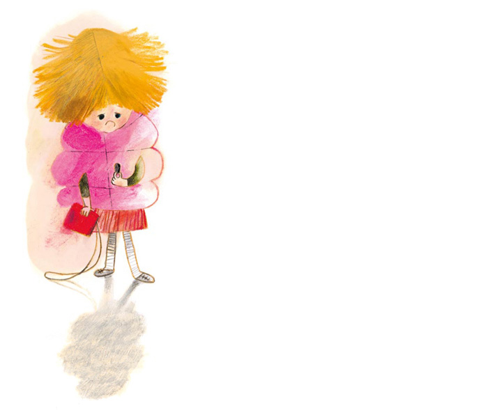
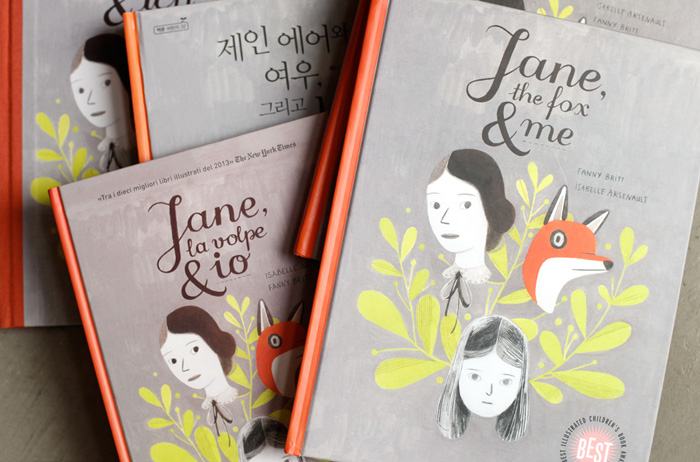
Catarina Sobral is a Portuguese illustrator, animator and graphic designer. She’s the creator of three award-winning picturebooks which are published by Orfeu Negro and translated into many languages. In 2014, Catarina won the 5th International Award for Illustration at the Bologna Children’s Book Fair.
In this post, Catarina talks about ‘O Meu Avô’ (My Grandad). The jury of the 5th International Award for Illustration at the Bologna Children’s Book Fair agreed that this work shows a great maturity, a strong personal identity, a clear control of composition, and profound sentiment shown through pure lines and primary colours.
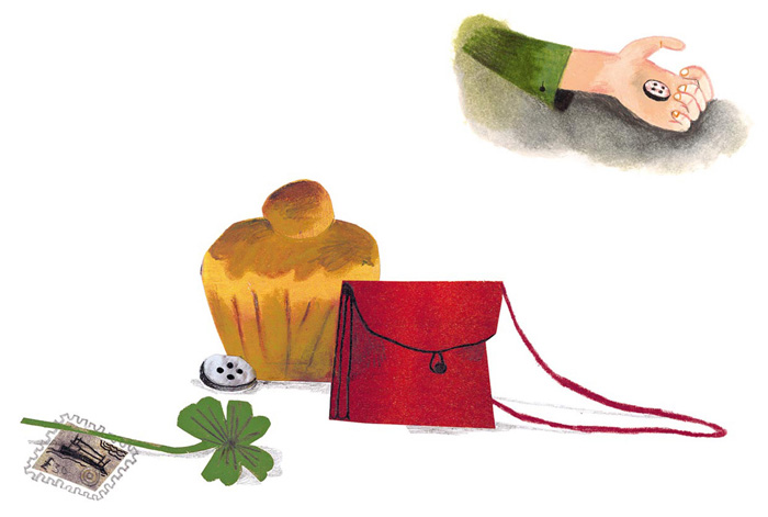
Catarina: At a certain point in ‘The Notebooks of Malte Laurids Brigge’, Malte begins telling the story of a neighbour who decided to trade all the years of life that he still had for days, hours, minutes and, “if you could bear it,” for seconds. As the days went by, however, he realised that no matter how much time he tried to save, there was none left. And that, contrary to what happens with a year, this “infernal pocket change” just kept disappearing – God knows how. He felt he’d acted too hastily and wanted to get his time back… in 10-year notes, four of them, and one 5-year note; as for the rest, the bank could have it!
This chapter made me want to write a story about time, more specifically about how we spend our lives running around and wasting precious minutes and seconds. Since I wanted to tell this story primarily through images, I thought about juxtaposing two characters (the neighbours, like in ‘The Notebooks’) and allowing the written text to narrate the routine of only one of them. This way, I’d be able to play with the relationship between text and image, between adjoining pages, and with the montage of the book.
At the same time, I wanted to make a book which was narrated by a child (in my books, the characters are mostly adults). This is when the grandfather (heavily inspired by Monsieur Hulot) and the grandson narrator appeared. The neighbour would obviously have to be someone younger, with an experience of the passage of time and of the rhythm of daily life – opposite to that of a dandy grandfather who writes love letters and has picnics on the grass. I named him Dr Sebastian (he’s a kind of alter ego) and he is introduced like this: “My grandfather used to have a clock store. Now he has plenty of time. Dr Sebastian is not a watchmaker (although he is always looking at the clock) and he never has any time to lose.”
Once the characters were defined, I moved on to the structure of the book: three double pages at the start where the characters are introduced, and three double pages at the end where the narrative is concluded. In between, all illustrations are single pages, with the grandfather on the important page (on the right). On the first two spreads and on the last one, the grandfather is on the left page, and only crosses the spine of the book when the text says, in effect, that the two characters usually cross paths in the morning and at night. The book doesn’t tell the story of a single day, but it felt like a good measure of time to use the start and the end of the day to start and end the book, giving the grandson’s words some circularity.
In many of the pages in the middle, I tried to find symmetries or similar compositions, positions or points of view, in order to reiterate the idea of juxtaposition. All the day-to-day activities that are described work in parallel and, at the same time, in opposition. For example, when the grandson says that his grandfather often travels to Paris, we see him sitting on an armchair, wearing a beret and looking at photos from when he was in Paris in 1962. It is metaphoric travel, and the image amplifies the meaning of the text. On the contrary, and furthering the text (which was purposely positioned on Dr Sebastian’s page), the grandfather’s neighbour is actually in Paris, astoundingly, on work. Like Monsieur Hulot in ‘Playtime’, who can never see the Paris of the Eiffel Tower and of the Sacré-Cœur, except in mirrors and reflections. But this is not the only reference.
My books talk with each other and with other works of art, and I like to introduce intertextuality in my books. There are also references to Manet’s ‘Le déjeuner sur l’herbe’, to Chaplin’s ‘Modern Times’, to Fernando Pessoa, to Almada Negreiros, and to ‘Groundhog Day’ (Dr Sebastian is a sort of Bill Murray, waking up each day on the very same day, with a Panasonic alarm clock).
The storyboard and the text were practically entirely defined before I began the illustrations, although several pages in the middle changed position after the illustrations were created, for the sake of rhythm. I wanted the illustrations to have a graphic tone that referenced the past (because we are talking about a grandfather and because of my own references), so I decided to do the book in spot colours, with overprint, and with a more geometric language. That is when I tried the following technique: overlapping acetates painted with acrylic paint, which is scraped with a box cutter, using the same principle as in linocut or woodcut printing.
I tried to use a contemporary language with the technique, printing and method of representation, even though I was referencing a different time. Of course, this was not a quick discovery; it never is. It always requires a lot of work before I get two or three images that look right for the tone I want for the book. But once those images are done, the process is a lot faster. Since I was going to use spot colours in overprint, I had to select two colours with high contrast. The colour that I use most frequently (other than black) is red, and red’s complementary colour is green. Yellow and pink were more arbitrary options. Since the acetate layers would have to be prepared digitally as layers on black, I used black acrylic paint. I also did this so that I could get greater contrast for scanning. Because of this, the book’s original sheets are a kind of photolithograph, where black is information that is turned into colour during offset printing.
The cover was designed to present the three main characters (grandfather and grandson on the front, Dr Sebastian on the back cover) and to create greater identification between the reader and the grandson (we only see the grandfather’s face on the inner pages of the book. On the cover and title page, he’s either cropped or with his back towards us).
Since my grandfather died young, I have the same physical memory of him as a child’s: someone very strong, very tall, a great man. And the grandfather on the cover could be any reader’s grandfather, even mine, who never wore a suit and caught rain with his shoulders. I hardly used any shadows in this book, but on the cover and the third double-page spread I decided to create an almost imperceptible visual metaphor: the shadow projected by the grandfather is shaped like the two hands of a clock.
The book’s closing sentence was decided after all the illustrations were created (including the one on the final page). Contrary to what seems to be said throughout the book (it is the grandfather who has a lot of time, not Dr Sebastian), the grandson ends the story saying: “Time flies when I’m with my grandfather.” After all, no matter how much time we have, the way we experience it is subjective: it always goes by too quickly when we are doing what we like. And it flies by in the company of those we love.
My Grandad and Dr Sebastian. Two characters, two different times. My Grandad used to have a clock shop. Now he has a lot of free time. He takes Pilates classes, learns German and writes love letters for hours on end. Dr Sebastian isn’t a watchmaker, but he never wastes a minute… This is a small format book on modern times, sprinkled generously with artistic references from Jacques Tati to Fernando Pessoa, the Portuguese poet.
Marjorie Pourchet studied illustration with Claude Lapointe at the School of Decorative Arts in Strasbourg. After graduating, she wrote and illustrated ‘La tête dans le sac’, which was selected for the 23rd Mostra d’Illustration in Sarmede. Since then, she’s illustrated books for publishers such as Sarbacane, Rouergue, Actes Sud and OQO.
In this post, Marjorie shares some beautiful illustrations and talks about her working process on ‘Mucho Cuento’ (Many Tales). This inventive picturebook, which was written by Enrique Páez and published by OQO Editora, is a celebration of fairy tales.
Marjorie: When OQO Editora offered me ‘Mucho Cuento’, I was immediately interested in the recursive nature of the book within a book. It was an opportunity for me to seize characters from classic fairy tales, and to plunge (once again) into the references and codes of the genre, and to play with them.
Up until that point, I hadn’t been asked to illustrate many fairy tales. But of course, I was inhabited by strong iconographic references which guided me in my research for this book: the engravings of Gustav Doré (I allowed myself a wink at one of his cover compositions to create my own), Bilibin, illuminations, books of spells, the yellowed pages with baroque ornaments crimping the illustrations in the earliest illustrated books… I had in mind an ageless storybook, somewhat magical, which would provide me with a narrative space.
In general, I see myself as a sort of stage director; my characters are my actors, and they can play many parts, from one story to another, depending on how I dress them up, apply makeup on them and style their hair… They are always somewhat alike; they all look a little like one another (almost in spite of myself). I lend them a life outside the book, and I’m satisfied with my craft when I come to believe they exist.
So this idea of characters who step outside books immediately appealed to me. The double meaning of the original title (in Spanish, I’ve been told that ‘Mucho Cuento’ literally means ‘Many Tales’, but it’s also an expression often used for anyone who play-acts and makes up lots of stories) served to guide my efforts.
The difficulty for me was in selecting from all these references, between all these fairy tale characters who I wished to conjure as a whole, and who I imagined to be one big family… I had to make certain choices for the sake of clarity, measure what I would present explicitly against what I would leave to the reader’s imagination, since my goal was that several narrative spaces would co-exist:
Sleeping Beauty’s bedroom was to be the backdrop of a scene where the characters play out and reinvent their stories.
The storybook would be the stage.
The library would bring us back to the space of reality.
The ornate picture frame, inspired by old illustrated books, would be the gateway from one space into another: from the inside of the book to the outside, from the text to the image, from one side of the mirror to the other. It would be the connecting thread, guiding you to the outcome of the story, to the final recursion. The librarian is a sort of magician who has access to this gateway and to this small world inside books: a sort of mother to all the characters who make up stories for themselves, like children do when they don’t want to go to sleep, absorbed by their game.
My creative process is substantially the same in each of my books: I draw a lot of sketches (maybe too many!) in order to carry out the ‘casting’ of the characters, and I think of all possible postures, scopes, allusions. This is generally rapid note-taking, with aesthetics not yet taken into account. Next, I hang them all around me and I try to reorganise them, so that I may find what will provide me with the tracks of a railway that will link the pages. Only after all of that is in place can I look into the implementation of the colour rendition that I have in mind.
Technically, in several of my books, there is reference to engraving. Here, this graphical tribute (to the first technique for the reproduction of illustrations) seemed to me to make perfect sense, since I referred to the portrayal of old books. In addition to quill work made in the style of drypoint, I used linocuts for certain recurring motifs, such as the famous ornate picture frame, trees, patterns in dresses… This is also a more playful approach to the colouring process.
I love to work on little details and I can spend a very, very long time on a single illustration. So I always try to remind myself how important it is not to lose the sense of play, so that the end result doesn’t end up strained. Also, my colour work was done in a lighter way than before, using inks rather than acrylic paint. I noticed that this has developed my drawing, especially my characters.
The graphical experiments put to use in this book are still being used in my current projects. I’ve built some little graphic tools for myself, which I feel can offer me lots of possibilities.
Sleeping Beauty is woken by a kiss. But instead of her charming prince, she opens her eyes to the Tin Soldier, who asks for her hand in marriage! Beauty discovers that while she’d been sleeping, Hansel married the ballerina, Prince Charming married the Little Mermaid, and Cinderella and Little Red Riding Hood moved into the woodcutter’s hut and have the wolf as a pet!
‘Mucho Cuento’ (Many Tales) features several stories in one, and an endless stream of characters who appear and disappear, leaving new adventures in their wake.
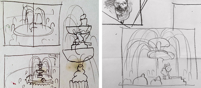
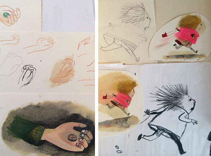
Øyvind Torseter is a Norwegian artist and illustrator who has created eight books on his own and several with other authors. He’s received numerous awards for his books, including a Bologna Ragazzi Award and the Norwegian Book Art Prize. In 2014, Øyvind was a finalist for the prestigious Hans Christian Andersen Award.
In this post, Øyvind talks about the creation of two books which feature the same character: the hugely successful ‘Hullet’ (The Hole) and his new picturebook, ‘Mulegutten’, which was inspired by a traditional Norwegian folktale and will be published in May 2015.
Øyvind: I have just finished a new picturebook that will be published by Cappelen Damm here in Norway in Spring 2015. It is based very loosely on ‘The Troll with no heart in his body’, one of the traditional Norwegian folktales of Asbjørnsen and Moe. The tale is about Askeladden (Ash Lad), the main character in many Norwegian folktales. He represents the small man who succeeds where all others fail.
I have had an interest in these traditional folktales for the last couple of years, and have made a lot of drawings by mixing images from the folktales with my own figures and images. It is fascinating working with them, as they trigger the imagination so much.
In the original tale, Askeladden had to go on a quest to save his brothers from the Troll. He had to go inside the mountain, where the Troll lived, and confront it. The Troll in the tale does not have a heart in his body; it is hidden and not to be found. The only way Askeladden can get rid of the Troll and save his brothers is to find the Troll’s heart and destroy it. Inside the mountain, Askeladden meets a princess who is also captured by the Troll, and together they start searching for the Troll’s heart.
My book is called ‘Mulegutten’ (Mule boy). I made my own story based on the original tale.
The book is a mix between a picture book and a graphic novel. I don’t usually have a lot of text in my books; the storytelling is mostly visual. But this time I did much more writing. Most of it is in speech bubbles.
I read the original text over and over again, and then put it away. I wanted to use the text as a starting point and then develop my own story.
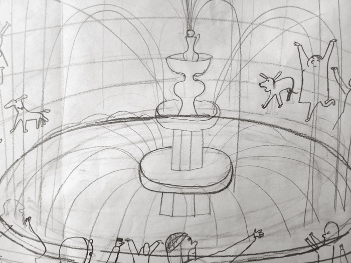
The following pictures are scans of the original drawings for the book before being cropped.
These are two of the first drawings I made, without really knowing how the story would go, creating the visual universe and working from there.
This is how I usually work when making my own books. I start making drawings without thinking too much. After making a lot of drawings, I start to put drawings together as sequences. Sometimes I do a bit of cutting and pasting.
This is the longest story I have done; there are a lot of images. At times, the project and my studio got very chaotic. There is a lot to keep track of when making a long story. But I really enjoy it. The chaos makes the images and the story grow in directions I cannot control.
Line drawing is my ‘default’ way of working. I like to draw directly without sketching, and to include accidents and coincidences that happen on the way. The drawing process itself is very important in how my projects develop. I have to be focused and concentrated while drawing; the line has to have the right feel to it.
I use colour to compose, pinpoint or tell a story. I use it in a controlled way as a contrast to the free line drawing. Here is a drawing before and after some cutting/pasting and colouring. I used masking film and acrylic paint to colour these images.
I mix different drawing tools and techniques. Here are my most important tools: fountain pen, ink, acrylic, soft pastels, watercolour, ink pad, handmade stamps made from erasers, knife, wax crayon, masking film, and different kinds of paper.
I have some characters that I like to use in my books: an Elephant man, a sort of a cat woman, and Mulegutten. I like to draw these characters.
This is from a book called ‘Detours’.
The main character in ‘Mulegutten’ was also the main character in another of my books called ‘The Hole’. This is a book with a hole punched right through the book, and a story about this hole.
I wanted to make a very physical book. So I drilled a hole through a lot of sketchbooks and started to draw using the hole through the papers as a starting point. I often start with a visual idea in my books.
At first, the ideas were obvious. Then after a while, the ideas got stranger and more interesting.
After producing a lot of these sketchbooks, I started working more critically – putting together sequences, maybe adding some new drawings… then turning the sequences into the story.
These are fountain pen drawings: scanned and bitmapped. I did the colouring directly in InDesign using Pantone colours. This was my first time working in this way. It is interesting because the display and the colour in InDesign was so different to how the printed book would look.
In a way, it was good working in this way: not knowing exactly what the printed book was going to look like. Also, the book is meaningless on the computer screen because it is a story that can only be told as a physical book.
I was a bit nervous about the printing of this book, and about the punching of the hole (after the book was printed, each book had to be holed manually). But everything was fine when I got it from the printer.
The protagonist of ‘The Hole’ has discovered a hole in his apartment and tries to find an explanation for it. He seeks expert advice. But not everything can be explained. Perhaps he’ll just have to accept that the hole is there?
‘The story is at once simple and profound, amusing and philosophical, the sort of quiet meditation that gently, playfully tickles us into existential inquiry.’ —Brain Pickings
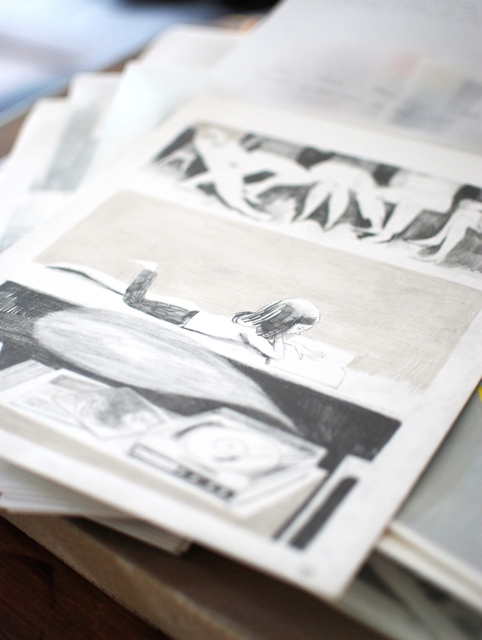
Joanna Concejo was born in Poland and graduated from the Academy of Fine Arts in Poznan. Her books have been published in numerous countries including France, Spain, Italy, Poland and Korea. Joanna was selected for the Illustrators Exhibition at the Bologna Children’s Book Fair, and ILUSTRARTE in Portugal.
In this post, Joanna shares some development work and stunning pencil illustrations from her interpretation of Charles Perrault’s much-loved fairy tale, ‘Little Red Riding Hood’. This beautiful picturebook is published by BIR Publishing in Korea.
Joanna: When the Korean publisher, BIR Publishing asked me to illustrate ‘Little Red Riding Hood’, I was so happy! For a long time, I’d wanted to work on it. It’s not really my favourite fairy tale, but it’s one that struck me and inspired me in my childhood.
When I was little, I found the Little Red Riding Hood character very stupid, and I didn’t understand how she could find herself in such a complicated situation, when it would’ve been enough to just not stray from the path and obey her mother… But it’s true that without all that, there would be no story. Later, I understood that the story was about many other things; my point of view shifted. But I was still unsatisfied with the illustrated books of ‘Little Red Riding Hood’ that were on offer in bookstores. I didn’t find in them what I felt and sensed. I wanted to offer ‘my story’ and now the opportunity had arisen.
I was really very fortunate, because the publisher gave me complete freedom and I didn’t even have to make a storyboard beforehand.
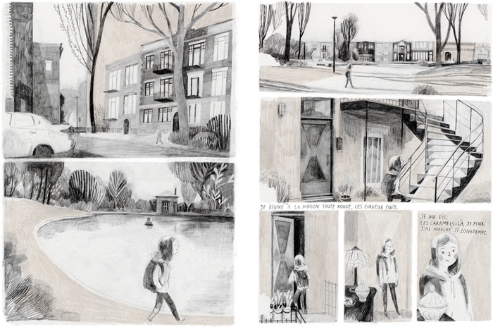
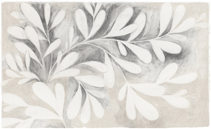
From the beginning, it was clear to me that the forest in which the story takes place is itself also a ‘character’ in the book. I was born in Poland, in a forested region, full of rivers and lakes. I always imagined that Little Red Riding Hood lived in the vicinity… I love the forest, I feel good in it, and I wanted to show it as an important element in the story.
In the illustrations, I also put in many other elements straight out of my childhood in the countryside: Folk embroideries from the region of Kaszuby, which my grandmother taught me, my love for manual labour, plants, ambiance…
The work for this book took a very long time; some boards required several days to be drawn… but it was also the most exciting, happiest time. The ideas for the illustrations came relatively easily as the work progressed. I would say that the time spent drawing the fullest boards, sometimes tens of hours, allowed me to really immerse myself fully in the atmosphere of the tale, and other images would appear in my head. Everything connected, everything found its place. Like that red thread that runs through the story, the thread with which you play, you communicate, you find and you lose, you catch and you tie… the thread with which, in the embroidery at the end, Little Red Riding Hood tells her story.
During the work, I had only to be receptive to what was happening within myself as I drew… to be open to that flow that came from somewhere mysterious and beautiful.
When people ask me what I do, it’s a little hard for me to answer. Because to just say that I am an illustrator is not really right for me. To say that I am an artist? That doesn’t suit me. I think that I simply express certain things which dwell in me, which are important to me, which make my heart sing and make me feel alive. And I do it through drawing. I just draw.
This is the form that suits me. This is my language. It’s built itself up from a number of drawings, of attempts, of erasures. It’s precisely the erasures which make me understand so many things, that allow me to advance, to understand myself through hours spent getting as close as possible to what I want to express, hours spent drawing blades of grass in a meadow, long periods thinking about everything and about nothing, while my hand pursues a dream on the paper… whether it’s raining, the wind blows or the sun shines, whether I’m feeling good or bad. This language is always in motion; it’s endlessly happening, full of surprises and astonishments.
I’ve chosen the simplest materials: the graphite pencil, coloured pencils and a sheet of paper. I love to draw in pencil because there’s something very intimate, sensitive, fragile and unsettling about it… The pencil traces every hesitation and every tremble of the hand. In a stroke of the pencil, the soul stands bare. It’s unprotected, despite the mastery of technique. There is tension, and that pleases me. Between two failed lines, there is this third one, invisible, which is right. There’s no use in drawing it. It’s there, all the more present by its absence. It’s the vibration between the other two lines.
I like to draw on old pieces of paper that I pick up all the time. I have lots of them at home. The pieces of paper that have already served, lived. That have traces of time, tears, stains, folds. Light has yellowed, or on the contrary, paled them… The papers that people have held in their hands, on which they have already written.
I like to inscribe myself in that continuum, in that journey through time; it inspires me, reassures me. While drawing, I have the feeling of doing no more than pulling out of the page that which is already there, even if it’s not visible. It’s as if the sheets are talking to me, showing me what they’re hiding. They’re more than a simple substrate; they welcome my drawings, make room for them, illuminate them with an inner glow, soft and mysterious. There’s sometimes a longing, a delight, a regret, an anxiety. I love when drawings grow restless, when they become insolent.
When I illustrate a book, I always think of writing it in another way, with imagery. I don’t think of illustration as being in service to the text. It should never be. What’s interesting is to create a dialogue between the text and the images, so that the two can, when meeting in the space of a book, tell something new and unexpected. They can open new pathways and new possibilities for interpretation. Let that meeting surprise, disturb, worry, question. I think this is possible only when the text and the images remain free and beautiful in their difference. When they are lovingly distinct. As two beings holding hands as they go together on their way. It’s their meeting, their relationship which is beautiful. For me, the same goes in a book.
Illustrating ‘Little Red Riding Hood’ was a true inner journey for me. A walk in the unfathomable forest of my unconscious, a return to childhood, but at the same time an opportunity to offer my interpretation of the text. I was very fortunate to have had the full trust of the publisher.
A little girl, her mother, her grandmother, a wolf and a hunter… The story of Little Red Riding Hood is well known throughout the world. It’s been described in hundreds of different ways by hundreds of different authors and illustrators.
This new interpretation of the much-loved fairy tale is told with stunning pencil illustrations by Joanna Concejo.
Lizi Boyd is an American artist and illustrator who creates children’s books, paintings, sculptures, rugs and various other things. In 2015, ‘Flashlight’ – Lizi’s second picturebook with Chronicle books – won the prestigious Bologna Ragazzi Award in the Fiction category. Lizi lives in Vermont with her family.
In this post, Lizi talks about the creation of her enchanting wordless picturebook, ‘Flashlight’. This masterful exploration of night, nature and art is published in numerous countries including the United States, France, Korea and China.
Lizi: A book maker needs a quiet studio and a merry band of believers to join in: a brilliant editor, clever eyes on the production, inventive marketing team, cheering publicity team and the band’s leader: the publisher. I am fortunate to have found all these wonderful people at Chronicle Books.
I’ve been making books for years; the work has become an old friend. She’s stubborn, demanding, insistent, questioning and forever curious. She also gives, delights and surprises me.
Zuli and Olive, my dogs, led me to ‘Flashlight’. They ran off on a moonless night. I grabbed a flashlight and went in search. I heard them in the field and flashed the light. Suddenly there was colour: their bright collars, fallen apples, tangled grasses and their eyes staring back at me. This is a book, I thought. The idea seemed so simple I was certain it had already been done.
My theory about ideas is that they float just above our heads. Whoever reaches up and plucks them down can take them. It seemed ‘Flashlight’ was mine.
At the time, I was working on another wordless book, ‘Inside Outside’. There was a wonderful rhythmic silence in the studio. ‘Inside Outside’ had been leading me far beyond its original sketches. The story was building in layers and nuances I hadn’t imagined. Its process was teaching me a new kind of patience and trust.
‘Inside Outside’ wasn’t finished but it waited a few days while I cut out pages to explore ‘Flashlight’. There was no story in my head. I mimicked what I was learning: following silence to sound. The sketches began by finding the images.
The sketches became a rough outline: a boy, a dark night and his flashlight. The characters presented themselves. The raccoon took the lead as he hid here and there, peering at the boy with his mysterious light.
‘Inside Outside’ uses die cuts as the book’s structure. They are an integral part of the storytelling: the reader looks through the window and sees a glimpse of what will happen on the next spread. (The boy is hanging up a drawing inside. Outside, through the window, one see the birds.)
The die cuts in ‘Flashlight’ work differently: they are little bits of discovery.
‘Flashlight’ uses several die cuts throughout: the moon, leaves and the rocks. Initially there were more: I liked the idea of creating another forest in the book made only of shadows. It would present itself only if the reader looked at the book with a light shining down through the pages. This might not happen for several readings. In the end, these die cuts were too problematic for the book’s production.
I made several completed dummies before I went to the finals. I was imagining the paintings being as simple as the idea itself: dark, sparse, only the single flashlight beam of colour. Once I began the paintings, this changed.
Then there was a question of what paper to use. I’d sketched ‘Flashlight’ out on a dark grey but in the end I chose a dense black. The paper was 100% cotton, absorbent and very unforgiving. I began by working just the greys on five or six spreads at the same time. I’d then add the beams of light that required a few coats of white. Working the illustrations this way felt as if I was preparing the forest for what was about to happen.
It was July, the month we spend at our summerhouse. Often, I’m in the midst of a book so I set up a small studio in the big room. The front of the house faces the lake, the backside the edge of the woods. There is no internet so there are few interruptions and distractions.
On one of my first nights at the lake, I saw the luna moth. It had just hatched and was drying itself, hanging on a tree. It was then that the luna moth began its flight through the pages.
Others presented themselves too: the tiny white spiders in the paint trays, the white moths circling the lamp. I’d go for a walk collecting things from the forest floor. The illustrations grew more elaborate and layered. The simplicity of my days, nature’s noise, her silence, the lake and woods all worked themselves into the book.
‘Flashlight’ is a wordless book but isn’t it filled with sound? If the raccoon is sneaking around in the bushes can you hear the scratching leaves? If the fish are jumping can you hear the splash when they land? If the owl is flying can you hear the hum of its wings? Sound is elemental.
At the end of July I made a terrarium of ferns and mosses to take home. I needed a little of the woods around me while I finished the book.
The cover, in sketches, had always been the boy shining his flashlight, looking out from inside his tent. When all the art was delivered, Chronicle felt it didn’t quite work. I’d submitted several title page ideas: one was of the boy with his flashlight. Chronicle suggested I reverse the two images, cover and title page. This is why as book makers we need our merry band of believers!
Months later, the first copy of ‘Flashlight’ arrived from Chronicle Books. When I opened it I bent my head into the inky smell of its pages. The smell was as pungent and dense as the woods themselves.
Inside a tent it’s cozy. But what is going on outside? Is it dark? Is it scary? Not if you have your trusty flashlight! Told solely through images and using a spare yet dramatic palette, Lizi Boyd has crafted a masterful exploration of night, nature and art. Both lyrical and humorous, this visual poem – like the flashlight beam itself – reveals that there is magic in the darkness. We just have to look for it.
Oliver Jeffers is an artist and illustrator who is widely known for his picturebooks for children. He debuted with ‘How to Catch a Star’ in 2004 to critical acclaim. This was followed by ‘Lost and Found’, which won the Nestlé Smarties Book Prize Gold Medal, the Blue Peter Book Award and was shortlisted for the Kate Greenaway Medal.
In this post, Oliver shares some illustrations from his award-winning picturebook, ‘The Incredible Book Eating Boy’. He also talks about his career as an artist and picturebook maker, and how his books and fine art are more closely linked than people often think.
Oliver: I am a storyteller at heart.
Though making picture books wasn’t the first form my storytelling took.
I am also an artist, and embarked on a career as a painter almost twenty years ago.
My early paintings were made as a form of storytelling. Many of my first canvases depicted moments that suggested a larger narrative that bled off the edges. Perhaps you’re viewing the middle of a story, or perhaps the canvas is pure momentum and the story is just about to begin. Sometimes what’s shown is the aftermath of events left undocumented.
Either way, it was all narrative.
They were all stories that occasionally used words as a way to either compliment or contrast what you were seeing. I had fun with that.
That was the way I told stories until I discovered picture books.
In picture books I found the true playground where words and images interacted with one another. It began when I was sketching for a body of work where someone is capable of physically catching something as intangible as a star. My singular sketches morphed into the beginning, middle and end of a story. Without much choice, I was left with a picture book.
That was that.
Many people believed that my career forked in two at that point: making picture books and making art. My picture books are clearly about telling stories and my art work is clearly about asking questions. But that isn’t entirely true – it didn’t fork.
Yes, my picture books are about storytelling at its most core level. I grew up surrounded by storytellers and learned, at an early age, there’s an art to the act. My books do not set out to impart wisdom or teach thinly-veiled morals. Rather, they are made to entertain, perhaps instil in others the sense of wonder and curiosity I’m fortunate enough to remember as a child.
And, yes, my art is about question asking. When picture books quenched my thirst to explore the play of word and image, the words fell away from my paintings. The words were replaced with numbers: first as a graphic device, then, not wanting to do so arbitrarily, I began to explore mathematics and how our world works. I fell into a fascinating conversation with my now wife about our different university experiences. I studied art, where as long as you have enough guff to back up what you make, you can pretty much get away with anything. She studied engineering where there’s a very clear right or a wrong answer with legitimate consequences. I became transfixed with this apparent paradox in how we understand our world. Here were two completely different, but entirely valid ways in which we could view things: artistically and logically. It is to that end I’ve been making art ever since.
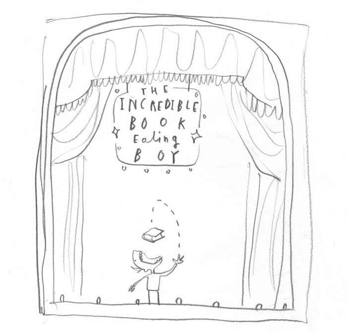
Now, nowhere is it clearer that the perceived split between my books and my art is not so, than with my third title, ‘The Incredible Book Eating Boy’.
As I mentioned earlier, I’m a storyteller at heart. As most writers and storytellers will admit, every so often we are lucky enough to find the nugget of a story that, once uncovered, tells itself. ‘The Incredible Book Eating Boy’ was exactly that type of story. This book came about because of three things.
The first is a random drawing I made while waiting on a delayed flight. It depicted someone throwing a book up through the air and into his mouth.
Secondly, I had been collecting a lot of old and discarded library books. I was using the covers for an art project called ‘BOOK’, whereby I sent a sketchbook around the world between myself and three other artists, in a call and response manner. Despite not needing the interiors of these books, I couldn’t quite bring myself to throw them away. So they sat in a pile beside my desk while I was trying to visualise this idea of making a book about books. The inspiration to draw on the pages of old books was one that occurred to me while staring at that pile.
Thirdly, I’d been making paintings about mathematics. When I initially started a series to explore the potential of simultaneously viewing the world both logically and emotionally, I began by placing mathematical equations atop classical style still life paintings. Through the first of these paintings (‘Understanding Everything’, a glass of orange with the equation for the refraction of light on top), I met a Doctor of Quantum Physics at Queens University in Belfast, who introduced me to the search within his field for the unifying Theory of Everything.
We decided to work on a project together, called ‘Additional Information’, where we paired equations with figurative paintings.
It was during that project that the final piece of the puzzle for my story fell into place.
It occurred to me that the byproduct of this ridiculous and graphic act of gobbling books must be that the information got digested by the brain. At this point, the story unrolled like a red carpet. It’s no coincidence at all that both projects were about the quest for ultimate intelligence.
Henry loves books… but not like you and I. He loves to EAT books! This exciting story follows the trials and tribulations of a boy with a voracious appetite for books.
‘Mouth-wateringly irresistible.’ —The Guardian
‘This is a book that children will devour.’ —The Observer
‘A beautifully produced edition that really is good enough to eat.’ —The Bookseller
JooHee Yoon is an illustrator and printmaker. She regularly contributes to publications such as the New York Times, Le Monde and the Washington Post, in addition to working on her own book projects. JooHee’s original pieces have been exhibited in gallery shows throughout the world, including the Bologna Children’s Book Fair.
In this post, JooHee talks about the creation of ‘Beastly Verse’, a boldly illustrated collection of animal poems, written by the likes of D.H. Lawrence, Lewis Carroll and Hilaire Belloc. This beautifully produced book is published by Enchanted Lion.
JooHee:‘Beastly Verse’ was born from an idea I had many years ago. I wanted to create a book bringing together my interest in the natural world with poetry. Often people seem to view poetry as something daunting, perhaps a feeling left over from long days in school struggling through strange words and the anxiety of memorisation. But this could not be further from the truth and I am always astonished by what a handful of words can accomplish. I wanted to share this appreciation, especially with children, who I think are naturally drawn to the rhythm and playfulness that can be found in poetry.
One of the challenges was to make the poems approachable. I was aware of other books previously published exploring a similar theme. But most poetry books I think have too many poems all crammed together and not nearly enough pictures. I wanted to create a book where both the writing and the images had equal importance, and at times the pictures had a bigger role to play in the telling.
My initial sketches were simple outline drawings capturing my ideas. The artwork went through many changes, mostly due to my dissatisfaction than anything else. But from the start I knew the element of surprise would be the driving force of the book.
The main challenge was capturing the story found in the poems in one or two spreads. Unlike a continuous story where each picture connects to the next and builds up the narrative, in this book each poem is a separate story. It was like having sixteen stories in one picture book. My solution was to use the flipping of the pages, to play with the before and after, sometimes the scale of the objects, and a fold-out page structure for some of the longer poems.
In order to make all of these separate narratives come together, I created a world these characters could inhabit through my way of mark-making and drawing. A place in which all the characters could be imagined to live together. Where hyenas play the concertina on their days off and pelicans multiply endlessly.
I am fascinated by the process of printing, both traditional printmaking techniques and the industrial process. Rather than mixing colours on a palette and putting it on paper, I enjoy working with flat colour layers overlapping one another to create the secondary colours. I admire books from the mid 1900s, when working with spot colours was the norm since reproduction methods were not as developed as they are today. It is amazing what some artists could do with so few colours! This is the same process I am using, but one from choice rather than necessity. I love the luminous, brilliant quality of the images when they are reproduced this way.
This book has been printed using just three colours: the pink, yellow and blue. The areas where the main colours overlap creates the secondary colours, resulting in a book that seems very colourful when in fact only a limited palette was used. Seen alone, each layer is a meaningless collection of shapes, but when overlapped on top of the other, it is magically transformed. I enjoy the challenge of figuring out what colour goes where to make a readable image. For me it is like solving a puzzle.
In selecting the poems, my goal was to bring to light ones with great humour and beauty and wonderful characters – poems that I remember enjoying when I first read them. I tried to stay away from the too well-known, but there are obviously famous selections such as ‘The Tiger’ by William Blake that were too good to pass up. Many of these poems have been buried by time and perhaps forgotten, as in ‘The Three Black Rats’ (pictured above). There are poems that typically don’t appear in picture books, such as ‘The Hummingbird’ by D.H. Lawrence, and ‘The Snail’ by William Cowper. Both pose challenging vocabulary and abstract ideas. But the imagery they conjured up in my mind made me feel these were worth keeping. And I hope over time, the youngest readers learn to appreciate the humour in the writing.
I wanted to create a book that not only tells wonderful stories but one that is a beautiful object. To me, the design of the book is just as important as the content, and the two are inexorably linked. I think all elements, from the font, the layout of the text in relation to the images, the binding, and the size and weight of the book, contribute to the experiencing of reading. This book was my most long-term project to date. From sketch to production took almost three years, and I hope readers enjoy it as much as I did in the making.
A playful romp through verse, rhyme, and gorgeous illustrations, ‘Beastly Verse’ carries children into the poetic realm in a way that is not only inviting but inspiring!
Consisting of sixteen wonderful animal poems, ‘Beastly Verse’ transports the reader into a richly-worded world of tigers, hummingbirds, owls, elephants, pelicans, yaks, snails, and even telephones!
Viviane Schwarz is an author, artist and maker of interactive books, games and comics. Her books have been published all around the world and have been shortlisted for the Kate Greenaway Medal (twice), the Roald Dahl Funny Prize, and have won her a Booktrust Best New Illustrator’s Award. Viviane lives in London.
In this post, Viviane talks about her hugely popular series of interactive picturebooks about cats, and how her childhood partly inspired their creation. She worked on the Walker Books series for eight years, and speaks here about some of the struggles she faced.
Viviane: I made three picture books with cats in them.
There are at least three friendly, colourful felines in each, up to about ninety. One book contains a complimentary dog. I like to keep readers happy.
I’ve been working as a picture book writer and artist for about fifteen years now – that is, as a published one. I’ve been making books all my life, pretty much. Before I could write, I drew and dictated them. My mother pierced bundles of my stories with a cast iron hole punch, and she said: “Behold the strength of your mother’s arms.” My father gave me binders to keep them in and said: “What are you going to make next?”
A page from my diary.
I was surrounded by books about everything that anyone in the family had ever wanted to know. Our walls were lined with bookshelves. My parents took me to the library weekly to take out as many as we could carry. It was awesome. I taught myself to read very early, because I had the notion that I could find anything I would ever need in books.
I was sure that I needed a cat.
I wrote a letter of complaint to the local newspaper about it. It said: I want a cat but my father doesn’t allow it. I couldn’t quite work out if my writing was made out of actual words yet, so I drew a cat on it for clarity. They didn’t print it anyway.
Cat, from my very early unfinished 240 page picture book epic, ‘The Hoop’.
For a few weeks, a neighbourhood cat visited me through the window until it got flattened by rush-hour traffic.
There were never enough cats in the books. Plenty of horses and dogs. I didn’t care for those at all. One day I found an old novel about a cat and a girl. I loved it, except when they were suddenly killed by a bomb. I carefully tore out the whole last chapter and made it into a small papier mache cat. Then I felt awful because I didn’t really know who the book belonged to, and whether it was the last surviving copy. I didn’t want to censor the story, I just wanted a copy of it where they didn’t die.
I resolved to only edit books that belonged to me and weren’t rare.
I cut and copied, traced and reassembled. I tried what happened if I changed boys into girls or mixed several books together.
A page from my diary.
Everything in the whole wide world could be found in books, but they were flat – even flatter than the cat who had been my friend for a short time. There was no way to get in there, even with scissors, but sometimes things could come out.
Pop-up books were great, but my favourite books had instructions in them. In an Astrid Lindgren book, some children escaped from a locked room by pushing a piece of paper under the door and tapping out the key. I did the same when I was grounded for glueing magazine pictures to the hidden sides of expensive furniture.
I didn’t think I wanted to be an author, or an artist. I thought that all adults naturally developed the ability to make proper art and books, like growing invisible antlers.
I wanted to be an inventor.
When I was twenty-seven, I had learned English and studied literature for a while and got a master’s degree in illustration. I moved to London to create picture books for a living.
I learned that in London, invisible antlers are not enough to keep you safe.
I had massive panic attacks every day, leaving me in so much pain that I could hardly draw a circle, let alone a whole book.
My publisher, Walker Books, gave me a desk in their offices so I could come in and work there.
“I don’t know what to do,” I said. “I can’t draw any more.”
“I think you should write a book about cats,” said Deirdre McDermott, head of picture books. “Cats have flair. People keep drawing cats. Someone has to write the stories.”
The next week, I told Deirdre that I wanted to write a book that actually had cats in them.
“Not just drawings,” I said. “A book that has cats in it, for when you really, really need them.”
“What would they be doing?” she asked.
“They’d be having the best time,” I said. “The best time ever. All day, and then you’d read it again. And again. It would never end.”
“I think you should draw the pictures yourself,” she said.
I went home and tried to draw. I cried because I couldn’t.
Then I put away my drawing nibs and pencils and tried to use brushes instead. I painted big, colourful shapes and didn’t even try to use detail. My arm still really hurt, but by and by, I filled a sketchbook with cats.
(Jeffrey didn’t make it into the book)
(Moonpie did)
Deirdre said: “I would like you to meet some people. I think you’ll work together well.”
Ben Norland and Lucy Ingrams art directed and edited all three books. I think I’ve never had more fun than working with them. I convinced them that I could invent a book that actually had cats in them, for when you needed them.
They gave me blank dummy books of the right size which I scrawled all over.
There was no beginning, middle or end, just badly drawn cats trying out everything they can do with a book, like kids trapped in a paper playground.
I cut and copied, traced and reassembled.
I made holes and tore pages in half.
We talked about meta levels and emotions and glue dots, clowning and Robert Altman movies and having to present this in sales meetings. We talked for months.
“It’ll be like magic tricks,” I explained, throwing a used up marker pen across the office and missing the bin.
Magic tricks were another thing I read a lot about as a child. I had a strong interest in escapology.
Misdirection is important in magic. So is repetition. My favourite thing, though, is that it is very easy to confuse the audience about causality and agency. Try this: when you notice that the sun is just about to come out from a cloud, quickly say something wonderful.
Cause and effect are easily reversed in human perception.
In ‘There are Cats in This Book’ the cats keep telling you to turn the page. You were going to do that anyway. What else, tear it out? But that’s what cats are like. Telling you to wake up just before the alarm goes off. Telling you to feed them when you are already holding the cat food.
So you keep turning the pages, until…
just for a moment, it changes. You do what they ask. It must be because they are your friends, and you are a nice person.
When the first book came out, I had the usual fear that everyone would hate it or a child would choke on a badly designed part (actually, there’s extensive testing where the books get ripped up and eaten by robots, I am told). Instead, I suddenly found that strangers were nice to me, because they’d enjoyed the book. People told me how their children talked to the cats. Often the children renamed them and decided what gender and age they were, and I was glad that I had left space for that.
They asked me to make another book, so I did.
Thumbnails and notes for ‘There are No Cats in This Book’.
And a third, with a dog in it, for everyone who asked when I’d make a book about dogs instead of cats. It’s a shy little dog of the sort that doesn’t make me sneeze too much.
‘Is There a Dog in This Book?’, Walker Books, 2014.
After the second book, Moonpie the blue cat started to get fan mail. People send me letters saying that one of the other cats is their favourite, but Moonpie is the only one to quite regularly get addressed directly.
I think of the books as ongoing little theatre shows – paper stages with flat cats acting in the voices of whoever is best at reading or has memorised all the lines.
Sometimes I catch a performance in a bookshop: parents trying the book out. I tried to write it so that it’s easy to perform. If it’s fun for the person reading out, it’s probably fun for the person listening.
‘There are Cats in This Book’, Walker Books, 2008.
On the way to my first author’s talk I gave the books to some kids on a train to stop them from playing hide and seek, which is not a good game to play on a full train. They read the book to each other and agreed that the cats looked nothing like real cats, then they read it again. And again. It’s good to have cats in a book when you need them.
‘There are No Cats in This Book’, Walker Books, 2010.
I put a lot into these books. No, literally: I put a lot of stuff in there. Their comfy blanket is a photocopied piece of knitting I did when I thought it would be nice to have a cosy blanket myself. Their exciting holiday destination outside the book is a particularly boring wall in Peckham, where I lived then.
Moonpie looking for a place to park his mobile home.
The boxes they play with are all from my local Lidl; I collected a stack on a very windy day and almost got blown into the street.
Original art made from many tiny bits of many large cardboard boxes.
I also put a lot of love in there. I made sure that the cats were safe and kind – not to pretend that it’s a safe and kind world, but because their book exists in our real world. I knew they’d have to deal with some harsh challenges, for example being torn out and sellotaped back in. You are a very lucky person if that never happens to you; actually, most people get sellotaped back together at some point and not all of them neatly.
The tricks aren’t the point of the book. The cats are. For when you need some cats.
All the unused paintings of Moonpie panicking on the sofa.
Did I tell you enough about how the cats are painted? I paint them quickly, with liquid dye and indian ink, many times, until they look exactly right. That’s all there is to it. I painted every character so often that in theory I could animate the whole thing just with the pictures I didn’t use. I throw away most of the spares, though, and keep only the few that seem alive, to arrange them into new scenes and sell them.
A while ago, someone asked me if they could translate the speech bubbles into other languages and just glue them into the copies they bought. Of course it is. I really hope that there are many copies out there with speech bubbles glued in.
You can make them say anything you like, actually, as long as it’s your own copy. If you do, write your name on the front cover along with mine, and put ‘edited by’ – I think that’s fair, so that we all agree I didn’t write it like that.
It’s your book, with your cats in it, for when you really need cats.
It’s maybe someone else’s book too, though, so ask them first, even if they are very small. It’s not okay to mess with other people’s books.
‘There are No Cats in This Book’, Walker Books, 2010.
Oh, yes, and I’m better now.
But I still like to draw with brushes. And, this is the best thing:
When did you last play with cats… inside a BOOK?! The cats in these books want to have fun, and by turning the pages and flipping the flaps, you can play their favourite games with them!
‘Witty, original and charming… extremely successful with toddlers, who will not only enjoy the jokes and connection with the cats, but also learn to understand and delight in the way books work.’—The Sunday Times
Eva Lindström studied at Västerås Art School and Konstfack in Stockholm, and has since created a long list of highly acclaimed picturebooks. For her contribution to children’s literature, Eva was nominated for the Hans Christian Andersen Award and the Nordic Council Children and Young People’s Literature Prize.
In this post, Eva talks about her working process and the creation of her beautifully illustrated picturebook, ‘Alla går iväg’ (Everyone walks away). This understated tale of friendship and loneliness will be published by Alfabeta in September 2015.
Eva:‘Everyone walks away’ is the name of the book I have just finished.
This is how the story goes:
Three characters walk away. One character is left all alone. Then this character walks away too.
At the end, the three characters appear again and the lonely one invites them to a tea party.
The story is rather quiet and emotional and it ends in an open way. The reader will be able to finish the book herself, or accept that it ends with a question.
I always start with just a fragment of an idea when I begin working on a book. A state of mind, a diffuse idea, a feeling of something that can turn into a story. And then, the more I write and rewrite, the clearer it gets, or it gets unclear in an interesting way.
All of the pictures are in my head while writing. The colours, the personalities, the landscapes: everything is there, pointing out a possible way to tell a specific story. And the stories often circle around subjects, such as lost things, lost people, friendship and no friendship, longing…
I really try to tell stories about other things too, but I seldom succeed.
This time, it happened to be a story about how one character is sad because he thinks that ‘everyone’ is walking away.
His name is Frank, and the ones who walk are Palle, Titti and Milan.
Why do they walk away? Does Frank enjoy being an outsider? Is Frank the one who is leaving? Is everyone walking away?
I don’t ask these questions while working on the book. It is when the book is ready that I first start to wonder: What is happening? Who does what? A good thing for me is to not know everything.
First there is the text and then the pictures. I start to paint and everything changes; a new story is told without words. And the best part of the whole thing is when I work with the words and pictures together. I rearrange the text (it is not allowed to say too much), cut most of it, write new pieces. And as the text changes, I paint another room, other trees, other faces.
I want there to be a space in both the words and pictures: small gaps where the reader can walk around. It is important that the text is not a fence. If I am lucky, a certain humour can appear when the words meet the pictures in an unexpected way.
In this book, as with some of my others, I have mixed people and animals.
Frank has a rather long nose and Milan has a longer one. The other two seem to be ordinary people. One reason for me to mix the species is because I feel that the pictures become interesting. Different kinds of bodies and faces make the pictures attractive and I have fun while drawing them. Another reason might be that this animal/human mix moves the story to a place outside the everyday world.
It is hard to clearly explain all the decisions that are made while working on a book. I think that the work itself, how it proceeds, makes things happen. Along the way I see options; the story has suggestions. I can follow these suggestions, and one thing opens up to something else.
Some years ago, I never did any sketches for my books. Now I do. Not always, but sometimes, and I am beginning to see the point in doing them. I don’t make them detailed – only very simple sketches that show in a vague way how things might be.
My working materials are watercolour, gouache and graphite. I paint on an Arches paper (300g, satin). I like it very much when transparent watercolour meets thick gouache, and I also like graphite contours – and spaces covered with graphite.
This is how I do it right now; I might change my approach soon.
A good thing with gouache is that it helps me to cover my mistakes. It is easy to paint something else on top of something that went totally wrong (I don’t use a computer). The resulting composition can be a surprise. The picture can take a new direction, as if I was not involved in the decision. A dark tree hides something and the picture gets a new balance.
It is always a step in the right direction to do something that I am disgruntled with.
Here are some badly painted hares. The picture is from a book called ‘We are friends’ (Alfabeta, 2014). Some of these trees and stumps would not exist if it were not for the ‘hare failures’.
Coincidences, accidents and failures are my best friends.
And here is Frank.
He is leaving his room now. The story will soon end.
He has been crying in a pan. He added 4 dl of sugar. He has cooked and stirred for hours.
The marmalade is ready to eat.
He will now invite the others for tea.
Frank feels lonely when everyone – Palle, Titti and Milan – walks away. He puts tears and sugar in a pan and lets it cook for hours. Frank’s marmalade. His very own recipe.
This beautifully illustrated tale of friendship and loneliness will be published by Alfabeta in September 2015.
Beatrice Alemagna, who grew up in Bologna and now lives in Paris, has created about thirty books which have been published all around the world. Her long list of accolades include the Premio Andersen Award, a Bologna Ragazzi Mention, five White Ravens Awards and three Baobab Prizes for the most innovative books for children.
In this post, Beatrice talks about the creation of her stunning new picturebook, ‘Le Merveilleux Dodu-Velu-Petit’ (The Wonderful Fluffy Little Squishy). She also shares some fascinating insights into her approach to storytelling and picturebook making.
Beatrice: I’m self-taught. I never attended a school of illustration, and everything I’ve learnt has been through making children’s books. I learnt by experimenting on my own, at my table.
I’ve been making books for over fifteen years and each time feels like the first time.
‘Le Merveilleux Dodu-Velu-Petit’ (The Wonderful Fluffy Little Squishy) is a book that required six years of reflection and two years of solid work.
Since I was little, I’ve been deeply fascinated by an episode of Pippi Longstocking in which she decided to look for ‘Spunk’, a word she invented and something that doesn’t exist at that time. It’s always stayed with me – the idea that in the end, you always find those things that don’t exist. And I convinced myself that this would require a long search in the shops.
This book is partly a homage to Pippi and the fascination I experienced when I was little: entering a shop full of things that were waiting to be discovered.
The most difficult thing that I’d wanted to convey from the beginning was a sense of lightness.
Over the last few years, I’ve started to take lightness very seriously – not lightly, as I did before. For me, lightness has become the place where serious things come together.
Upon reflection, I understood that lightness might elude us because of its subtlety. It’s not banal, and can in fact become the peak of tension in seriousness. The light discovery of something unique (like in Eddie’s adventure) summarises the idea of childhood that I wanted to convey in this book. Childhood as a moment of glory.
The whole book stems from the character of Dodu. One day, out of nowhere, I drew this kind of electrified dog and I instantly felt the need to tell its story.
Often the characters themselves call out to us, and for me it’s nearly always like this. At first this book was destined for Japanese readers. I started my very first drawing six or seven years ago. But the story was very different back then. The main character and the search in the shops were already there, but the little girl didn’t have a character yet, and the adventures Eddie lives through today didn’t exist.
I spent years taking photos of the most beautiful shop windows during my trips around the world.
My writing and all this research were left in my drawer for nearly six years: the necessary time for it to mature and come to life.
I wrote and rewrote my story at least ten times, asking myself how I could actually manage to tell what I wanted to through an adventure. A simple and classic adventure, in literary terms. I’d never written a real adventure before and it turned out to be a hard task.
With this in mind, ‘Le Merveilleux Dodu-Velu-Petit’ is very new for me.
But inside lie the core themes of nearly all of my books: travel, departure, the search for something, and accepting oneself. I think, deep down, I always want to tell the same story: a fragile being that finds great strength within himself.
My drawings required dozens of attempts as well. When I draw, I’m always looking for something. I keep going until I find something that tells me: yes, you’re on the right track – this couldn’t be any other way.
In order to tell this story with a ‘light language’, I wanted some of the main factors of fragility to play a part. Children are extremely fragile and Dodu is an abandoned, vulnerable being.
I wanted to talk about care, about every form of attention, research, and love (through the love for her mum, the little girl discovers the love for herself and her friends, who help her and advise her, offering her care and love).
I also tried to convey lightness in a visual way: snow, birds, steaming tea, gushing water, ruffled hair, Eddie running.
I wanted all this lightness to tell the story of the immense and fundamental power of fantasy. And the character of Dodu, with his bold colours and peculiar face, symbolises exactly this power.
I grew up in Italy with the popular traditions of Gianni Rodari, Luigi Malerba, Collodi, De Amicis… Children have always been connected, as in my childhood, with society and its problems. And so are all the characters in my books: beings in need.
Thanks to my love of foreign cultures (for example, English nonsense, Japanese animism, German surrealism, and the magic of Russian and Scandinavian fairy tales), I always try to explore new worlds and new visual languages.
It’s absolutely impossible to identify myself with something precise, because I want to explore, change and evolve – even at the risk of letting my readers down.
My books always emerge from a million doubts, reflections and redrafts.
Nothing is clear to me while I’m making a book, but everything flows naturally in my head. The hardest thing is trying to reach it.
I would like to say that I write books in the same way as I see or think. But this isn’t true. While drawing is perfectly natural to me, creating a book with a narrative pace to be respected is a laborious and sometimes painful process. But at the end of the book, the suffering always makes way for immense happiness.
I love mixtures and hybrids. I love avoiding walls or barriers. I love not worrying about age limits, time limits, precise aesthetic rules, pre-established conventions…
All of this comes from a huge trust in myself. I always work with something from within, which is strong and expresses itself clearly and intensely.
Lastly, I love paradoxes: my books often have big formats (I don’t like feeling constrained by the page), but they often talk about small things. I love discovering minuscule things in nature, in people’s faces, in the emotions I feel. Small things, like fragile things, are what move me the most.
One morning, Eddie wakes up and hears her little sister say these words: birthday—mama—present—fluffy—little—squishy. Worried that her sister will find one before she does, Eddie runs off on a hunt. But where should she begin? At the local shops, maybe?
Eddie’s search – magical and entirely her own – leads her just where she needs to go.
Pablo Auladell is an award-winning illustrator and cartoonist who has created books with publishers such as Actes Sud and Libros del Zorro Rojo. He represented Spain at the Bologna Children’s Book Fair, and he won the Second National Prize for Illustration. Pablo teaches at the Ars In Fabula Scuola di Illustrazione (Macerata, Italy).
In this post, Pablo talks about the creation of ‘La feria abandonada’ (The abandoned carnival), a stunning picturebook he collaborated on with two friends, Rafa Burgos and Julián López Medina. This poetic, melancholic work is published by Barbara Fiore Editora.
Pablo: Some of my books come from publisher commissions and some books come from within. ‘La feria abandonada’ (The abandoned carnival) belongs to this latter category. A book which for years was just the outline of an idea in one of my folders. Of course, even in that initial stage, the project was called ‘La feria abandonada’. In my case, the title is always the first thing that comes to mind – the first thing that needs to come up in order to begin working with a guideline, because what is not named does not exist.
I finally decided to start it, fed up with the poor quality of the supposedly poetic texts that publishers asked me to illustrate. Until then, I had only written texts in my comics, but never in my picture books. I had the basic idea and outline of the book and some written texts, but decided to accept the help of two old friends – the journalist, Rafa Burgos, and the poet, Julián López Medina – because I thought that a variety in the style of the texts would enrich the project.
I gave them an initial skeleton of the book and a few instructions on the features that the texts should have. They began to send me what they were writing and I rigorously approved and selected, attentive to the music of the book and the claims that the book itself demanded as an autonomous and mysterious animal.
Meanwhile, I was creating the illustrations. The biggest job was to build and perfect a suitable technique for what I wanted: Mediterranean images, minerals, with a mural texture, with imagery based on Spanish painting and the popular festivals of Spain and not on the freak shows of the more Anglo-Saxon model.
So, for a year, we carried on arming and disarming, building and demolishing and fitting together the pieces of this sudoku of melancholy: this almost middle-aged book, where I believe my imagery has collected during these last few years and which expresses the main feeling accompanying me during this time… the conviction of witnessing the collapse of a world, the disappearance of many things that I always considered safe.
I am convinced that it was a good move to collaborate with Rafa and Julián instead of writing all the texts myself. In doing so, the book has gained nuances: the texts by Julián are more philosophical, conceptual, sharp; mine are essentially lyrical; those by Rafa have a more direct tone and relate to very specific, recognisable, and everyday things.
It now seems very faraway, almost unreal: the mornings at my desk, drawing all this with a suicidal enthusiasm and very simple tools (a pencil, a few pastel colours and something to scratch and sculpt the charcoal).
Bob Dylan says that when he listens to his songs, they seem to be created by someone else. And I feel something similar, now looking at all those illustrations and those clean and well groomed texts in their analogue and portable box, ready to communicate, or not, with you. Left behind are dozens of failed drawings, texts that didn’t find their place, negotiations with publishers and some disappointment.
And it has been quite some time since I, at least, have worked on any other stories… and so this book has come to resemble itself and, you guessed it, is another ‘feria abandonada’.
Places where we’ll never go again… The people who couldn’t accompany us, are they not, perhaps, an ‘abandoned carnival’ – the remains of the piñata and the dance, the silent carousel where now only the suns of time revolve?
Beneath the broken banners, there are now other attractions, other quiet sleights of hand. Small bands of shadow. Broken-down jalopies going nowhere.
Andrés Sandoval is a graphic artist who studied Architecture at São Paulo University. Since graduating, he’s created books with publishers such as Companhia das Letras, Cosac Naify and Planeta Tangerina. He’s also produced artwork for numerous companies and brands including Coca-Cola, L’Occitane and The New Yorker.
In this post, Andrés presents two unique books which have very different visual languages, but are linked by symmetries. ‘Os Pontos Cardeais Acrobatas’ (The Acrobatic Cardinal Points) is published by Cosac Naify, and ‘Socorram-me em Marrocos’ (Help me in Morocco) is published by Companhia das Letras.
Andrés: The first of the two books I will talk about in this post is called ‘Os Pontos Cardeais Acrobatas’ (The Acrobatic Cardinal Points).
This project began on a trip to Japan in 2008 when I found a magazine that came with a cutout 3D pinhole – one of those unbelievable Japanese objects. When I got back to Brazil I produced a series of publications made with this machine and also some 3D drawings. I often start with small fanzines and sketches that I can consult in order to design a book.
The challenge was to use 3D language as a poetic device and not just a magical effect. It was also essential to consider the book as an object, with simple things like sheets superimposed, bound and folded to one side, with the intention of being able to leaf through from one side to another – a device I am always returning to in my work.
Behind the cat’s cradle game is my admiration for creating drawings with the hands in which the vertices are our own fingers. There is a delicateness in keeping the game going, without competition, where the goal is only to create figures. The players can afford to risk, at any moment, seeing their figures dismantled or becoming a knot. In this book, each hand is located on one page. By leafing through the pages, the hands touch each other like in the real game, and the lines fly over the book. That was the image which I pursued and wanted to see in print.
With the help of a photographer friend and assistant designer, we carried out around five photo sessions in a studio to get the texture, the light and the size of the images. We also captured the texture and the colour of the curtain and the lines, as well as the gesture of the hands (curiously this led us into unnatural positions at the time of shooting). In my childhood, the cat’s cradle had never been my speciality, so it was necessary to study the game – learning from specialised books to get a sequence of steps to be shown throughout the book.
On the photographed lines I decided on a graphic intervention. Perhaps by virtue of my motivation as an illustrator, I created characters balancing on the tightrope. It reminded me of a play that takes place on the moon by Vicente Huidobro (a Chilean poet who inhabits my depths), where four trained cardinal points are presented.
After personally seeing Calder’s circus in MoMA’s collection, as well as the books of Sol LeWitt, it became easier to realise these single characters. While hands play to make stars with the string, the cardinal points dance with each other and become a rainbow, a compass rose, a tower, and various other things.
Onto the next book, ‘Socorram-me em Marrocos’ (Help me in Morocco).
Like the cat’s cradle, this project also uses symmetries. While in ‘The Acrobatic Cardinal Points’ there is an almost hypnotic devotion to the mirrored image, this book had the challenge of undoing these figures.
The proposal for this project was to illustrate palindromes (noting that palindromes are those small sentences that can be read backwards). When I approached the subject, I realised that I was surrounded by geometries, pure forms and folds, and there was also an idea that perhaps the best book would be made only with letters.
After drawing a lot and even abandoning the project, I got back into it with a strong decision of leaving aside those mirrored images and typographical studies to make room for more open and humorous interpretations. The project turned into a dare – an effort to assert the illustrations.
I worked with a simpler and more familiar language to reflect my point of view about the sentences. The only mirror was the relation between text and image: one says one thing, the other one answers, and vice versa – and thereby finding the best angle to observe these small crystals.
Gradually, I discovered figures such as synchronised swimming, Alice’s mirror, Medusa, and stalactites. I became increasingly seduced by the natural eccentricity of palindromes. There is a certain ‘mystery of discovery’ in them; once the words come together, nobody wants to tear them apart. It is nice to see them together.
Here are some palindromes with their translations:
‘Ser cor e ser ocres / Being colour and being ochre’,
‘Lá vou eu em meu eu oval / There I go, in my oval I’,
‘Rir, o breve verbo rir / To laugh, the short verb to laugh’,
‘Ele parece tecer a pele / He seems to weave the skin’,
and ‘Socorram-me em Marrocos / Help me in Morocco‘, which became the title of the book, and is an excerpt from one of the most famous palindromes in Brazilian Portuguese.
The four cardinal points present their acrobatics on the tightrope…
This 3D book from Andrés Sandoval explains how to play the famous ‘cat’s cradle’ game while the cardinal points dance over the strings, trying to form the compass rose.
Made with twenty-three anaglyphs. 3D glasses included.
A selection of twelve Brazilian Portuguese palindromes, selected and illustrated by Andrés Sandoval.
‘Palindrome’ in Greek means ‘to run back’, and it’s exactly this that defines them… All of these lines can be read either from left to right or from right to left – as if the words were running back to say exactly the same thing, but in the opposite direction.
At the end of the book, Andrés talks about this ‘phenomenon’ of our language.
Mini Grey was born in a Mini in Newport, Wales. After working as a theatre designer and a primary school teacher, she took a Masters in Sequential Illustration at Brighton University. She’s since created many successful picturebooks including ‘The Adventures of the Dish and the Spoon’, which won the CILIP Kate Greenaway Medal.
In this post, Mini shares some wonderful development work and stunning illustrations from ‘Hermelin: The Detective Mouse’. This picturebook was quite a challenge for Mini to create, and she talks here about how she solved the mystery of the story.
Mini: As a child I tried to make something every day. I very much liked the world of the tiny – in fact we had a box in our toy cupboard that was just called SMALL THINGS. At one point I desperately wanted a mouse for a pet, and made my own mouse out of fur fabric and kept it in a cardboard box, though it never really fulfilled my pet-expectations.
I watched absolutely mountains of television as a child. I loved the films of Oliver Postgate and Peter Firmin– especially the ‘Clangers’. I loved the home-made knitted look of the Clangers, and the charming mystery of their life on a strange planet where you could grow your own music on trees and get blue string pudding from soup dragons.
Anyway, what I’m going to tell you here is about the making of my book, ‘Hermelin: the Detective Mouse’, and it’s a long and meandering tale that takes place over quite a few years.
Our story starts with a lost pet and a cheese box.
Here’s the lost pet:
The lost pet was our cat, Bonzo. We’d moved house and not installed a cat flap, and one night he went out of the window and didn’t come back. We put up posters for Bonzo on every lamp post, we searched the neighbourhood, we called for our cat high and low. But I couldn’t help noticing there were quite a lot of lost cat posters appearing on our local community noticeboard. Where were the cats going to? What if there was a mystery to investigate here?
The cheese box was this one. It came from Prague; the cheese inside was a sort of Camembert. I didn’t much like the cheese, but I really liked the box. Who might find themselves inside a cheesily-scented box like this?
It really had to be a mouse.
Now it seemed to me a mouse would make a perfect DETECTIVE or SECRET AGENT or OBSERVER, because it could travel incognito through drain holes and sewer pipes and gutters and cavities and tunnels – from rooftop to underground. It could get into kitchens and attics and all around a neighbourhood. Mice have special abilities; mice can drop huge distances without being hurt because they are SMALL.
Here is J.B.S. Haldane from ‘On Being the Right Size’: “You can drop a mouse down a thousand-yard mine-shaft; and, on arriving at the bottom, it gets a slight shock and walks away. A rat is killed, a man is broken, a horse splashes.”
Mice also love rubbish, and nibbling, and to be near people… However, people don’t like mice and usually want to EXTERMINATE them. In fact the word mouse comes from mus: ‘to steal, rob’.
Some mouse crime:
So there’s a terrible existential predicament in being a mouse.
I decided Hermelin was going to be a white mouse who wakes up in a cheese box, and discovers he can read. And there could be so many things to read: bits of newspaper, advertisements, cornflakes packets, crisp packets, milk and juice cartons, postcards, notes, posters…
Maybe a whole community noticeboard full of clues… (I’d seen the film ‘The Usual Suspects’, where at the end you discover the whole story has been constructed by Kevin Spacey’s character from the ephemeral fragments in front of him on a police noticeboard).
I made a few Suspicious Objects:
I made a picture of a mouse at a typewriter. Was this a way my mouse detective could communicate with a whole neighbourhood?
And if he left notes, no-one would know he was a mouse. (And here I must owe a debt to the marvellous ‘Anatole’ by Eve Titus which I had loved as a child.) An inspirational book was Graham Rawle’s ‘Diary of an Amateur Photographer’, which is a facsimile casebook of typed notes and found fragments.
Sketchbook – first ideas:
I needed to collect ingredients for this story; here are some little brainstorm pictures of situations Hermelin might find himself in:
Telling the story – we’d need the voice of Hermelin typing on his typewriter. I tried putting words with the pictures – trying out a bit of typewriting voiceover (in the sketch page below I haven’t realised yet that I need to be typing in Hermelin’s voice – d’oh!):
But I just couldn’t work out what was happening to the cats.
The secret truth is – although I really wanted it to be about the lost cats, I couldn’t solve the lost cats mystery. Here are a few of the ideas that just didn’t work:
So I was stuck with the lost cats – and then despite wonderful suggestions, support and help from my editor, Helen MacKenzie Smith, I just had to put the whole thing aside.
AT THIS POINT SEVERAL YEARS GO BY…
Then my next editors, Sue Buswell and Andrea MacDonald saw the Hermelin rough book again and thought perhaps it wasn’t so far away… if we could just put those cats aside, and make Hermelin’s journey from would-be detective to mouse-pest and back again the focus of the story.
Here’s some Hermelin storyboard sketches:
And some mice:
Often at the end of my favourite picture books you feel you’ve really been somewhere else. This story, to bring you into Hermelin’s world, seemed to need a real tangible sort of environment; there seemed to need to be a bit of a realistic setting to tell this story, maybe so that a mouse who can read is an unusual thing. The pictures were going to be cluttered with layers of readable stuff; loads of notes, messages, sweet wrappers and found items and general printed detritus.
Making the pictures: these are mostly painted in Quink and watercolour on heavyweight ordinary paper, with ink and coloured pencil on top. I used masking fluid quite a lot so I could splatter backgrounds or do messy washes. Then I scanned them into my computer and added textures and patterns I’d found. There were lots of readable fragments to make as overlays. Big shadows I added as transparent layers.
Here’s the opening in Offley Street; everyone is in the act of losing something:
Here’s Hermelin’s attic; he’s reading a bit of Sherlock Holmes:
Hermelin is horrified to discover he’s a pest. Here he has been sucked into an encyclopedia page, full of information on how to exterminate mice:
Later, as he sleeps, Hermelin is haunted by nightmares of mouse-pest creatures:
Here is Emily finding him in the attic:
ENDBIT:
So this story started with a lost cat. It might have to end with a lost cat.
2½ years after he’d disappeared, we got Bonzo back again. He was found living in a bush and taken to a vet who discovered the microchip which we’d had put in. Bonzo was just the same and as friendly as ever, except there was a bite-shaped chunk missing from one of his ears. We were overjoyed to have our pet back – though his sister Bonzetta didn’t seem so happy about it. He stayed with us for a few months but then we went on holiday leaving a neighbour to feed the cats, and when we returned, Bonzo had gone again. We haven’t seen him since, but we know he is a very friendly cat.
We still do have Bonzetta though, who likes to eat cream…
Hermelin is a noticer. He is also a finder. The occupants of Offley Street are delighted when their missing items are found, but not so happy to learn that their brilliant detective is a mouse! What will happen to Hermelin? Will his talents go unrewarded?
‘Grey brings her hilarious, cartoonish-yet-artful Traction Man sensibilities to this winsome story of the importance of transcending stereotypes…’ —Kirkus Reviews
Madalena Moniz studied Illustration at the School of Creative Arts (University of the West of England) in Bristol, and now works in Lisbon as a communications designer and illustrator. Madalena received a National Illustration Award in 2010, and an Opera Prima Special Mention at the 2015 Bologna Ragazzi Awards.
In this post, Madalena talks about the creation of her unique alphabet book, ‘Hoje sinto-me…’ (Today I feel…), which is published in Portugal by Orfeu Negro. The jury of the 2015 Bologna Ragazzi Awards agreed that the work avoids cliché, and uses whimsy, wit and metaphor to illustrate emotions in an unexpected way.
Madalena: The idea of creating an alphabet book about feelings came up during my final year at university in Bristol. The challenge was to create a different kind of alphabet book – unlike the usual kind. I developed the book for a university project and gave it the title: ‘Manu is feeling… from A to Z’.
The book was redone and published in May 2014 by Orfeu Negro, with the new title in Portuguese: ‘Hoje sinto-me… de A a Z’ (Today I feel… from A to Z).
It’s an alphabet book about feelings, whose protagonist is a boy that has all the feelings from A to Z. The boy is the guiding thread of the book, and unites the different images with one another – but each page consists of an idea and concept isolated from the rest. Thus the reader can imagine a different story for each situation in which the boy is in, and interpret what leads him to have each of the feelings.
A: Audaz / Audacious
B: Baralhado / Confused
The ideas for the content of the book did not come up in an organised way. Sometimes I would think of a word and an image at the same time; other times I would have the idea for the image first and then I would try to find the perfect word to match it with; other times the opposite would happen. The objective was always to get to the most interesting relationship between the word and the image. The words chosen for each letter are adjectives that describe the boy’s moods and are illustrated with metaphors and ideas that add meaning to the word.
E: Espacial / Spacial
I did a lot of experiments to get the ideal graphic interpretation for this book. The use of watercolour and Indian ink, as well as patterns, details and the detailed and accurate drawing, gives delicacy, emotion and lyrical intensity to the images – to be contemplated and absorbed.
The real challenge was to illustrate feelings – something you cannot see – and to do it in an interesting way. This demanded creativity, which was the main reason why I chose this subject.
N: Nervoso / Nervous
To give strength and consistency in its simplicity, the structure of each double-page spread is the same throughout the book: letter and word on the left, always in the same position and the same size, and the image that represents the feeling on the right, in a composition that fills the page.
P: Paciente / Patient
After deciding the materials to be used, the mood of the book as a whole, and having created the main character, I started building each page through small sketches. For each letter, many ideas for different words and images came up, which were altered and improved throughout the process, until reaching the most interesting and challenging result. This was the lengthiest process because, while some ideas came up one day and were immediately decided on, others took months. Before starting the final illustrations, I finalised the idea and composition of each double-page spread and made sketches of the whole book, to confirm that they would all work together in the right order.
For the final illustrations, I used smooth 300gsm watercolour paper, and painted with watercolour and Indian ink. Several pages (if not all) were done and redone several times until I reached a result that made me happy enough to consider it finished.
Powerful and lyrically intense, this ABC of feelings has a strong visual identity and explores complex relationships between words and images.
Each illustration conveys a strong emotional presence, and the adjectives chosen to represent each letter – Audacious, Beloved, Curious – are often described through a visual metaphor, avoiding the traditional approach to an alphabet book.
We can all play: How are you feeling today? From A to Z.
OPERA PRIMA SPECIAL MENTION: BOLOGNA RAGAZZI AWARDS 2015
Manuel Marsol, who grew up in Madrid, has degrees in Advertising and Audiovisual Communication, and a postgraduate diploma in Children’s Book Illustration. He’s featured in the Bologna Illustrators Exhibition twice, and he won the V Catálogo Iberoamericano de Ilustración and the Edelvives International Picture Book Award.
In this post, Manuel talks about the creation of his stunning debut picturebook, ‘Ahab y la Ballena Blanca’ (Ahab and the White Whale). This poetic and beautifully illustrated story was inspired by ‘Moby Dick’ and by Manuel’s lifelong fascination and love for the ocean.
Manuel:‘Ahab y la Ballena Blanca’ (Ahab and the White Whale) is inspired by ‘Moby Dick’, and tells the story of a sailor obsessed with finding a whale that is, paradoxically, always in front of him. Ahab thinks that what he has in front of him is a strange warm iceberg, but in reality he is touching the great white whale. This is a story about obsession and the mysteries of the sea.
As a child I would spend the summer on the Mar Menor and dive for hours with my sister, surrounded by fish and jellyfish, experimenting with a mix of fear, excitement and happiness. Then we would paint everything we had seen underwater with our parents. Onto the paper we would glue seashells and even dried seahorses we found on the sand.
‘Moby Dick’, a book I really love, was the excuse to make a book related to those memories about the fantastic and everyday side of the sea, which sums up the mystery of life quite well: it is within our reach and we admire it, but it holds things that we will never understand, and that scare us. Beauty and fear. It may seem calm on the surface, but what battles are fought down there? When I was a child, the sea was a door to the unknown; what was the difference between a jellyfish infestation and an alien invasion?
Memories are not enough to tell a story. This is where the difficulties start! I believe firmly in the capacity of thinking through drawing. At first, I am not sure where I am going, setting out on a series of emotions, landscapes or atmospheres. To me, this is absolutely essential to the development of the story. For example, I began drawing a giant white whale rising to the surface, like an island with palm trees, which is another engraved childhood memory about a book we had at home: ‘Sol Solet’ by the theatre group, Els Comediants (recipient of the Critici in Herba award at the Bologna Children’s Book Fair in 1985).
‘Sol Solet’, by Els Comediants, published by Edicions de l'Eixample, 1985.
Then I drew a cliff in the shape of a whale’s head. At that point I still had no idea what the story would be. I kept on drawing many scenes of whales ‘hidden’ in the landscape, along with loose ideas that did not fit in what would later become the picturebook. But some other ideas are almost intact in the final version.
Then I thought it would be fun to see Ahab obsessed with searching for something he always had right under his nose. And so I realised the connection between one of the biggest themes in ‘Moby Dick’ (obsession) and what I was doing. Besides, it was linked to my creative process: we are often sitting so close to the solution that we cannot see it. And sometimes, a few steps back from the fog are enough to realise that it is actually a whale.
‘Accidents’ are a very important part of my work, but there is also plenty of research: I read monographs on ‘Moby Dick’, I rewatched John Huston’s movie, reread passages from the book and references on the internet… Everything contributes to producing a sudden spark. Some people work with a very clear idea of the story they want to tell and how they want to tell it before even starting. In my case, I let my obsessions, intuition and research do the first part of the work.
The rest is rational; everything must make sense, and that is where insecurities and obstacles come in. There is no straight path. It is a matter of winning small battles, of making mistakes until you correct them, be it because you saw them or because your editors, your girlfriend or your friends saw them.
One of these battles is the tone of the illustrations. This is a task I begin before having a story, whether a test or a potential final illustration. It is very hard to visualise the rest of the book graphically until you find that one image that you know is the right one. I had no doubts after I had digitally retouched this one:
I like to try things out in Photoshop after scanning (this drawing was done on paper with Chinese ink, collage, watercolours, pencils and plastic emulsion paint). I like to change the levels, the tone, or switch the colours. Suddenly, my own drawing had surprised me, as if I had not created it myself! This is why I always say that we must be open to the accidents in the process – to things we had not foreseen – because they provide a freshness that is impossible to achieve intentionally. When I saw that night with its azure trees, another rush of childhood memories came back to me about pirates and the sea. Fear and fascination. Like the sense of mystery I felt when I played Monkey Island on the PC.
‘The Secret of Monkey Island’, developed and published by Lucasfilm Games, 1990.
For the final illustration, I just modified the character and enlarged it to a double-page spread.
After this discovery, many nocturnal or underwater illustrations were conceived in reverse. I mean, I thought of which colours were necessary so that when I inverted them I would get the desired result. For example, if I wanted a red octopus, I drew it in blue. The original drawings look like they were made by someone who is colour-blind!
Many good ideas only show up while you are facing specific issues. In the first depictions of the Kraken, who was to steal Ahab’s leg, I wanted to make the intertwining tentacles stand out, taking up the entire page. But I did not want it to look dramatic. So I needed a fun idea, and I thought I could make the octopus look like a giant hand. Now it was an octopus with a sense of humour. I drew it twenty times, changing tentacles here and there, until the image worked as a hand without stopping being an octopus. The upside is that during the process, enriching details tend to pop up, like giving it an eel-ring!
I presented the text (another of the picturebook’s big battles) as a project for the Edelvives International Picture Book Award, and it was different to the one in the final book. This was because months passed between me receiving the award and the final artwork delivery. During that time, I had the chance to rework it, but it wasn’t until almost the day before delivery that I rewrote it from beginning to end! The story was the same; the problem was the voice I had used, which was not quite right. Originally, someone else was telling us Ahab’s story. The captain said things out loud; he complained and grumbled. You might know the feeling that when something doesn’t work, you can just sense it. You might not know exactly how to fix it, but you know that something is not right. And when you finally put your finger on it, and you know what to do, you feel like screaming for joy.
So the text was too flashy, every line wanted to be funny, and it often repeated what we already saw in the images. It did not fit with the poetry of the illustrations; they asked for peace, they wanted us to observe the infinity of the details, and to think. I began by reducing the amount of text, but it was not enough. One morning, I thought, I will tell the story in the first person, as if I was Ahab. And suddenly the screaming gave way to the silence – that is, the mystery, the interpretations and the multiple readings. I rewrote it in one morning. It almost wrote itself, and this happens after a lot of work: everything tidies itself up without warning! I had actually been rewriting it in my head for a long time.
Regarding the colour, my reference was John Huston’s film of ‘Moby Dick’. I liked the classical touch it achieved with such a limited palette. Despite that it is in colour, we get the feeling we are watching a black-and-white movie.
‘Moby Dick’, directed by John Huston, 1956.
As I moved further through the process, together with my editors, we realised it would be interesting to add some amazing glints of sea life colour. I think the picturebook has a good balance between the classical and, let’s call it ‘hallucinogenic’ sides of the sea floor.
The evolution of the work can be seen in the scene inside the whale’s belly. The original was practically black and white:
And this is how it finally looks in the book:
Many people ask me about the textures. These are inspired by the chipped paint on fishermen’s boats, seaweed on sunken bricks, fish scales, seashells, etc. As a child I would stare at the seaweed and almost touch the sea floor with my nose. I also remember the feeling of holding a fish in my hand: the texture of its raspy skin.
On the other hand, some of the textures are also greatly influenced by an abstract painter from Madrid called López-Soldado, as I was brought up surrounded by his paintings. I spent a few months painting with him and he taught me some of his techniques, based on mixtures that give random results that have always interested me (like oil with acrylic, water with Chinese ink, etc).
Paintings by López-Soldado.
His amazing world fascinated me to the extent of running my hand over his paintings. This is why I like it when I see people running their hands over the pages of my book, as if they expect to feel something coarse – like the feeling I had as a child when I held a fish in my hand.
An original and poetic interpretation of Herman Melville’s classic novel, ‘Moby Dick’.
Captain Ahab is determined to find the great white whale, and will not stop until he finds him. He sets off on an epic adventure full of excitement and danger: sea monsters, inexplicably hot icebergs, caves inhabited by cannibals… but no sign of the great white whale.
Suzy Lee graduated from Seoul National University with a BFA in Painting, before heading to London to pursue a Masters in Book Arts at Camberwell College of Arts. Since then, she’s created a selection of award-winning picturebooks which have been published all around the world. Suzy lives and works in Korea.
In this post, Suzy talks about how she made the brilliant ‘Shadow’, the third title in her hugely successful ‘Border Trilogy’. This inventive picturebook, which celebrates the power of imagination, was a New York Times Best Illustrated Book of the Year.
I love the great story in the book and I love the book as an object. The physical elements of the book are part of the story itself in some of my books…
‘Mirror’ (Corraini, 2003) is vertical and opens to the side.
‘Wave’ (Chronicle Books, 2008) is horizontal and opens to the side too.
These two books are the same size and they share the same idea: the centre binding of each of the book’s left and right pages works as a border between fantasy and reality. I wanted to make one more book to complete the ‘Border Trilogy’.
So what form is left?
I thought that it should be horizontal like ‘Wave’…
But this time, I wanted it to open from bottom to top.
I made a blank dummy book and stared at it.
A book that opens from bottom to top – a top world and a bottom world divided by the border of fantasy and reality – a play made by the child alone – the child’s creations coming alive…
The conclusion came easily: shadows.
Sometimes, the motivation for creating a book can come from the conditions of the book’s structural form and not only from literary subjects.
The shadow is an attractive subject. It’s black, flat, and it looks just like me and you. There are many interesting references. Here are some notes:
Notes: The myth of Narcissus / “Dinner’s ready!” Mum called. The child went out of the room. But what if the shadow of the child couldn’t catch up? What if the shadow was the other being from the start? / Wendy sewing a shadow onto Peter Pan’s foot / ‘Melancholy and Mystery of a Street’ by Giorgio de Chirico.
So I started making some thumbnail sketches.
In the dark shed, with the click of a light bulb, a girl’s imagination also lights up. She creates many shadows and plays with them.
Then I drew some images. In ‘Mirror’ and ‘Wave’, I used charcoal. Charcoal displays two traits simultaneously: the linearity of clear strong lines and the dynamic sense of volume through finger-blurring effects.
How to make the shadows then?
How to make proper textured shadows that could go with the girl’s rough charcoal lines?
A shadow traces the contour of something. I felt that drawing by hand wouldn’t express its distinctive lines. I had to think of another way to express the shadows while still maintaining their flat nature. Stencil seemed to be a good solution.
I cut all the characters out from the stencil papers. After cutting around the shadow outlines one by one, my fingers wound up curved in the other direction.
I played around with spray paint.
Spray paint is a very flexible medium. When sprayed on paper that has been fixed in place, the spray offers clear outlines; when the paper is slightly lifted when spraying, the shadow’s movement and perspective become remarkable.
Next, I built up all the drawings and shadows together, digitally.
Then I added the colour. I chose yellow because it makes black stand out beautifully and clearly. Yellow shows the area of fantasy.
Back to the story. The girl has fun with the shadows she created. But the mischievous wolf attacks her and she runs away to the bottom world of shadows. And then, with the help of friends, she scares the wolf and the wolf bursts into tears.
But in fact, the wolf is also the girl herself. Everyone opens their hearts easily. The yellow that had existed only in the shadow world gradually crosses the border.
When the book got published, it was great to hear the readers’ different ways of reading ‘Shadow’. Some said that you need to read it on your lap. If you place it at 90 degrees, the shadows look more convincing, as if they are cast on the floor.
Some said that you have to see both pages together to see the real and imaginary world at the same time.
Some said that you have to keep turning the book around. By rotating the book, you can even choose the part of the story that you want to see first. All methods of reading are possible because it’s a ‘book’.
The most interesting feedback I’ve ever had was from a girl in kindergarten. She liked the all-black double-page spreads the most. Why?
When she casually flipped the pages, she saw another shadow through the black page because the light was behind it. She was able to catch the other shadow in the blink of an eye. Marvellous!
The readers always tell me their own method of reading books. And I think that’s the charm of wordless picture books.
I had an exhibition recently in Korea, for which I made ‘My Shadow Theatre’. The audience made their own shadow puppets and a play which was shown on the screen.
The children in the audience stayed in the gallery for quite a long time. They came back again and again to play with their own shadow creatures.
A dark attic. A light bulb. An imaginative little girl.
Suzy Lee’s highly inventive picturebook perfectly captures the joy of creative play and celebrates the power of the imagination.
Isabelle Arsenault is a Canadian illustrator who has achieved international recognition for her work. She’s won the prestigious Governor General’s Award for Children’s Literature three times, and two of her picturebooks were named as New York Times Best Illustrated Books of the Year. Isabelle lives and works in Montreal.
In this post, Isabelle talks about illustrating ‘Jane, le renard & moi’ (Jane, the fox & me), which was written by Fanny Britt. This striking graphic novel was originally published in French by Éditions de La Pastèque and has been translated into many languages.
Isabelle: For a long time I’d had the desire to create a graphic story with a good number of pages. Fanny Britt’s text was suggested to me and I was touched by its main character: a young girl who is rejected by her peers at school and finds refuge in the novel, ‘Jane Eyre’ by Charlotte Brontë. The unusual form of the story – its length, the two levels of narrative, its subject, its tone – all gave me a glimpse of great possibilities.
I developed my sketches quickly at a small size, directly onto my copy of the manuscript. I am quite the perfectionist: so much so that if I applied myself to my sketches as I do to my final renderings, I’d waste a huge amount of time. The book cover, for example, was doodled quickly. Later, I had the idea for the colours and I scribbled them on my phone. These little visual notes have very little detail, but they are enough to guide me in my work.
I added each corresponding part of the text to my little sketched drawings, so that other people could better follow what was happening in each panel, on each page. It was this version, with the text, that I put forward to my publisher and the author, Fanny Britt. To make sure I was communicating my proposal well, I sat with them in a cafe and I read them the draft of the book from beginning to end, sometimes stopping to give extra details about the images, to explain the way I’d render them, etc.
Thankfully, they were able to understand what I had in mind, and once everything was approved I went directly to the final artwork. The fact that I had done my roughs so loosely allowed me to adapt my artwork according to my moods and wishes during the production of the book. I enjoyed giving space to experimentation and improvisation. I was willing to make mistakes throughout the process.
I approach each of my books in a different way. Each text invokes a particular universe, and I endeavour to grasp it by adapting my techniques, my renderings and my graphical approach to each project. For this book, I had foreseen from the beginning that I would combine colour pages with black and white ones, to reflect the two levels of narration that are present in the story. I also had to choose techniques that would suit the speed of my execution, taking into account the number of pages required for this project (and my slowness!).
Pencil drawings were mandatory to illustrate the pages in black and white. I liked the fact that I could easily redo everything if it didn’t work. I also liked the marks that the erased drawings would leave on the paper. Sometimes I’d play with these effects; I used the marks to create textures and tonalities. I like being able to use my hands and play with materials that are so simple and accessible to build my images.
The pages in colour refer to ‘Jane Eyre’, which the character in my book reads enthusiastically. When she dives into this book, the story takes another shape, and it seemed important to me to do something on a graphical level to underline this distinction. I chose coloured ink to get the saturated and fluid effects that allow the readers themselves to breathe and escape too. Through this rendering – not particularly representative of the Victorian age – I also wanted to underline the fact that this part of the story takes place in the imagination of the main character and is therefore shaped by her references. By the end of the book, the two styles converge to support the story, which takes a new direction.
‘Jane, the fox & me’ is a book that, from the beginning, wanted to be very intimate. Fanny Britt’s text was inspired by her own history. As for me, I took this very personal text and wanted to interpret it in such a way that it resembles and represents me too.
Fanny and I originally had the feeling that this book – not really for children and not really for adults – would have trouble finding its audience and risked pleasing nobody but the two of us! What followed proved us wrong. The book won many prestigious awards and is now translated into a dozen languages. A new collaboration between the two of us will be published in 2016.
‘This graphic novel is engaging and very moving. Evocative drawings with clever use of colour illustrate Helene’s isolation, sadness and, finally, hope.’
—The Bookseller
‘An absolute treasure that blends the realities of children’s capacity to be cruel, the possibilities of transcending our own psychological traps, and literature’s power to nourish, comfort, and transform.’
—Brain Pickings